Best Buy & Amazon, Part II

In September 2012, I wrote about how Best Buy had the potential to beat Amazon in the home delivery game, specifically suggesting that Best Buy might leverage its storefronts as a network of warehouses, and further suggesting that one-hour delivery and fulfillment of online transactions might be within reason.

Two things have happened in 2014.

First, Best Buy has seen a marked improvement in company performance, which investors attribute to Best Buy’s edge in using its storefronts as shipping hubs.

Second, Amazon has launched one-hour delivery in NYC, with plans to add additional cities in 2015.

I don’t think I was even really serious about the one hour window thing back when I wrote the original post. So it’ll be all the more incredible to see how that feels in reality the next time I have to buy Amazon junk.


Netflix, Part III

In January 2011 (almost four years ago!) I wrote about how Netflix should let me recommend movies to my friends.

In fall 2014, Netflix came out with precisely that feature.

I actually had a chance to chat with someone on Netflix’s Product team sometime around February 2013, who suggested that they’d been kicking the tires on the idea for some time — with one of the biggest hurdles being that they wanted to be conscious of users who really didn’t want to share their viewing history openly.

I’m really glad that the feature is out in the wild now, and that the team pays such careful detail to its users’ privacy. I’ll still be looking forward to my  Jan 2011-proposed combined-profile algorithmic recommendations, so that I can easily figure out what to watch with my parents whenever I’m home for the holidays… hopefully we’ll see that before another four years pass.


Cars & Smart Screens, Part III

In March, I wrote about how cars should solve their most glaring dumb interface problem by abandoning the mirror system that’s been in use for over a century and upgrading to modern camera/video technology.

This month, Cadillac revealed that a video feed rearview will be a standard option in one of its lines in 2016, noting that this solution will “offer a field of view up to four times greater than that of a standard mirror,” and also “reduces glare and allows crisper image in low-light situations.”

#TimesIWasRight

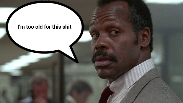
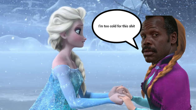
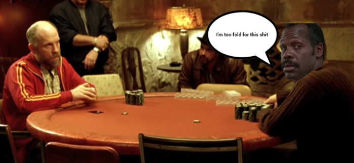
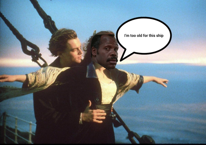
Danny Glover

Danny Glover in Lethal Weapon:

dannyglover_old


Danny Glover in Frozen:

dannyglover_cold


Danny Glover in Rounders:

dannyglover_fold


Danny Glover in Titanic:

dannyglover_ship


Danny Glover in Indiana Jones:

dannyglover_gold


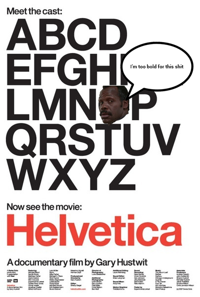
Danny Glover in Helvetica:

dannyglover_bold


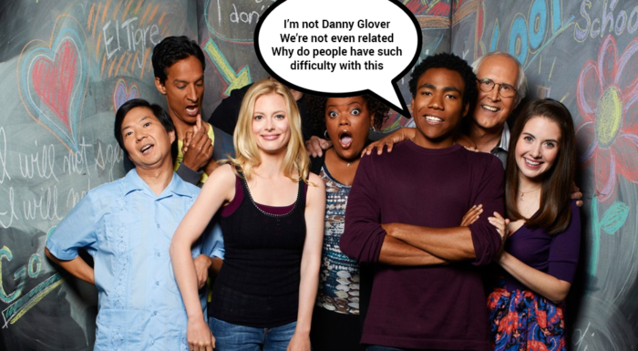
Danny Glover in Community:

dannyglover_donald


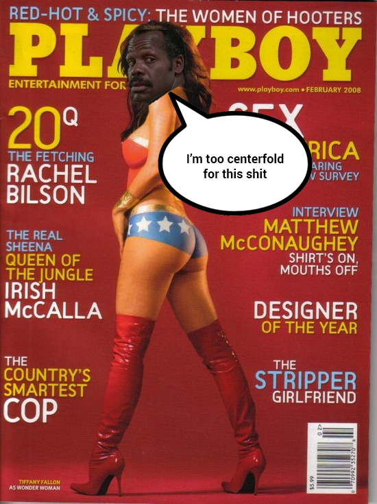
Danny Glover in Playboy:

dannyglover_centerfold


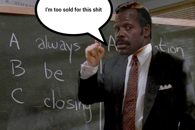
Danny Glover in Glengarry Glen Ross:

dannyglover_sold


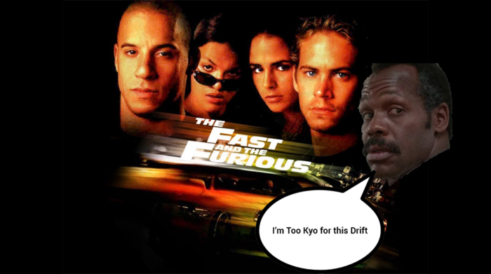
Danny Glover in The Fast and the Furious:

dannyglover_drift


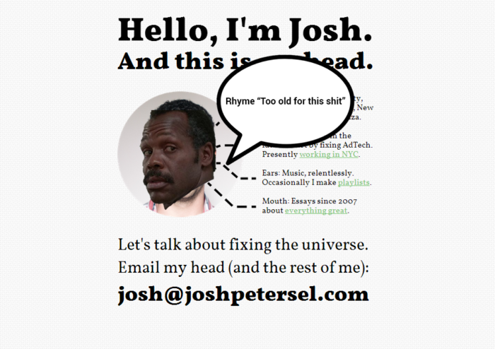
Danny Glover in JoshPetersel.com:

dannyglover_rhyme


(h/t Logan)

Email

I had some thoughts about how Google and Dropbox and Slack and all these companies are trying to “fix” email. And then some thoughts about how Medium would do a better job.

So I wrote about that. And then, since it’s about Medium, I thought it’d be fun to publish on Medium. So I did that.

Check it out here.


Grandma Rozzie

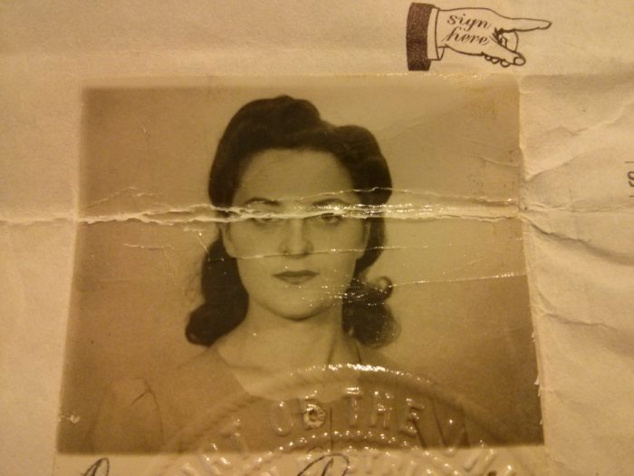
When my grandma was 17 years old, she made up her mind that she wanted to leave her friends, family, and home in Munkacs, Hungary, and emigrate to America. Her parents wouldn’t have it. So she did it anyway. It was 1937.

Here’s the photo from her US Certificate of Naturalization:

img_20141019_140718


I could spend the entire rest of my life trying, and I’d never catch up to being this poised, this collected, this cool.

Self-Driving Cars, Part 0.5

This past week Tesla unveiled the “D” model, which has a lot of cool features — but as per the post title, I want to talk about its advances towards our future self-driving reality.

Check out the demo here (particularly, the second half of the video):

On the one hand: It’s pretty incredible to actually see these sorts of features in real life as opposed to just in fantastic theoretical prose about the future. It’s definitely a little intimidating — the reviewer for TheVerge actually titles his piece “My Lap of Terror.”

I’m terrified, but for entirely different reasons.

As should be clear at this point from my recent update history, I’m rather zealously looking forward to the day when cars are driving themselves around the road. It’s worth noting that assisted driving features have been publicly available in cars since around 2003, when Toyota began selling a car which could parallel park itself. I have the same level of confidence in car technology’s ability to safely and effectively navigate both Toyota’s parking and Tesla’s lane changing and speed limits.

What I have very little faith in is people.

For example: How long do you think it’s going to take for some lunatic to post a video to YouTube of himself turning on Assisted Driving and then just completely abandoning the drivers seat?[ref]We already had the Ghostride fad circa 2006.[/ref]

You think it’ll take a few weeks? A few days?

What if I told you… someone actually already did exactly this over two months ago?

Scarier than that, because I think it’d be far more commonplace: Just simple lapses in human judgment. I think assisted driving leads us to being lazier drivers. We already have a hard enough time checking our blindspots when we switch lanes.

Say you’re a little groggy and happen to be taking your wife’s car to work instead of your Tesla one morning. Or say you get comfortable enough with assisted driving that you justify it as a good time to take out your phone and sneak in a few text messages from behind the wheel. All it takes is one second.

I don’t want to start sounding too much like your nagging, paranoid parents here. But no question about it: Lazy driving and distracted driving lead to accidents.[ref]Tangentially: It’s worth reading up on the European cities which made their streets safer by removing every single form of traffic signal, on the premise that without all of the crutches of traffic lights, stop signs, and so on, drivers would intuitively be relegated to be hyper-aware of their own safety, so they’re more careful. Accidents have gone down precipitously.[/ref]

We’re in sort of a treacherous valley right now — at the far end of the horizon, the utopian fully-autonomous vehicle. One view of the world was that we might just make one big gigantic leap across — say, Google just deploys its self-driving car and we all hope it clicks. What it looks like, though, is that we’ll be crossing the valley baby step by baby step — inching closer to the future and deploying the self-driving car on a feature-by-feature basis over several years. There’ll be growing pains either way; I can only hope that we make it across quickly.

Advanced Email Tactics

A few techniques I’ve grown fond of employing lately:

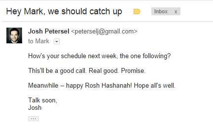
1. I put the greeting, and my recipient’s name, in the email subject rather than in the first lines of copy.

I think this helps email stand out in a mountain of inbox jargon. The sweetest music to anybody’s ears (err, eyes) is their own name. My sense is that my messages get turned around more quickly — especially notes to people who I haven’t spoken with in a while or who maybe weren’t expecting to hear from me.

The result looks something like this:
hey-mark-email


(Hat tip to Cy, who first brought an idea like this to my attention.)

2. I leave the period off the last sentence in the email.

A slight grammar offense, sure, but the benefits make up for it.

Here’s an example:

hey-natalie-email-no-period

By leaving off the last period, I find my emails are far easier for recipients to quickly respond to. It’s more casual, but no less formal because the ease in prose doesn’t arise from the use of conjunctions or colloquial diction. It evokes a sense of briskness, but stopping well short of the childish overzealousness that was the hallmark of, say, vintage Dugout-era Jim Thome.[ref]Maybe my most obscure internet reference on this website to date.[/ref]

This is the same sort of hastiness that you’ll see in, say, Mark Cuban’s weblog. He goes a bit farther — employing haphazard capitalization, formatting, and so on — than I’d feel comfortable with in a formal email setting. I think his goal is to exude a sense that he’s not really spending more than 17 seconds on any given rant, but also, in a weird way, it makes his work easier and faster to read and react to. And that’s precisely the sort of behavior I’d generally like to extract from my email recipients.


3. Things I don’t do.

A) Email signatures. These started out as an okay idea. At one point, in fact, they were a huge contributing factor to the viral growth of Hotmail.

Now, they’re just stupid. Gmail (and I’d assume other modern email clients too) has figured out that they’re a waste and will clip the bottom of your message off as soon as it’s figured out you’re in the signature zone.

What’s the point of a signature? It’s not to convey important information. Most people include the following three things in their signatures: Their name, their email address, and their phone number. Any time you’d need my phone number, I’m going to be sure to write it out again for you. Something’s truly amiss if you should need to be reminded of what my name and email address are.

A signature in a hand-written letter is more a token or authenticity and care. “This was definitely me who wrote this letter, and I put thought into it.” None of that sentiment comes through when you’ve got a signature set to send automatically with every message. In fact, you’ll often see people conclude emails with an individually written “Best, Charles” — so now they’ve got two signatures.

B) Separate signature from your smartphone. “Sent from my Samsung iPhone S1000 by VeriSprint Mobile.” This was an important thing to have, but only back in like 2003 when people were sending emails using T9 Messaging on flip phones and errant words were potatoes knife like text grade dad not all that uncommon.[ref]Sent from my 2003 Mobile Device[/ref]

First of all, “Sent from my iPhone” signatures make you a participant in an Apple viral marketing campaign which you didn’t sign up for. Second, if you’re on a smartphone, you’ve been afforded an ample screen, a Qwerty keyboard, spellcheck, and every other convenience any modern computer might possess. Any errors in your message are entirely your own fault.

…Then again. Suppose there is something to the idea of “Sent from my smartphone” exuding and prompting a sense of hastiness. I wonder what’d happen if I just set my desktop email signature to “Sent from my smartphone.”

C) Legalese.

This e-mail message and all attachments transmitted with it may contain legally privileged and/or confidential information intended solely for the use of the addressee(s). If the reader of this message is not the intended recipient, you are hereby notified that any reading, dissemination, distribution, copying, forwarding or other use of this message or its attachments is strictly prohibited. If you have received this message in error, please notify the sender immediately and delete this message and all copies and backups thereof. Thank you.

My reaction when.

Berkshire Hathaway

A quick moment of reflection and praise for one of my favorite boutique sites on the internet:

http://berkshirehathaway.com/

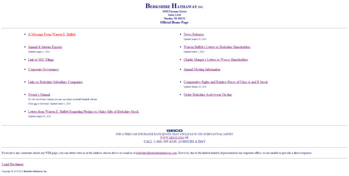
Which, for posterity’s sake, looks like this:


berkshire-hathaway

That’s it. 127 lines of HTML code.

You can almost imagine the conversation that took place:

Warren Buffett: “We don’t need a website! The hell do we need a website for?”

Advisor: “Sir, it’s the internet. It’s important. We need a website.”

WB: “Fine. Just shut up. Here’s a website. I hope you’re happy.”

And you know. I think these two imaginary figures came to the right conclusion. Berkshire Hathaway doesn’t really need stuff on its website. You’re there because you already know who Warren is and what he’s about — he doesn’t need a blog to explain himself.

The design is a little extreme — and my designer friends would murder me for coming anywhere close to paying the site a compliment in this arena — but I’ll take it. The site has no frills, no nonsense, probably costs nothing to maintain, and it pretty effectively surfaces all of the content I could conceivably have been looking for upon my arrival. They say good design isn’t “what more can you add” but “what more can you take away.”