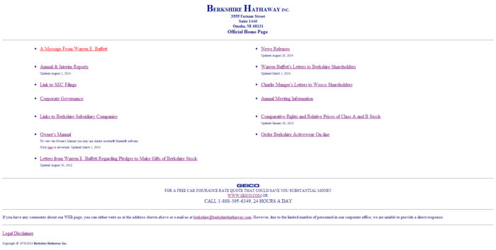
A quick moment of reflection and praise for one of my favorite boutique sites on the internet:
http://berkshirehathaway.com/
Which, for posterity’s sake, looks like this:

That’s it. 127 lines of HTML code.
You can almost imagine the conversation that took place:
Warren Buffett: “We don’t need a website! The hell do we need a website for?”
Advisor: “Sir, it’s the internet. It’s important. We need a website.”
WB: “Fine. Just shut up. Here’s a website. I hope you’re happy.”
And you know. I think these two imaginary figures came to the right conclusion. Berkshire Hathaway doesn’t really need stuff on its website. You’re there because you already know who Warren is and what he’s about — he doesn’t need a blog to explain himself.
The design is a little extreme — and my designer friends would murder me for coming anywhere close to paying the site a compliment in this arena — but I’ll take it. The site has no frills, no nonsense, probably costs nothing to maintain, and it pretty effectively surfaces all of the content I could conceivably have been looking for upon my arrival. They say good design isn’t “what more can you add” but “what more can you take away.”

reminds me of this gem: http://motherfuckingwebsite.com/