“I’m moving to New York City; how do I get a decent apartment?” — A Practical Guide

  1. Go on Craigslist and find a temporary place in an okay location. It’s going to be infinitely easier to do actual apartment hunting if you’re physically based in New York and you have the logistical potential to visit the listings you read about. This temp place is probably going to be awful, but you can put up with awful for 4 weeks. My entry apartment in New York was a studio apartment which had four people living in it full-time. Three of them had consistent sleepover girlfriends. I slept in a bunk bed with soundproof walls and ear plugs. One guy slept in a hammock, one guy on a foam mat which he unrolled from the broom closet. Your entry apartment will not be this awful… I think.
  2. Your listings venue of choice is Padmapper.com. It’s like Craigslist, but with infinitely better sorting tools. For starters, narrow your view by geography and by price per bed.
  3. Your objective is to find a room 2- or 3-bedroom apartment where the other rooms are already filled and there’s an empty room because of a roommate moving out. This way, you likely actually avoid the broker’s fees, and possibly get rent that’s way under market because the lease & terms have been passed down a few generations. Click everything in your area, hide the listings that are terrible, and employ steps 4 & 5 for what remains.
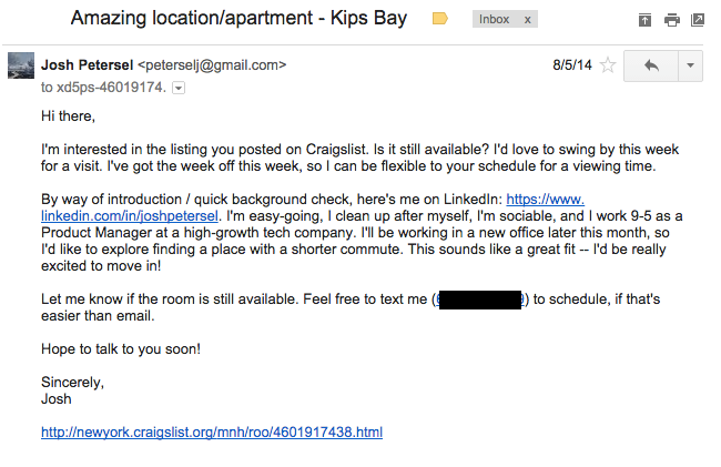
  4. Draft your form email, which will look something like this:apartment-draft-email1

    This form email has six key elements in some form:

    • Your Linkedin profile, which is an easy way to reassure the lister that you’re a decent human being
    • Proper grammar and punctuation, which is an easy way to reassure the lister that you’re a decent human being
    • Some indication that you have an income and a life, which is yeah yeah you get it
    • As applicable, a few details from the listing (does the lister mention her name? some key personal interests?) to reassure the lister that you’re not a robot or that you’re not blatantly spamming everyone even though you kind of are
    • Some proposed time slots where you could come visit the apartment so that you can get down to business quickly (Above, I had an entire week free. You might only have 5-7 after work)
    • A link to the listing in question so that when you’re reviewing the responses to the mass of form emails you send out, you can quickly figure out which listing you’re referring to
  5. Send your form email to literally any apartment that looks decent. Make this part of the process brainless. If it looks questionable, send anyway. It costs nothing to pretty much copy/paste an email. It’s easier to decide on whether you want to live in a place after you’ve actually visited and after you’ve actually engaged with the lister.

With this method, you can probably comfortably churn through 20-30 decent outbound form emails in a sitting, and set up 5-6 apartment visits in a week.

Unfortunately, Craigslist scams are still a pretty real thing. Some things to be wary of when you’re searching through Craigslist apartments:

  • Unreasonably good deals. If you’re seeing a 1-bedroom for $750, and the next-cheapest apartment in the area is like $900 per room in a 5-bedroom compound… there’s probably a problem, catch, or scam
  • No pictures. It’s not hard to take some photos with your cell phone. Only reasons I can think of someone not having photos are a) the photos would reveal a pretty meaningful problem, b) it’s a scam, or c) it’s a little old lady who doesn’t have a smart phone or doesn’t really know any better. Maybe you’re lucky and the lister is a (C), but probably not
  • Age of listing. NYC housing moves fast. A listing up for > 10 days is pretty unusual. Maybe there’s a good reason — the lister had to go on an emergency trip, or an applicant flaked out. Maybe it’s just a scam. In the same vein, you might check for duplicate listings by copy/pasting a few keywords into the Craigslist search bar. Often for bad apartments you’ll find multiple listings with slightly different titles but the same body copy
  • Fees and forms (before viewing)Some places will ask you to fill out rental forms and pay broker fees. Unfortunately, the NYC housing market sucks and is riddled with shady practices like that. You may wind up having to pay a broker fee; that’s okay. You should never fill out forms or fees before getting to at least see the place, though

Key questions I’d consider asking during a visit which actually make a difference:

  • Is laundry in the building?
  • Do the A/C and heat work?
  • How’s the water pressure in the shower?
  • (If furniture present) Which items are staying, going?
  • Are there broker’s fees, security, deposits, other bullshit?

For apartments with roommates:

  • What is your cleaning schedule for common space?
  • How often do you have friends over?
  • Do you have a serious significant other? How often do they come over?
  • How often do you cook?

Up to you to seal the deal from there.

If you want to read about the worst parts of NY apartment hunting, check out “I’m moving to New York City; how do I get a decent apartment?” — An Adventure in Misery

Google Maps and Internet Super Heroism, Part II

About two years ago I discovered myself in Google Maps Street View, holding up a promo thing for my old company Eleven. This has brought me a pretty much infinite amount of joy.

Turns out I’ve made it to Street View… again. https://goo.gl/maps/XxVvh

screen-shot-2015-05-10-at-5-43-04-pm

I wonder what the record is for most Google Maps Street View appearances is by non-google employees. I’ve gotta be most of the way there at this point.

See more of my best internet accomplishments here.


“I’m moving to New York City; how do I get a decent apartment?” — An Adventure in Misery

Lots of people have asked me for help in moving to New York City. Here’s how it works.


Step One: Look at a ton of misleading apartments on the internet (ongoing)

There are about infinity different resources to look for housing in New York. You’ll see lots of apartments claim to simultaneously be decent, and affordable, and available. This will give you hope. Expect this hope to be crushed brutally in no time.

You’ll be revisiting this step often during the process and we’ll investigate it more closely a bit later on.


Step Two: Learn about broker fees

A broker’s fee is this special fun bonus (one of several) unique to New York City housing.

Here’s what happens: When you get an apartment through an agent, they charge you an additional 15% of your (already ungodly) first year’s rent. And you have to pay it up front in cash or government check or gold bullion or something. And you also have to pay a $100 fee for your background check (because I guess if you can afford NYC housing, there’s a good chance you’re a criminal). AND you have to pay a $100-$150 non-refundable application fee just for the right to be considered for the apartment.

I’m sure there’s other creative terms for “fuck you, I don’t care, pay me” that brokers might invoke on you which I am forgetting.

Optional bonus reading: Why do broker’s fees exist?

Basically, it’s because the vacancy rate — that is, the percentage of housing available on the open market at any time — is preposterously low in New York. Guess how low it is.

Did you guess 5%? That’s not a bad guess.

Did you know that the national average vacancy rate is 7% according to the census? 5% is a little worse but pretty close to that.

Turns out you were actually incredibly wrong about 5%, though. It’s actually 1.64% in Manhattan. You might also think of it this way: The average apartment in New York is sold off the market in less than six days. That 1.64% figure includes the apartments which are somehow so small — and up so many flights of stairs while still paradoxically smelling so strongly of the Vietnamese restaurant at the ground floor — that they’re permanently stuck on the open market and drive the nominal rate up. So the effective vacancy rate is probably even lower than 1.64%.

If you really care about background info, there’s some sound logic suggesting that the reason for this low availability is because extremely wealthy people are just buying up NYC apartments as weird loophole personal investments and tax shelters. It’s not so much that they’re hogging housing, but more that they’re incentivizing architects to build luxury apartment-mansions instead of decent respectable apartments to be used by normal people.

Alternatively, if you’re the sort of person who feels more intimidated by technology than by 1%-ers, you might like to buy into the theory that vacancy situation is entirely Airbnb’s fault.

Step Three: Declare publicly that you’re not going to pay a broker’s fee

It’s important that you announce to your friends that you’re going to get a no-fee apartment. This makes you sound like you know what you’re doing.

(Generally, a “no-fee” apartment will just spread the cost of the fee throughout the year by having higher rent. But still, you sound like you know what you’re doing.)

Steps Four through Six: Give the misleading online apartment search another shot

Step Seven: Realize you can’t afford any of this dear god how do people even live in this city

Step Eight: Naturally, start thinking about a bigger apartment

Maybe you can save some money by splitting rent on a 3br instead of getting yourself a tiny 1-br or studio?

You might try asking some of your friends currently in NY to vacate their current leases and move in with you. This is futile.

Everyone who currently has an apartment in NY is irreparably psychologically scarred from their move-in experience and they sure as hell don’t want to re-open that wound just for your convenience.

But I hope you briefly enjoyed living in this daydream fantasy.


Step Nine: Cross off every item on this list of misleading apartment listing gambits

The “hee hee, we’re a no-fee apartment!” schtick was just the first of your worries. Here’s a more comprehensive list of what you can expect:

  • The apartment that claims it’s “no-fee” but winds up being just as expensive as everything else
  • The photo of this apartment was clearly a photo of an entirely different, much nicer apartment
  • The apartment you were looking at in the listing is “no longer on the market,” I’m so sorry, but hey, while you’re on the line, why don’t you come take a look at this other apartment which is simultaneously way worse and way more expensive
  • The apartment purportedly has 170 other people looking at today and you’ll never find anything else like it and it’ll surely be gone forever by the end of this sentence so you better take out your checkbook right this second and make a big, rash, expensive decision or else
  • The apartment’s only toilet is in the middle of the living room
  • The apartment’s only toilet is on the ceiling
  • There is either a loud mating ritual or a discombobulated percussion instrumentalist perpetually performing inside of the radiator
  • The apartment comes with a 73-year old person and their 173-year old cat
  • The apartment comes with free pungent Vietnamese restaurant smells at all hours
  • The apartment is actually inside the engine of a firetruck whose horn is blaring constantly
  • The apartment is actually an RV made in Mexico where it’s always raining inside
  • I could go on for hours here
achewood rays RV rain

(please read Achewood)

achewood-rays-rv-rain

My favorite gambit gets a step all to itself.


Step Ten: Learn about walls

Inevitably this happens: Someone is going to show you a misleading internet apartment, claim it’s a 3-bedroom, and you show up and they explain something like “This is just a 1-bedroom now, but once you put in some walls, it can go up to three, even 17 bedrooms!”

Did you just think you were just hunting for a NYC apartment? Turns out you’re on your way to becoming  a hobbyist architect. Congratulations!

Generally, there are three kinds of fake walls you are going to learn about.

  • “Walls” which are pretty much just shower curtains
  • Walls which have to leave like a 10% gap of open space at the top without touching the ceiling
  • Walls which are the fortitude of solidified papier mache

Every apartment building in New York has different rules about which kind of fake walls you’re allowed to install. Sometimes it has something to do with requiring a window in every room. Sometimes it has to do with building code. Every time, though, the rule is that you have to put the wall in yourself — but don’t worry, it’s only going to cost you between $200 and $1,000 on top of your rent and broker’s fees and everything.

I’ve never installed a fake wall personally, but it’s not hard to imagine that this would be a nightmare to accomplish.


Step Eleven: Okay the practical guide for how you actually do it

If you haven’t blown your brains out yet, here’s your actual best shot at finding a decent place to live.

“I’m moving to New York City; how do I get a decent apartment?” — A Practical Guide

Apple Watch: Part III of III

Plenty of digital ink’s already been spilled about the Apple Watch. Most of the reviews did a terrible job at actually reviewing the product. Many reviewers and casual observers alike have complained aggressively, but for the wrong reasons, about how it’s priced.

Two weeks ago was Part One and last week was Part Two of three thoughts on the product’s present value proposition and its pricing. Those parts were relatively dismal. Here’s Part Three where we talk about something really exciting: the future.

Part Three: The Apple Watch is not a watch at all

Apple is a pretty smart company. It’s possible that what I’m about to describe is what their vision’s been all along.

In Part 1, we talked about the most important use case of a wristwatch, particularly using a wristwatch in lieu of a pocket watch: To tell the time, not to a fraction of a second, but in a fraction of a second.

I’m fascinated by thinking about other instances where the apparently minuscule traditional value proposition of the watch — do “x” in a fraction of a second — leads to a demonstrable improvement in experience.

Well, what else can we pull out of our pockets? Usually, we’ve got phones, keys, and wallets.

On the phone front: Apple harps on moving your messages/notifications/inbox from your pocket to your wrist. I’m thoroughly convinced this is rubbish. Messaging is something that benefits too much from having screen real estate to read and write. It’s not a quick, mindless, glance-and-get-back-to-what-you-were-doing activity. We’ve discussed the importance of this phenomenon at length already.

There’s also a big push for apps on the Watch — Uber and Google Maps for example — but again, my thesis is that if you’re doing something that takes more than a half a second, you might as well take out your phone.

This “no bullshit” user guide suggests using Siri instead of the menus because the menus are “fiddly” and Siri is faster. Then — right freaking there — he says “there’s a bit of lag. It can take a second” and it’s bewildering to me how we’re not all in agreement that just taking your phone out at this point is easier.

Side Note: In fact, I’d be amused to see tests run which pit Phone and Watch versions of apps against each other in races. I’d bet that nine times out of ten, you get the task done and get back to work just as quickly — if not more quickly — if you use your phone. Your Uber isn’t going to get to you any faster because you’re using your Watch. I’d bet you wind up reading and responding to your messages more slowly because of the Watch’s screen size. Checking the time is going to be markedly faster, though again, it still takes a fraction of a second too long.

Surprisingly, the phone replacement branch is the part that Apple seems to boast about the most in its current marketing push, and it’s the part which I think is by far the least productive.

So if not a phone replacement, what else?

On the keys front: This is potentially incredibly neat.

Here’s a bunch of questions:

  • Why do we even still have keys? Why do we carry around dumb pieces of metal — often a half-dozen dumb pieces of metal — which all look exactly alike? Isn’t it annoying when you accidentally try opening the door using the wrong key, because it looks exactly like the right key?
  • Why do we trust our security to a dumb piece of metal which the locksmith down the street can duplicate in like 15 minutes? Why are we stuck in a system where if you lose your dumb piece of metal, you need to hire a guy and it costs an afternoon and a few hundred bucks for him to rip apart your door to replace the locking stuff?
  • Isn’t it annoying when you get home and you have to fish through your pockets to get your keys while balancing two huge bags of groceries? Before that, wasn’t it annoying when you got to your car in the parking lot and had to do the same thing to open the trunk?

Using your keys and opening stuff is exactly the kind of process we’re looking for, where the seemingly insignificant improvement in process time leads to a measurable increase in satisfaction, and where you can convert a process that takes even a modicum of mental energy into one that’s completely effortless. Opening stuff by holding my wrist near a sensor would be awesome.

(Yeah, but Josh, doesn’t this raise security issues?) I don’t think so. A stolen Watch/Key might have different password protocols if the cellphone it’s usually paired with isn’t present. A building with Watch/Key doors could simply install an extra magnetic charger at the front where people with dead Watches could charge for 5 seconds to get the requisite 20 seconds of battery life needed to unlock the door.

On the wallet front: This is cool. Really cool. The Watch can replace my wallet.

Apple Pay is something that already exists today. This is a system by which you can pay for stuff by holding your iPhone up to a reader and pressing down on the thumb reader for a minute. And it’s getting some traction. But digitizing the wallet is only half the idea — the whole idea, again, is turning a process which takes a second into one that takes a fraction.

The manual process for buying stuff in 2015 is almost archaic. At my grocery store using a credit card:

  1. I wait in line for 20 minutes
  2. Lady scans all my food items and bags them
  3. I take out my wallet
  4. I take out my credit card
  5. I swipe my credit card
  6. (Inevitable: The lady scolds me because I swiped too soon)
  7. (The lady says “okay now swipe”)
  8. I have to pick between Debit or Credit
  9. The receipt prints
  10. A second receipt prints
  11. I have to physically sign the second receipt, which she puts god-knows-where
  12. I leave
  13. Later, I throw out my copy of the receipt

With Apple Pay on iPhone, I sub the words “credit card” for “iPhone” and almost everything is the same.

If I have an Apple Watch, the grocery store lady simply scans my wrist the same way she scans my chosen box of frozen vegetables. The process looks like this:

  1. Line is much shorter
  2. Lady scans all my food items and bags them
  3. I scan my Watch (I can do this while the lady is bagging. And my preferred card is already chosen, or I can select it.)
  4. I confirm on my wrist
  5. I leave

So: Try to think about all the times you have to pay for something in your day-to-day life. Groceries, restaurants, bars, subway ticket, Starbucks, Bloomingdales, you get it. Now imagine that every single time you pay for anything, the process is twice as fast. And it’s twice as fast for everyone else — which means every single line you ever wait on is exponentially shorter.

In fact: There’s already a live and compelling case study for exactly this sort of thing: Electronic Toll Collection (called E-Zpass here in the northeast US). This study illustrates that toll processing goes from about 425 cars per hour when on manual collection or coin collection, up to 1,200-1,800 cars per hour with electronic toll collection. 2.8-4.2x process speed.

In fact: There’s an even better case study. As it turns out, the exact ecosystem I’m describing — with automatic payments, fast lines, room keys, everything — already exists. It’s at Disneyworld.

Here’s an impossibly long explanation from Wired. If you don’t want to read that, here’s 90 seconds from YouTube:


What if every single time you had to pay for something, you could do it 2.8-4.2x faster? What if you permanently lived in DisneyWorld? That’s a universe that Apple Watch can create. If this idea existed, if there were fast lanes at the grocery store, coffee shop, everywhere for transactions paying with Apple Watch, people would flip. Tech journalists would maybe even write something genuinely positive about the device.

I would flip.

In fact, watch this flip:

Score: 2 out of 10

No longer.

Score: 7 out of 10

Just kidding. Still fuming that TheVerge doesn’t have the balls to say anything negative, ever, about any Apple product.

Future Score: 9 out of 10

It’s hard to give a high score to a product that doesn’t totally work today and needs pretty comprehensive ecosystems built out in order to fully realize its potential. But Apple is unarguably one of the only companies in the world who could effect that kind of change.

I’m a little afraid of this future. I wonder if $350-$550 is really a fair trade for a bunch of pleasant design accoutrements and some efficiencies in minutia — it sounds like a ripoff. Though I guess this is the same value proposition that the Nest thermostat has, and that seems to have done quite nicely for itself.

I have no plans of buying an Apple Watch today. I’m happy to let the fanboys toil for a few years of sniffing their own farts blinding themselves on 4pt font text messages while I wait for Keys and Wallet functionality to fully materialize. But come 2019 or so… maybe hell’s freezing over, or maybe I finally come around to the Apple side of the tech world.

anigif_enhanced-buzz-10829-1389137938-8

Apple Watch: Part II of III

Plenty of digital ink’s already been spilled about the Apple Watch. Most of the reviews did a terrible job at actually reviewing the product. Many reviewers and casual observers alike have complained aggressively, but for the wrong reasons, about how it’s priced.

I discussed the mediocre world of reviews in Part One. Below is Part Two of three thoughts on the product’s present and future.

Part Two: “OMG! $10,000! That’s insane!!” — Everyone

I think Apple’s pricing strategy has some hangups — but not for the reason you hear everywhere else.

The thing with Luxury Goods is that pricing never makes practical sense. In fact, it’s not supposed to make practical sense. In Luxury Goods world, price isn’t just a signal of quality, it’s a driver of quality. The Porsche 911 Carrera, at ~$117,000, won’t (legally) get you anywhere twice as fast as the Porsche Boxter priced at ~$50,000, but it’s about twice as good a car because it’s priced twice as high.

It’s weird to think that while Apple is inarguably the maker of the world’s most luxurious phones and laptops, they’ve never really made a “luxury” product. The iPhone and the Macbook are typically among the most expensive products in their respective markets, but their price is determined by rational drivers: quality craftsmanship and effective marketing.

The Smart Watch industry has been in a weird position since its inception because expensive watches are a Luxury Good. So pricing on the order of $300 – $600, though it’s in-line with the pricing of phones and similar digital devices, are confusing in watch world: It’s hard to appeal to either the purveyors of Luxury Goods or to the people who just want a practical way to tell the time.

////

On a slightly different note:

It’s interesting to consider the plausibility of a $10,000 watch being a tenable purchase for an average Apple consumer.

Matt, Kevin and I exchanged a few emails on this subject. In 10 years, Matt’s purchased two laptops, two iPods, and two iPhones — that’s roughly $6,000 spent by one typical guy from his late teens through his late 20’s. At this rate, it’s realistic to think that Matt will spend somewhere between, say, $20,000 and $60,000 in his life on Apple products. (Though I may be off by an order of magnitude if the rumors about Apple Cars are true.)

From that lens, spending $10,000 on the watch category doesn’t seem so far out. Apple might need to establish a payment plan, and Matt could realistically afford to buy a Watch Edition. That’s not so far-fetched. Payment plans exist for every other hard-to-reach product (houses, college educations, etc.).

The other important caveat impeding Matt’s purchase is that luxury watches like Rolexes and high-end watches are considered “buy it for life” investments. With Apple’s traditional product line, it’s more or less assumed that you’re going to replace your product once every 2-3 years (like Matt’s laptops and phones in our example above). He couldn’t afford to spend $10,000 every two years. But committing $10,000 in exchange for a lifetime of having the world’s best wrist-worn device? I don’t think that’s out of the question.

Interestingly, there’s precedent here too: My dad mails his Rolex back to the manufacturer once every few years for regular maintenance and cleaning — I’m sure this sort of thing is far from unique. And I’m confident Apple could arrange a similar program to ensure its Watch owners were always, ahem, up-to-date.

In sum, we can think about consumer use cases for a watch like the Watch:

  1. I need to tell the time (probably for relatively cheap)
  2. I want a luxury good to impress my friends (probably for very expensive)
  3. I want to buy an accessory for life (probably for very expensive)
  4. I like Mac stuff and whatever just give me the newest thing

Compared with Apple’s offerings:

  • Watch Sport for $350
  • Watch Edition for $10,000
  • Watch (regular) for $550

So the Sport version is too expensive for people in Use Case 1, and it’s also priced in the middle of the pack among the market of smart watches, which is unusual for Apple product introductions. The (regular) Watch I guess was designed to appeal to Use Case 4 but I can’t see why the #4’s wouldn’t just opt for for the Watch Sport to save a few dollars. (Perhaps creating a pricing structure to make it look like the Sport version is a relative bargain was precisely the point.) And the Edition version, as far as I can tell, bears none of the lifetime assurance and customer service markings which are essential for luxury and lifetime products.

What I mean to say is: The pricing and value propositions and product differentiation fail on all fronts.

What I would have done instead:

  1. Nix the Sport edition. That way, you’re priced at the top of the market with Apple Watch (regular) and you’re getting an extra $200 from all the Category 4 buyers who are going to get this thing regardless.
  2. Lifetime service stuff for Edition buyers. A guarantee that (for a nominal fee of, say, $150) every two years they can mail in their Watch and get a brand new one back. This massages the fear of buying an obsolete device, and puts Edition owners in rarified air as members of an elite Apple club. Apple might break even or lose a little money on those $150 upgrades, but who cares because a) they’ve already made $10,000 off a customer, and b) as long as the customer is wearing a Watch, she is forced to be using an iPhone — she can’t switch or her Watch becomes… just a watch. A $600 every-other-year customer for life is worth is worth a few bucks in maintenance here and there.

In the end: That $10,000 price tag is actually, improbably, maybe among the least insane decisions Apple made in launching its new product.

Apple Watch: Part I of III

Plenty of digital ink’s already been spilled about the Apple Watch. Most of it said “it’s not for everyone,” which completely misses the point of reviewing a product. Most of it also completely missed the point on what’s actually good and bad about the product itself.

Here’s Part One of three thoughts on the product’s present and future.

Part One: “It’s not for everyone” — Every tech journalist on the internet

This narrative sounds like it was directly ripped from The Emperor’s New Clothes.

Here’s some link soup borrowed from Rusty Forster’s April 8th delivery of Today in Tabs.

Oh hey it’s Apple Watch review day … Farhad says it isn’t for everyone. Re/code says it’s kinda like other smartwatches but that doesn’t mean it’s for everyone. Topolsky says it probably isn’t for everyone and also demonstrates that checking your watch makes you look like a huge dick. The Wall St. Journal says that “[w]ith the Apple Watch, smart watches finally make sense,” but that it isn’t for everyone. The New York Times calls it “Less Than Fulfilling,” and points out that it probably isn’t for everyone. The Verge made a review so pretty I am unable to read any of it, but I think the gist is that the Apple watch is only for some people, not all the people. And if you only have 4:30 to figure out whether you want one, watch Joanna Stern’s video, which certainly makes it look like the watch isn’t really for anyone.

The Verge spent 6700 words to give the Watch a “7” out of 10 — which is to say, they spent 6700 words to say nothing. “It’s not for everyone” says nothing.

It feels like everybody is too afraid to look silly in front of their peers and their tech overlord Apple to articulate what’s plainly in front of them: “This product is not very good, and the Emperor is standing in there in the buff.”

apple watch king

So I’ll say it: I don’t think getting notifications on your wrist is helpful or productive. I don’t think calling or sending quick canned message responses to people from your wrist is interesting or time-efficient. I don’t think these features make for a compelling product, and they especially don’t make for a compelling watch. And I don’t even think you need to demo the watch for a week to come to this conclusion. It should take seconds.

Of all that word vomit across every tech website, I think the very most important quote is this one line in the John Gruber Daring Fireball review:

There’s an inherent tiny amount of lag that isn’t there with a regular watch.

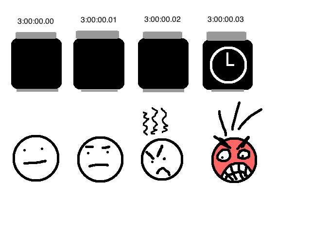
Gruber is saying that it takes a split second for the Apple Watch accelerometer to realize that it’s being summoned and to wake up. I don’t think he means for this to be a big deal, but to me, this split second means everything.

I’m a zealot about use cases and User Experience (this is why I do Product Management for a living), and as an avid watch user myself, there is one very explicit, defining, and specific reason for wearing a watch: To tell the time, not to a fraction of a second, but in a fraction of a second.

Read that again, and then let’s unpack it. To tell the time, not to a fraction of a second, but in a fraction of a second.

“To tell the time…” obvious.

“…not to a fraction of a second…” According to Daring Fireball, Apple is advertising that its watch is accurate down to five hundredths of a second. Maybe this is important for molecular physicists? I don’t think anyone else really cares. My primary watch, like many perfectly functional wristwatches, doesn’t even have a second hand.

“…but in a fraction of a second.” I wear a watch so that I can glance down during a meeting, or mid-conversation, or while I’m walking, or as I’m writing this very post, or anywhere, and know the time without having to wait or fidget or lose my stream of thought. That process time and that lack of cognitive interruption are vitally important.

Introduce even the most minuscule amount of lag (or even a “Sleep” timer, or anything like that) and the Watch’s primary use case is crippled.

watchlag2


Gruber draws out a few other illustrations:

I wanted to catch a 4:00 train home to Philadelphia. I was sitting on a low bench, leaning forward, elbows on my knees. It got to 3:00 or so, and I started glancing at my watch every few minutes. But it was always off, because my wrist was already positioned with the watch face up. The only way I could check the time was to artificially flick my wrist or to use my right hand to tap the screen — in either case, a far heavier gesture than the mere glance I’d have needed with my regular watch.

Similarly, it turns out I regularly check the time on my watch while working at my desk, typing. I didn’t even know I had this habit until this week, when it stopped working for me because I was wearing an Apple Watch. Again, because in this position the watch face is already up, the display remains off. My wrist doesn’t move when I want to check the time with my fingers on the keyboard — only my head and eyes do. And yes, my Mac shows the time in the menu bar. I can’t help that I have this habit, and Apple Watch works against it.

Here’s one more scenario. I grind my coffee right before I brew it. I put a few scoops of coffee in my grinder, cap it, and press down with my right hand to engage the grinder. I then look at my left wrist to check that 20 or so seconds have expired. But with Apple Watch, the display keeps turning off every 6 seconds. There are ways around this — I could switch to the stopwatch, start it, and then start grinding my coffee. But my habit is not to even think about my watch or the time until after I’ve already started grinding the beans, at which point my right hand is already occupied pressing down on the lid to the grinder.

This is how watches are used. Everything else is secondary to this. Apple Watch fails — and fails hard — at being a wristwatch. (Did they not do live user testing? Wouldn’t this stuff have come up almost immediately?)

It’s rare, but not unheard of, for a new product to perform underwhelmingly in its core use case but have other value propositions more than compromise for this shortcoming. A large chunk of Clay Christensen’s seminal book The Innovator’s Dilemma discusses the microprocessor industry, and explores how new companies built processors which were much weaker than incumbents — but whose advantages in size and price enabled them to find new profitable customers and use cases.

I don’t see those advantages or use cases here. And because of that, here’s the score that the Apple Watch today deserves:

Score: 2 out of 10

The Watch gets a 0 out of 10 because it fails to do what it is explicitly supposed to do: be a wristwatch. Then it gets two charity points (not 7, The Verge!). One because the Watch is an interesting new thing that if you buy it you will impress people at your office’s water cooler.

Who is this watch is for? Not for “not everyone,” but for people who have blind faith in Apple products — and if that’s you, then you didn’t need any review of any length to aid you in a purchase decision.

The other charity point I’ve awarded because it’s obvious that there’s potential here for something much greater than what we see today.

(That much… we’ll discuss when we get in to in the much more positive and forward-thinking Part 3.)

Ratatouille

Through March 2015, I’d only ever submitted one thing to Reddit: Hulk Hogan Plays Guitar On Top of Places. That set a pretty high bar.

One of my favorite communities on Reddit is /r/FanTheories — a domain where sleuth fans search movies, tv shows, and general media for clues left (often unintentionally) by producers which can add to, explain, or change the narrative in a meaningful way. Favorites of mine include theories on Super Mario BrosWilly Wonka and Back to the Future.

In re-watching Pixar’s Ratatouille last week, I stumbled upon something clever which felt to me like it’d made the cut — both in maintaining my pathologically high Reddit submission standards, and in adding something substantive to the movie’s intended story.

Check out submission #2, worth about 600 fake internet points: [Ratatouille] Chef Gusteau, like Linguini, was being controlled by a rat.


Lollapalooza Chile

My coverage of the 2015 iteration of Lollapalooza Chile was published over at Consequence of Sound.

I was told this year Fritz and I were the exclusive US media presence down in Santiago. (So I’m sure the same might be said of our work in years past.)

As usual, the experience was simultaneously otherworldly and humbling. As usual, the Fritz & Josh try to employ American puns and humor into their middling grasps of conversational Spanish show was met with cackling laughter among Fritz & Josh, and blank or confused stares from pretty much everyone else. As usual, a whole new slew of incredible friends with whom we’ve parted ways all too soon.

Auction strategy & fantasy baseball (or: How to subtly be a ruinous jerk at your fantasy baseball auction)

(Note: I realize fantasy sports often make people sound like this. You’ve been warned.)

Winning the fantasy baseball auction — any auction, really — is a lot like winning poker. The novice way is to play the hand that’s in front of you. The expert way is to play every one of your opponents’ hands for them and to subtly shift the entire draft landscape in your favor. Sure, like in poker, you can accomplish this by bluffing effectively. But if you’re as terrible at poker as I am, the more surefire and sneaky way is to use psychology to just subtly be a ruinous jerk.

Most gentleman managers use the following rules to guide their participation in a fantasy auction:

  1. Come up with a rough idea of which players you want to spend your money on (and which ones you don’t)
  2. Nominate the most expensive players left in the pool
  3. Bid on players you like, don’t really bid on players you don’t like

Generally, the goal in your auction is to capture as much value as possible — if you start with $260 to spend (standard in baseball leagues) and wind up with $300 in value, you’re in pretty good shape. The gentleman’s way to do this is to follow the guidelines above and hope (fingers crossed!!) that you can win the players you want at a price below their face value.

But let’s not leave things so much to luck, and take a little more control of the battlefield.

The ruinous jerk way to do this is to annoy all the other co-managers, frustrate them psychologically, and beguile them into spending more than they ought to — which leaves them with less spending power and mental fortitude with which to compete with you.

We accomplish all this by flipping the gentleman’s strategy pretty much completely on its head.

1. Come up with a rough idea of which players the other managers want to spend their money on (and which ones they don’t)

There’s one guy in my fantasy baseball league who once drafted Torii Hunter every year for like five years straight. It was a fun running joke, but also, it was obvious that the manager really liked Torii Hunter. If I was more of a jerk years ago, I would have made a point of nominating Torii Hunter very early, and forcing that manager to fight for Hunter while all the other managers still had ample budgets available.

The easy way of being a jerk and adhering to this rule is to just actually watch baseball and see which players are exciting. (If you can’t handle the devastating monotony of actually trying to sit through a few baseball games, try just skimming a few ESPN Fantasy “sleepers” articles written by “experts.”) For example: Everyone gushes over Matt Harvey; he’s some kind of superhero or something. I’m confident plenty of managers will be waiting patiently for his name to come up with the rest of the $14-$16 pitchers and hope that he goes for about face value next to the substantially less interesting likes of Jeff Samardzija and Sonny Gray.

The ruinous jerk thing to do would be to nominate Harvey in like the second round, while everyone is still bidding on the likes of Adam Wainwright and Yu Darvish, and watch Harvey go for $4-6 over face value.

Some 2015 buzzy candidates: Matt Harvey, Evan Gattis, Jose Fernandez, Mookie Betts

The slightly harder way of being a jerk is to look at each manager’s rosters from past years. Assuming your fellow managers are human beings, they’re going to be predisposed to liking players who helped them compete last season. A player who is on the manager’s roster AND part of the team name is a dead giveaway. Intuitively, players who came out of nowhere and blew up big seem more likely, too. Watch for the holes in other managers’ rosters during the draft, nominate accordingly, and if you’re feeling poker-ey, bid aggressively.

Some (feasible) 2015 homer candidates: Jose Altuve, Corey Kluber, JD Martinez, Brian Dozier
2008-2013 candidate: Torii f*@%^# Hunter

On the other hand: To figure out which players the other managers don’t want, look for guys with really boring, vanilla names who’ve been around for forever but aren’t dilapidated messes yet like CC Sabathia and Mark Teixeira and basically half of the Yankees. Maybe guys who were big on hype last year and failed to meet lofty expectations. On eBay, one parallel strategy would be trying to bid on items which don’t have pictures, or have misspellings in the listing title — in all likelihood, these are meaningless aesthetic differences which lead to meaningful price savings. In fact, there are websites designed specifically to help buyers take advantage of this.

Some boring 2015 candidates to get for yourself: Brian McCann, Evan Longoria, Jimmy Rollins, Matt Holliday
2008-2013 candidate in any league but my own: Torii f*@%^# Hunter

2) Nominate, like, the third-most expensive player in a category

Check out the list of shortstops available in 2015:

stort shops

If your fellow managers are following the gentleman’s guide to drafting, I guarantee that a handful of them are eyeing the top 3 shortstops because everyone after Jose Reyes is boring or flat-out horrible.

The ruinous jerk strategy here is to nominate Jose Reyes as soon as possible.

By taking Reyes off the market, you prematurely create artificial scarcity around the three premium shortstops — like DeBeers creating artificial scarcity in the diamond market.

With only gentlemen drafting, managers will probably bid on Big 3 SS’s up to around their face value — the fourth manager sighing politely and accepting Reyes at a slight discount.

With you, the ruinous jerk, taking Reyes off the board, there’s now a monstrous drop in value between Ian Desmond ($25) and Alexei Ramirez ($10). Gentlemen managers following their 1st rule know that they want a big 3 SS and don’t want to get stuck in the dredges — so it’s very likely that they’ll pay a sizeable premium in order to stay close to their draft strategy and avoid the SS gutter. The unfortunate manager who does get stuck with Alexei now has to re-configure their draft strategy around your tomfoolery — and they might be steamed from losing the Desmond bidding war, to boot.

Remember, somebody’s probably going to nominate the most expensive player pretty soon, anyway. Even when the plateau candidate isn’t as obvious as Reyes above, continually and strategically nominating the 3rd or 4th best player gives you consistent opportunities to force other players to overspend on their rosters.

3) Bid fast and start low on players you don’t like; bid slow and start high on players you do like

The goal here is to manipulate the fatigue and attention spans of the rest of your league.

Here’s some research on auctions from the Kellogg School of Management. They found that eBay auctions with a low starting price ($1) wound up with a higher end sale price. The key: Get more traffic and attention in the auction.

Some quotes from a corresponding article in the Chicago Tribune:

When someone enters an auction, they invest time and energy in bidding and watching it. This is called “sunk costs.” In business school, students are taught to ignore sunk costs. But most bidders do not.

“Early bidders get trapped, because they’ve spent time and energy in the auction, and it motivates them to spend more time and energy on that auction,” Galinsky said.

Get it? So, more bids → more bidders → higher price. This also means that for players you don’t want, it’s a subtly productive & malicious strategy to actively bid-up players in $1 increments until they get closer to market value, whereupon you can safely walk away.

And bid quickly. Clicks are easy to get caught up in, and you can goad managers into bidding wars simply by inciting them to quickly click back and forth. (Just be careful not to get caught yourself.)

Employ the opposite logic for players you’re interested in: Start the bidding high — or jump-bid them high if they were nominated by a different manager. Again, we want to make the auction appear very uninteresting and weed out attention. Also, because you’re a jerk, this makes the draft less fun for observers who just like to participate and click on stuff.

I think a good rule-of-thumb is to set your targets’ auction price at two thirds of their face value. So If you actually wanted Reyes ($19), and somebody opened him at $1, you should quickly write in a $12-13 bid. There’s some fear that you might be leaving value on the table — some stray chance that you might have been able to nab Reyes at $11 or less — but based on the research above, that fear’s probably unfounded. In 9 years of auction drafts, I don’t think I’ve ever seen a player taken for more than $10 under face value. Your actual odds of winning are way better when you remove bidders from participation.

Also, when bidding on your targets, bid slowly. Because the slower you bid, the fewer bids there are. And because long, drawn-out bids every 15 seconds are infuriating — each additional dollar feels like torture. I’m inclined to reference Prospect Theory, and suggest that, say, five individual spends of $1 are collectively more painful than a bunched spend of $5. But your mileage may vary with this one.

///

End of the day: What’s perhaps nicest about the ruinous jerk draft strategy is the fact that you can employ it year-over-year, sport-over-sport. Just try not to get caught. And try not to get punched.