Nest Connected Home & Smart Devices

Here’s a recent article about Nest covering all the details about how Google plans to make Nest the center of the connected home.

Ugh.

I’ll boil down the use cases and pain points they’re claiming Nest can help solve:

  1. If you’re running the wash, and Nest notices you’re not home, it’ll keep your dryer running for you so your clothes don’t wrinkle
  2. Nest can toggle your lights on and off, or turn the bulbs red, if it notices elevated CO2 levels
  3. Nest can text your neighbors if it detects smoke in the house
  4. Next can notify you if it thinks your kids are messing with it
  5. Nest & Mercedes are buddies now, so you can turn your thermostat on the EXACT SECOND you arrive home so you don’t waste energy
  6. Nest & Jawbone are buddies, so when Jawbone thinks you’ve fallen asleep it can adjust the thermostat to nighttime mode

Ugh, ugh, ugh.

My grievances from largest to smallest:

  • A big part of Nest’s whole shtick is that it can save you money by making you smarter about your utility bill. In my opinion (and in Kevin’s, who’s written about this) , it seems kind of implausible that nickel-and-dime-ing a utility bill after laying out the $250 to first buy the device is ever going to return positive from a monetary basis. That’s the benefit that #4 and #5 are trying to sell you on. And yet… there’s #1, which promises TO LEAVE YOUR DRYER RUNNING INDEFINITELY[ref]How I feel about this.[/ref] while you’re out of the house for who knows how long. It’s worth pointing out that under just regular use, your clothes dryer already accounts for roughly 12% of your house’s entire electricity bill.What interests me: How does Nest justify building a system for this? They had to have done research to identify this use case and pain point. Who in the world A) Is regularly having the problem of leaving the house with the dryer running only to come back to wrinkled clothes, and B) Is upset enough about this that they need to buy an expensive product? I need to meet these people; maybe there’s a bridge I can sell them.[ref]This assumes they’re not too busy saving up on their utility bills so they can afford a nicer Mercedes.[/ref]
  • Generally, you probably don’t really care about the room temperature once you’re asleep — after all, you’re asleep. When you do care about the room temperature is when you’re trying to fall asleep. I’m not sure what Nest & Jawbone’s intent is with #6. If they’re turning the thermostat off when inhabitants are asleep and won’t mind the heat/cool, then great, you’re saving another few nickels. If they’re saying you want to adjust the thermostat to make falling asleep more comfortable, then the timeline here totally misses the mark.Either way: For this system to work, it requires everyone in the entire household to have their own Jawbone, otherwise you’re dependent on the one Jawbone user to be last to bed and first to rise if you want to ensure that everybody’s comfortable. So I guess, now that you’re two to six $100+ devices in the hole, you’re ready to really start saving money.
  • If there’s CO2 or smoke: Please, benefits #2 and #3, don’t alert the neighbors. You’re probably not all that close to them. If you’re not home, I don’t know why Nest might necessarily expect that they are. I also don’t know why Nest thinks they’re going to be checking your windows for suspicious red lighting, or why Nest thinks they’ll have any idea what this even means without you first having to go over and teach them. Do you really want to go and have that conversation?Please, just tell the authorities.
  • It’s 2014, you own a home, you’re in a financially sound enough position to put a Nest in your home, and your unattended kids are messing with your thermostat to entertain themselves? Don’t they have iPads? If #4 is what’s getting you excited about this connected home, you’ve got way bigger problems than your utility bill.

As usual, complaining is the easy part. Anyone can complain on the internet. What I get excited about is the challenge of coming up with the right products and strategies myself.

So: What would I do if I was on Nest’s Product team? I’d stick to the core thesis which made Nest such a big hit in the first place: Pick an already-existing interface in the home which nobody really carefully thinks about, and design the shit out of it.

Specifically, I’d take the same basic interface of the Nest thermostat, make a new product, and put it right here:

showers_main_large_arrow

showers_main_large_arrow


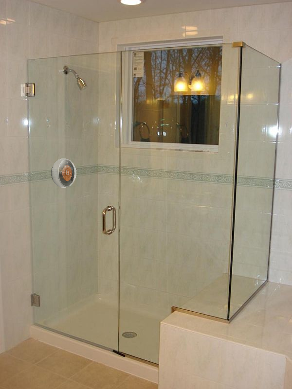
It shouldn’t be too hard to imagine that the Nest Thermostat would make for an amazing shower faucet interface.

Look at this picture here. What in the WORLD do those three knobs do? The middle one probably turns on the water… but getting just the right temperature? That could take weeks of practice and fine-tuning.

Isn’t it ridiculous how every time you bathe at a hotel or a friend’s house, you have to re-learn how to get the shower right?

Here’s how it should look:


nestshower

NestShower

Functionality:

  1. Press the Nest and the water comes on, press it again and the water goes off. Not hard to add the right design language to make this intuitive. You might even really idiot-proof this and make it so twisting the Nest turns it on, too.
  2. Like the thermostat, the front-facing display shows the temperature. Twist it to adjust to the desired degree Fahrenheit/Celsius. One color background (say, red) indicates the water hasn’t arrived at the desired temperature yet, another color (green!) says the water’s perfect.

Now all I need to learn — once — is the water temperature I prefer.

There’s challenges, sure. Shower faucet installation is substantially more complicated than the installation of a thermostat or smoke detector. You’ll probably need buy-in from plumbers. That’s a hurdle, but it’s not unsolvable.[ref]There’s actually a relatively famous HBS case study on this very subject.[/ref]

In fact, if you want to get really smart & fancy, and if you want to really pay attention user process flow and User-Centric Design, you’d employ the following design which Kevin & I have been talking about:


nestshower2

NestShower2

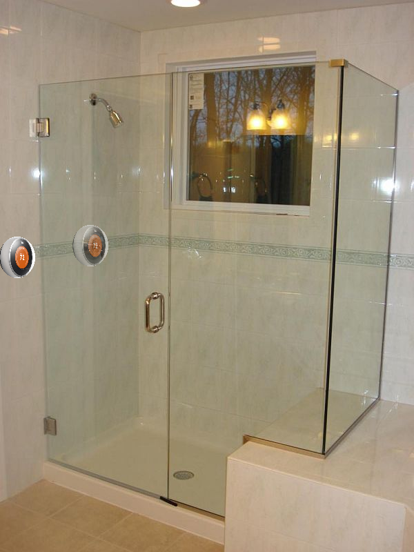
One set of controls outside of the shower, one inside. Which at first glance looks totally preposterous and superfluous.

But when you think about how you actually use your shower, isn’t it totally ridiculous that you have to dip your hand in the shower and risk getting wet to turn the shower on, or otherwise you have to stand in the shower naked with freezing water splashing at your toes while you wait for the water to heat up?

All showers are designed that way not because this is an enjoyable experience, but because in a practical sense, the faucet heads were physically attached to the pipes behind the shower. With Nest being a “smart” device, why not give users the luxury of keeping their clothes on until the water’s good and ready, instead of the other way around?

Hey, here’s that Billy Mays part: BUT WAIT! THERE’S MORE!

There’s been rampant speculation (and from the comments section, bellyaching) that Google might plan on serving ads on the Nest display screen. Google has since denied the rumor. This was a pretty obtuse thing to complain loudly about, anyway, because nobody in any home, ever, is spending their time and undivided attention in front of their thermostat.

You know where people do spent a ton of time and undivided attention? Yep. In the shower. So if Google actually did want to make a smart device which could meaningfully serve news headlines, the weather, and the occasional ad… the Nest Shower Head would be a bona fide place to do it.


Re: Cars & Smart Screens

In the first week of March, I wrote about the devastating misapplication of modern technology in cars, and the ample opportunity for car manufacturers to improve the capabilities of rear-view mirrors.

Today, Kevin points me to this Co.Design article which proposes the same: Use cameras, reduce/obliterate blind spots. The article also talks about reduced drag, which I think is a relatively minor issue, and about many governments’ legal requirements for cars to have side view mirrors installed, which could be a substantial roadblock. Nonetheless, it sounds like we’re headed down the right path.


The Best Thing Since Sliced Bread

I think I’ve always wanted to write a post with that title.

As many of my friends — and especially my food-enthused colleages at Farmigo — are acutely aware, I’m a sandwich kind of guy.

What especially piqued the interest of my Farmigo crew, though, was the fact that I’d tend to eat the same exact sandwich for lunch every day of the week: Turkey, ham, swiss, hummus, with some week-to-week variation.

I don’t progressively benefit from eating the same meal several days in a row.[ref]This isn’t going On Fire we’re talking about here.[/ref] Rather, it’s the result of my own sandwich hacking: I figured out that I could cut down precipitously on sandwich-making process time if I made a week’s worth of sandwiches all at once as soon as I unpacked my groceries.[ref]Here’s Brian Regan who better articulates all the time I’m saving.[/ref]

Recently I took another critical look at my sandwich-making process, and as the post title states, I literally came upon the best thing since sliced bread.

Here it is:

Tirtollas

The Tortilla. It’s AWESOME.

Here’s why:

  1. Since I’m just going to roll everything up at the end, I can be even lazier about building my sandwich — I don’t need to fold oblong-shaped slices of turkey to fit my rectangular bread.
  2. On a related, but subtly distinct note: Sandwiches prepared tortilla-style have walls. In the past I’ve never really invested in complications like tomatoes, which on a normal sandwich are all but guaranteed to slide around, fall out, or leave one really strange bite at the tail end. But now, an entire world of slippery supplements is possible. (Thanks for reminding me, Peter.)
  3. I know exactly how many sandwiches I can make. Tortillas come in packs of 4, 6, 8 — you name it. I have no idea how many slices are in a loaf of bread. I can’t imagine there’s an industry standard (though at least the bread gods all seem to have agreed that there should be an even number). And I’m not about to sit there and count individual slices by looking through the plastic bag.
  4. No crust. I’m over the hurdle of eating the crust on the individual slice of bread, but I still don’t like the crusty slices at the ends of the loaf. I throw them out, which makes me feel bad because it’s clearly wasteful. But at the same time, why should I subject myself to a clearly inferior — and inherently avoidable — sandwich experience on at least a weekly basis?
  5. You know what the absolute worst part is about bread? It’s the crumbs. Crumbs which fall out of nowhere and spill everywhere. Crumbs which wind up spread all over the counter just densely enough to be a clear nuisance but not enough to really merit cleaning up. Crumbs which are magnetically attracted to the little cracks underneath the keys on your keyboard if you so much as think about taking a bite out of your sandwich and you’re standing anywhere in the same timezone as your computer. Tortillas? No crumbs.

Apparently, NASA feels the same way. I suppose they’ve been too busy playing with the dirt on Mars to clue the rest of the planet in on the fact that they knew the best thing since sliced bread — and have been using it for over 30 years.

Or maybe they just figured “The best thing since flour tortillas” doesn’t roll off the tongue quite as easily.

Credit Card Design, Pt. III

In November 2012 I wrote about Credit Card Design. And later that month I wrote a follow-up when I saw that MasterCard basically did the exact opposite of what I proposed.

Kevin pointed me to Coin, a new sort of credit card designed to alleviate the pain of carrying multiple credit cards in your overstuffed wallet.

Coin Credit card

He and I share some concerns about the quality and effectiveness of the concept. My commentary:

Damn. I’m thrilled with how similar this looks to the design I made a year ago.

I’m not as worried as you are about the 2-year battery expiration. Two years is a long time — you’re replacing your credit cards that frequently anyway. They’ll probably deteriorate structurally by that point, anyway, from normal wear and tear. (Remember how our college ID cards needed to be replaced at about that rate?)

What I am worried about:

1. I share your concern about displaying the name and the CVV data. The latter from a use case standpoint. The former because what happens when 2+ people in your party have a Coin? How do you tell whose is whose when the waiter returns your check? Etc.

2. If it’s that easy for you to switch which card you want to use, it’s probably also that easy for the waiter to accidentally (or maliciously?) tap the card and switch it to the wrong one. You probably won’t even find out until the end of the month when you get your statement.

And opportunity:

1. $50-$100 is not really a whole lot of money when you think in terms of locking a customer into a long-term relationship. Cell phone companies figured this out ages ago and have been employing the practice of deep ($100+) phone discounts in exchange for 1- and 2- year contracts. I could easily see Bank of America, or Visa, or whoever the appropriate relevant party is, knocking off the $100 fee in exchange for setting up an account.

Travel site search results

From Quora: What’s something that is common knowledge at your work place, but would be mind blowing to the rest of us?

The loading screens you see primarily on travel websites are artificial. Finding the cheapest flights, the best hotels, and whatever else you may be looking for takes less than a second. In fact, a lot of hard work goes into making all that information very easily accessible for the web app.

The loading screen exists because when the information is returned to the user as quickly as possible, he or she will often perceive it to be less valuable. It’s as if the server didn’t put much effort into really finding a great deal. No customer ever actually articulates that; but surveys, customer testing sessions, and most importantly conversion rates support the notion that when a seven or eight second loading screen tells the user that the numbers are being crunched just for this one query, the result is perceived to be more valuable.

In other words: an objectively better solution — the same results, but instantaneous — is panned as worse because of being human. And of course, the phenomenon isn’t universal. Google sinks untold amounts of money into surfacing the fastest results possible. In fact, they’ll even quote you precisely how long a results page took to draw up — often around 0.3 seconds or less.

Moral of the story: People are weird. But you have to build for people.

AA Battery Design

No buildup introduction area for this post. I just love these batteries.

They look like this:

now with more lime green!

Here is why they’re great:

1) No instructions necessary.  This is pretty much the success criteria of all great design. You want a battery that works like a battery and charges via USB. Done.

The packaging they arrive in is worth mentioning:

splinter cell package

Packaged this way, you can see everything you need to know about how these work. In the bottom configuration, they’re batteries. In the top configuration, it’s obvious that the cap easily pops off to reveal the USB prod.

Were these packaged like traditional batteries, this wouldn’t be intuitive.

2) There’s a little rubber band that keeps the cap attached to the body. Because otherwise, obviously, you’re destined to lose the caps within 30 seconds of opening the package.

3) Because they charge by USB, you don’t need to lug around an enormous wall outlet charging station as you would with traditional rechargables.

4) If you look closely, the “BCELL” part of the USBCELL logo looks like the product. If these guys were feeling especially clever, they might color the “US” portion green to fit the whole product into the logo…but that might be pushing it. (It looks like they recolored the U, S, and B in “re-usable,” which I think looks dopey, but it at least establishes some design parameters.)

There is one thing I don’t care for: It’s kind of tricky to tell when they’re done charging. The instructions (which did exist, though I threw them out immediately) described some kind of system where green lights around a ring where the body meets the cap will start flashing, or hold steady green, or blink once for yes and two for no, or something. My solution is simple: I just leave them to charge for a while. Or overnight. My laptop mouse still gets weeks and weeks of power either way, so I’m sort of indifferent.

Flosser Design

If they rated things in dentistry the same way they rated things in sports, entertainment, and the like, I’d say that flossing is highly underrated.

Here’s an article from WebMD. Two things stand out: 1) under 50% of people floss regularly, and 2) dentists say flossing is even more important than brushing when it comes to preventing gum disease and tooth loss.

Why don’t people floss?

woman-flossing-close-up

That’s what flossing looks like. The girl in the image above seems like she’s having a fun time, but I’d wager otherwise.

Classically, you might say the steps of flossing look like:

Step One: Floss.

But thinking holistically, I’d reframe the process to look like:

Step One: Decide to floss.

Step Two: Unravel and cut a length of floss.

Step Three: Floss.

Here are the pain points behind the scenes:

  1. You’re going to have to stick your hands way back into your mouth and they’re going to get icky.
  2. Using this technique, it’s actually relatively difficult to be highly accurate. When you’re plucking your hands in and out of your mouth, and between gaps in your teeth, it’s easy to accidentally skip a gap or two — at least compared to the feeling of accuracy afforded by using a toothbrush to brush teeth.
  3. In the same vein, flossing is relatively mentally and physically taxing. It requires both hands! In fact, you need to devote your express attention in order to orchestrate their movement in harmony. Brushing your teeth easily affords lazy opportunity to daydream.
  4. Less intuitively, but still painful: cutting an appropriate length of floss from the packet prior to flossing can be incredibly difficult.It’s not easy to tell precisely how much floss you’ve drawn and whether that’s a sufficient amount. (Toilet paper, on the other hand, has very convenient perforations.) And the way most floss boxes are designed, you’ve got to also calculate for that little bit of floss that doesn’t end up getting cut after you’ve measured it.

    Cut too small a thread and you’re prone to losing your grip mid-stroke. (Stroke? Swoop? I don’t know.) Cut too long a thread and it feels like you’re being wasteful — one of those human phenomena that’s truly ridiculous but totally exists. A thing of floss costs about $3; an excessively long thread might cost you a fraction of a penny, not to mention the long-run savings in dental work.

    Adhering to our brushing metaphor: It’s mindlessly easy to judge how much toothpaste to apply — the head of the toothbrush is really only so big.

  5. At least, until you’re doing it regularly, flossing can be painful and bloody.

Here’s what I use:flosserI don’t think these things even have a name, though “flosser” seems to be what brings them up in an Amazon search.

Here’s why they’re brilliant:

  1. Two hands –> One hand.
  2. No fretting about cutting the right length of thread. Just grab and go.
  3. Much easier, in my experience, to run the flosser along your teeth and gauge whether you’ve missed one. Also much easier to reach back teeth.
  4. My hand does still get a little wet. But it’s far more manageable. I stay dry enough that I can easily floss while away from a sink. To boot, I’ve got a hand free which I can use for typing, texting, and the like. In fact, I’m flossing right now.

Ultimately, I save a small amount of time and a large amount of mental tax. But I got lucky that I thought to give these things a try. Biggest next step from here is to understand what’s going on with the influencers — Crest, and more importantly, your dentist — and see if we can’t figure out why these aren’t a bigger deal.

Airplane Mode

Airplane mode, a la mode

Dear iOS & Android,

Please fix this garbage.

How impossibly stupid is it that the only time that you are ever—EVER—explicitly told that you can’t use your phone’s Airplane Mode is when you’re actually sitting on an airplane?

“Airplane Mode is not enough; your phones have to be turned all the way off,” says every poor flight attendant across the entire country, for every flight, every day, as planes are preparing for takeoff.

Look, I get why this setting is secretly brilliant. Modern smartphones depend on a steady signal connection in order to update mountains of inane app updates, tweets, emails, whatever. When this connection is lost, the phones are designed to exhaust all effort possible to reestablish connection—which is fine if you’ve, say, stepped into an elevator and you’re in the middle of a thing. But it’s a battery-crippling disaster if you’re somewhere like an airplane. Airplane Mode turns off most of the signal transmitting functions while still affording people the opportunity to keep their phone on so they play Angry Birds or whatever the hell.

You have to fix this.

See, I can’t blame the users here. You’ve clearly designed this feature to give them the impression that it’s acceptable for use on airplanes—there’s that neat little airplane logo that you utilize, and the whole using the word “Airplane” in the name thing. People have been trained for millenia to pick up on those sorts of signals. I think it’s perfectly reasonable for an average consumer to conclude that Airplane Mode is an appropriate alternative for the flight attendants’ hopeless “turn all your stuff off, for the love of god, I’m begging you” plea.

I’m certainly not asking the airline people for help. They’ve demonstrated sufficient evidence of significant mental trauma already. That’d be a hopeless endeavor. So it’s you guys.

I don’t want to ask for much. For sure, you all might be able to invent a smarter algorithm for checking data signals. But that sounds like a lot of work, and I’m not technologically sophisticated enough to make a sound recommendation here. So how about this: Turn your airplane logos into traincar images, and re-brand your feature as “Subway Mode.”

Thanks.

(One first-world problem down, infinity to go.)

Re-designing the Travel Bag II

Yesterday, I investigated the travel bag, and re-framed the problem of designing a travel bag that best suits the size and portability needs of modern tourists to also include the needs of several other parties involved, including airlines, airports, and airplanes.

Here’s a creative matrix I used to brainstorm some ideas.

EXCELE

Along the X axis, I asked myself questions critical to the value proposition for each of the stakeholders. Along the Y axis, I listed the most likely levers available to drive change. Then I used my brain for 15 minutes.

Once those ideas were down, I sorted them chronologically by importance—in other words, “how likely is it that this idea will result in a significantly improved overall travel experience?” From there, I ranked by ease/affordability, with the most points going towards ideas that might have the lowest cost barriers. I could have been wrong at any point. Then, I found a sum using a skill called “basic mathematics.”

ACLES

Interestingly, seven of the fourteen ideas I’d come up with all received a fairly high allocation of points (20+) and as such might merit future consideration. At the conclusion of my rankings, I was surprised to find that altering an entire culture—the idea to eliminate the norm of bringing overhead bags—was only the sixth most expensive idea to implement. But to be fair, I did come up with a few especially strange ideas. Having circus muscle men to help people load luggage in overheads would be pretty funny.

With these in mind, I came up with a pair of possible product prototypes.

Solution Alternative #1: The top of the travel bag detaches and doubles as your TSA bin.

First, I focused on the top two ideas: TSA branded, approved product and a travel bag with TSA security parts (bins, liquid baggies) built in. It seems likely that the two might be built in chorus.

One critical aspect the two have in common is that they address a human problem. For the former: Airline passengers hate the TSA. They’re the enemy. People feel personally violated by the TSA (probably because they physically are personally violated). It seems like the TSA exists with the sole purpose of making things slow and difficult. As a result, the passengers treat the security process like they’d treat anything they don’t like: begrudgingly. Many are willfully ignorant of TSA officers’ requests to remove belts or jewelry, or otherwise partake in assorted small acts of anarchy.

Aside from potential advances in check-in rapidity, a TSA-approved luggage series might provide another more important benefit: an olive branch, and the notion that the TSA actually wants a speedy, painless process just as much as the passengers do!

As for enhancing rapidity: What are the true causes of such lengthy lines at the security check step of the travel process? My first thought goes to the exhaustive laundry list of demands that the TSA has created (ziplock bags for all liquids, separate crate for laptops, etc.), but I assume these are immobile—in fact, I felt these were so entrenched that I (perhaps foolishly) actively chose not to address this issue in my creative matrix. My gut’s next instinct is to blame the on-site TSA team…but upon reflection, I don’t think they’re necessarily the second biggest contributing factor to lag. Checking passengers’ ID and processing them through the human-size metal detector are I think actually fairly speedy processes. I think lag comes in as a result of the way passengers pack and unpack their bags.

While queuing for the metal detector, passengers must unpack hurriedly and haphazardly. Quickly, I must stuff my shoes, belt, cellphone, wallet, jacket, travel size shampoo, toothpaste and more into one bin, while unzipping my carry-on to remove the laptop which must get stored in a second bin. Moments later on the other side of the metal detector, I have to undo this entire process. Awesome times.

Bags can move slowly through the carry-on metal detector and may need to be re-screened by the TSA expert. Why? Because the inside of a typical travel bag is a mess. Check out what these guys have to sift through. I couldn’t find Waldo in here, much less a concealed weapon. The TSA officer has to sift through piles of junk to try and detect anything suspicious, and there’s no way she might standardize this process.

A TSA-approved travel bag could feasibly solve both these problems at once. With consideration under the guidelines of subtraction and closed-world conditions: What if the airport didn’t provide bins? What if all we had to work with was our travel bag itself?

I made a very crude mock-up. Seriously, the most crude mock up of all time.

crockup

The idea is as such: When you arrive at the metal detectors, you simply detach the top of your travel bag and flip it upside-down to use as a bin. In my vision, the inside of the top might be stitched with suitable elastic bands and clear baggies, or otherwise have explicitly designated cubbies for most of the core pressure-point items, such as my laptop and toothpaste. This gives the TSA agent an easy rubric to follow and check against for aberration. As this type of bag proliferates, there’s reduced need for bins, which means reduced clutter, transactional labor and friction.

On the other side of the equation, this solution relieves me of the burden of having to open and sift through a bunch of things—critical items would be proactively packed neatly and accessibly. I’d envision this top might not have to be attached to the bag by much more than a few straps of Velcro—sturdy enough to withstand the modest rigors of commute and overhead storage, easy enough to undo and redo in a flash without even requiring precision. Before the final product is publicly unveiled, I’d foresee numerous iterations here in order to cater to style and personal security needs, etc., but at some level, the bag should devolve to “TSA mode,” which might only need to hold up long enough for you to get from the metal detector to your gate before you armor up.

Reaching back into my bag of ideas, this might be a clever way to simultaneously implement expert traveler fastlanes. Allowing travelers toting TSA-approved luggage to use the first-class lane (or otherwise, a separate lane just below first class) would be a terrific way to align TSA and passenger interests, rewarding patrons who seek to expedite the process and creating value for both parties.

Solution #2: Travel bags contoured for overhead storage.

More crude mock-ups!

go go gadget MS PAint

The idea here is that many airlines use a very specific set of planes in order to increase operating efficiencies, and as such, probably very readily know what the overhead storage capacity is for their fleet. JetBlue comes to mind as an airline that only flies two different models of plane. Could they not design and propagate a carry-on bag that fits perfectly?

Similar to the TSA problems above, much of the lag in boarding planes is the result of human error. We pack enormous carry-on suitcases hoping to avoid checked baggage fees. In fact, often enough, an overhead bag that fit perfectly on one plane can be too large for the overhead on another—yet how should we know? Rampant is the problem of customers squandering time and holding up the entire boarding process by trying to shove these bags into the overhead, worse still the time and effort exhausted when an oversized bag must be taken from the cabin and moved into the checked luggage post-facto.

Suppose JetBlue said “this bag will definitely fit into our planes.” Oversized bags: eliminated. Bags checked post-facto: eliminated. Customer confidence, happiness, and loyalty: skyrocketing. If I know my bag is guaranteed to fit JetBlue, and I don’t want to invest in a whole portfolio of bags catered to each airline, I’m overwhelmingly more likely to seek JetBlue flights.

One interesting correlated thought: As far as I can remember, the overhead storage space in most or all planes is shaped like a trapezoid (like the mock-ups above). Why is the standard profile shape of a carry-on bag rectangular? My guess is that this is to aid stacking and shipping. But a carry-on travel bag should never need to be stacked…so is the rectangle necessary? Generally, the clothing on the inside will be folded and stacked to meet a rectangular profile; is the bulbous part of the luggage’s profile rendered useless? Or could it be used to store my toothpaste, hair gel, and other odd essentials?

Perhaps, ideally, this bulbous part could be used as the aforementioned TSA tray, and we might kill two birds with one stone.