“Contact Us” is a page that exists on pretty much every website. This is because virtually the entire point of most websites — especially for businesses — is for you, the visitor, to reach out to the host person or company to strike up a conversation.
At best, the Contact Us page on every website I’ve ever seen can be fairly universally described as “mediocre.”
For example:

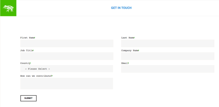
That’s from Frog Design — one of the world’s premier business design consultancies. Everything they build should be world-class in terms of user experience. Their Contact Us page, though? Nope. This is pure vanilla.
Googling around for “Contact Us Page Best Design” surfaces nothing beyond cutesy re-skins of the same exact crap.
- Name (often first & last separately)
- Phone
- Company Info
- Open-ended essay on what the visitor is inquiring about
- Submit Button
And of course, every field above is marked as “required.”
This is all insane. A feature important enough to exist on basically every single website, and nobody thinks to do a good job of it.
So I’ll try.
What do you want to happen at the Contact Us page?
I want people to contact me.
(Okay, duh.)
If I get really specific, though: I want my visitors to hit the “Submit” button. Nothing else they do on this page matters — no amount of personal information or detail about their inquiry — none of it matters if they don’t hit “Submit.” That’s our bottleneck, and that’s what we’ll design around.
My Proposal: Cheat
Albert Einstein was a pretty smart guy. He said this:
Make things as simple as possible, but no simpler.
Name, email, phone, company/personal info, open-ended note, submit.
I propose: 66% of these features are actually (surprisingly!) unnecessary at first pass.
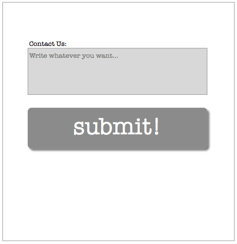
Instead, allow me to present the ideal Contact Us form:

That’s it. It’s such a simple form that I’m hesitant to even call it a “form” anymore.
Q & A:
1) Why just this
Because any simpler and we’d have either a) a page that was just an open text form that couldn’t be sent anywhere, or b) a page that was just a Submit button. Both obviously non-functional. “As simple as possible, but no simpler” would not pass.
2) But Josh, this is insane
Are you sure?
3) Yeah I’m sure! How will you reach back out to the visitor without their name, job title, company info?
I mean, they’re contacting you without your name and job title. So is that all really such a big deal?
And besides, if that info was really important to them, any submitter you’d actually want to reach is probably smart enough to include it in the box.
And besides-besides, if it’s really important to you, you can just write them and ask once you’ve received the message they’ve sent. You can’t do that with a visitor who reaches this page, balks at the 5+ mandatory fields, and flakes out. Once you’ve gotten them to hit that first submit, the conversation’s open.
4) But what if they forget to include their contact info
Arguably, again, any submitter you’d actually want to reach should probably be intelligent enough to include their contact info. If they can’t do that much, they probably aren’t worth your time to respond to.
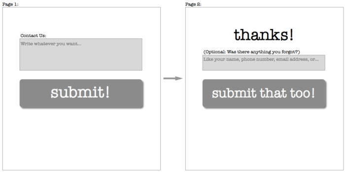
HOWEVER! Good design is also accident-proof. So let’s bake that in:

Now you’ve got the highest likelihood of hitting the Submit button, and you’re mistake-proof. If a visitor still manages to screw up on the contact info part, well… you didn’t want them anyway.
5) Why is this called “Cheat”
We’re cheating because we know the Submit button is important, so we’re shortcutting all those annoying middle fields. Before, with Frog, the Submit button was the 8th (!) thing you filled out. Now it’s the 2nd.
We employed a similar practice when I worked at OpenTable. There, we correctly identified the objective and bottleneck was “complete reservation.” Anything we put in the way between a new site visitor and “complete reservation” was lost reservations and lost money. So now, if you visit Opentable.com for the first time to make a reservation, you don’t need to create an account with a password until after the reservation is confirmed. (There’s still a prompt to create a password once you’ve finished confirming your reservation. But again, at that point, they’ve already got you through the bottleneck.)
6) What else is great about this?
- The Submit button is HUGE! People like big buttons. People are more likely to click big buttons. More people will click on my button than the Frog button
- Also, because the Submit button is huge, the open text form doesn’t look as big. People don’t like big, open-ended essay areas. (Probably deep-seated emotional scars from english class in grade school.) So if we make this part seem smaller, it won’t feel like such a chore to fill out
- Two fields to fill out is way more mobile-friendly than eight. It’s 2015 and mobile phones & responsive-design websites are a big deal. So this is good
- Nowhere in my form does it say the word “Required.” “Required” is spooky language. (Probably also related to the grade school emotional scars from #2.) You hate doing things that are Required. Just as bad is that feeling when you *think* you’ve gotten through with filling the form out, and you hit submit, and it sends you back to the top of the page with an Error! message and it turns out you missed some “Required” stuff. With my form, that’s impossible
7) Wow Josh that’s all really cool
thanks
8) What else you got?
Let’s see…
One okay idea
You could try having a “chat with us!” widget on your site. The psychological hurdle for IM’ing someone is substantially lower than writing an blind email (or, heaven forbid, making a phone call). It does hinge on you actually having someone who can hang around and respond to chats at most hours, and if you’re a small org or just generally busy, that’s probably not tenable.
One really bad idea
Many places still employ the WORST FUCKING THING on the internet: Mailto links.
That’s the thing that looks like a regular link, but actually, it’s like a Rick Roll on steroids. Because instead of just sending you to a dopey YouTube page, the Mailto link automatically freezes everything else you were doing so that it can force-open Microsoft Outlook and start a new email.
It looks and works like this (and I can’t stress enough, don’t actually click on this unless you hate yourself): Contact
The Mailto link is a prime example of failing the “as simple as possible, but no simpler” test. It’s too simple. Nobody needs to be saved the hassle of copy/pasting an address into their email client of choice. And nobody deserves the surprise and anguish of having to force quit the desktop email program that hasn’t been opened since it came pre-installed on their computer and only booted only once on accident the very first time you powered the computer on.
I can’t stress this enough. The worst, the worst, the worst, the worst.
But still, suppose you really hated forms and wanted an email thing
Your objective then changes from “get the visitor to click submit” to “get your email address in the visitor’s email client.” They’re probably going to use copy/paste to get it there.
So at some base level, you just could have a totally blank page with just your email address on it. (Check out Cards Against Humanity. Be careful about the Mailto link)
There are ways to manipulate text strings so that visitors can copy your email address in one click. (Check out what happens when you try shortening a link at http://bit.ly). That saves a step.
You can add a bunch of words to explain how excited you are to hear from your visitor. But that sounds to me like the equivalent of recording an extensively long voicemail greeting for yourself.
Instead what I’d propose is doing something quirky that would inspire curiosity and engagement. If you get someone to convert to contacting you just because they’re curious, you’ve still won.
So my email address-based Contact Us page would look something like this:
Please contact whoever you think you'd most like to speak with:

josh@joshpetersel.com
grandma@joshpetersel.com
freemoney@joshpetersel.com
bizdev@joshpetersel.com
asfhlrghliughelruhuliwreg@joshpetersel.com
notjosh@joshpetersel.com
abelincoln@joshpetersel.com
press@joshpetersel.com
fuuuuuuuck@joshpetersel.com
puppies@joshpetersel.com

We look forward to hearing from you.
You might need to tone down (or tone up!) the sense of humor depending on the nature of your business.
(Those email addresses all work, by the way. Try one if you don’t believe me.)
But again…

The dream.
