How SnapChat is going to start making money

In case you were wondering. This past week, SnapChat unveiled “Our Story.”  With it, the company sent this video out to all users. The media has been up in arms raving about how Our Story is some kind of masterstroke. What piqued my curiosity, however, was this follow-up message which SnapChat HQ sent:

screenshot_2014-06-17-19-52-15

Oh hello, SnapChat message with a link in it. Hello, clearly branded messaging. And hello, framework for advertising on SnapChat. Nice to meet all of you.

Stop screwing up time zones

As a professional (and as a modern young adult, in general), I spend a lot of time communicating across time zones. I’ve long since lost count of the number of missed calls and connections due to a hiccup in time zone calculation — even calendar invites aren’t immune.

There’s four time zones in the continental US. So, quickly: If it’s 1:00pm in San Francisco, does that mean it’s 4:00pm or 5:00pm in New York?

You’ll probably get the right answer…but it takes a step and a half longer than if I’d asked you “Quick: What’s 1 + 3 ?”

Luckily, I always keep a map of the continental US on-hand.

hand-america


Don’t see it? Look again:

hand-america-times


There. Now sorting out the common time zones is as easy as counting on your fingers.

Two other tips:

  1. Whenever possible, schedule appointments in your counterparty’s native timezone. Because it’s a simple, thoughtful, and courteous gesture. And because it puts the onus of sorting the time zones on you, and because of your hand map, you’re an expert.
  2. This doesn’t exactly solve for Daylight Savings Time. You’re generally safe for major US cities. Most of Asia, Africa, and South America don’t bother with daylight savings. The UK observes Daylight Savings Time, (on your world map above, London is usually your right ring finger) but the start and stop dates are different than they are in the US. Tread carefully — or maybe write “I’ll call you at 4:00pm EST which should be 9:00pm locally” so there’s some safety net and paper trail.

Admittedly, this mnemonic fixes a problem which seems fairly small and innocuous. That said, it absolutely makes my life easier on a weekly basis — if only by a hair. In striving to outsource as much of my menial mental work as possible — which I encourage of all of my intelligent friends — this is an easy starting point.

How to start a business

A prospective client comes to me and asks “Josh, I want to start Business X. What do I do?”

Actually, lots of prospective clients ask me this.

There’s nuance — some have raised serious funding and some haven’t, some want to get into the music space, others in fitness, others in nonprofit, and so on. There’s a lot of specially-tailored advice, accordingly, but there’s some more generalize-able insight I thought I’d share.

The biggest thing I consistently see missing from business plans and aspiring entrepreneurs? Get your first 15 customers.[ref]15’s a good starting point, though depending on the size of the customers, you might want more, you might want less.[/ref]

Things that you (maybe surprisingly) don’t really need in order to get your first 15 customers:

  • Funding, investment, or loans
  • 10-year financial projections
  • 796-page business plan
  • Gob’s business model
  • A Technical Co-Founder
  • Business cards
  • Office space
  • Precise laser-focused research
  • Etc.

Things that you do typically need:

  • A few sentences about what you’re envisioning
  • Some small prototype/demo
  • Hustle

The stuff in the second bullet list: Cheap. The stuff in the first: Expensive — if not costly in terms of money, then in terms of time and prognostication.

We initially did things the wrong way when we conceived Eleven Magazine years ago. As students in an entrepreneurship class,  we spent weeks building business plans and financial models and pitching to prospective investors who probably thought we were a bunch of idiots because I’m sure almost every single thing we wrote could be challenged or proven wrong.

It was a fun academic exercise, but it didn’t get us all that far in a practical sense. In the ensuing years of running the magazine, we never wound up referencing the business plan or financial model even once. We’re lucky that we had enough energy, hustle, and intelligent advisors[ref]To whom I am still and forever indebted.[/ref] to get us to the next step — otherwise we could have easily been bogged here forever or given up without even really giving our idea a chance.

What actually got Eleven off the ground was taking our prototypes out to potential customers, selling, and learning. It turns out our initial pricing strategy was utterly ridiculous. It turns out our initial sales strategy — printing out a dense, 11-page[ref]Of course it was 11-pages[/ref] media kit to give to every customer — was also ridiculous. It turns out people did really respond to the product and the physical medium. So we proved we were on to something, and fixed the things that didn’t work.

Before we knew it: Eleven Media Group had its first 31 customers — and our revenue was safely in the black — and we hadn’t even printed our first issue. We also learned a lot about what it would really take to run this company and had a chance to decide whether and how to move forward — without sinking our (or investors’) money into a nebulous pit.

I think the same philosophy can be applied to nearly every business from apps to retail. Sure, there’s a big challenge in securing the right real estate for your retail store, and you’ll want to have an idea of how many customers you’ll need to make the numbers sustainable. But if you do that first — if you put the carriage before the horse — then you miss out on answering key questions like “Is this really something that customers want” or even more importantly “Is this really even something that I want myself?”

Envisioning running a lofty, growing, successful business probably sounds enticing to just about anyone and it’s what drives aspiring entrepreneurs to the arena. Understanding the grit of what makes your startup work is something that will invariably be learned quickly — so learn it before the fixed costs and heavy philosophizing and save yourself from potentially barreling down a lifestyle you might not love or a business that might not work.

Best of all: once you’ve got your first 15 customers, figuring out everything else in that first bucket immediately comes much, much more easily.

(Oh hey, also, I guess. If you thought this was helpful and you’d like to talk more pointedly either personally or professionally, I’m just an email away at josh@joshpetersel.com)

I Show Up Early

An overwhelming number of my friends and colleagues show up 5-15 minutes late to everything.

I think it’s somewhat endemic to a certain class of modern busy person, and for a long time, it felt to me like a very toxic problem. When colleagues showed up late to my meetings, that tardiness was an affront. A theft of my time. Maybe a competitive power move — he who shows up last has the most valuable time.

I don’t think these people are really that competitive. Rather, I’m of the impression that they just inherently don’t think this is a problem which a brusque, halfhearted “sorry I’m late” can’t solve.

There’s plenty of ways you might deal with the tardiness problem — rewards and punishments, carrots and sticks. I’ve tried the stick and found very, very limited success. Even the most respectful confrontation imaginable ultimately boils down to my counterparts saying “Wait, you’re really confronting me about 5 minutes?” which creates an even worse working relationship than you had to begin with. Again — you’re reprimanding people who don’t appreciate the problem in the first place.

You might try to replicate the problem and out-tardy the other party, but I can’t see how that’s possibly productive. If anything, it either falls under extreme passive-aggression, or otherwise, simply reinforces among group members that tardiness is an acceptable behavior.

So I take the opposite approach: I show up early.

I think there’s two real core problems.

First: The psychological concept of Present-Biased Preferences. Most humans would trade a little pain later for a little pleasure now. Accordingly, there’s a weird part of your brain which says it’s a good deal for you to read one more Buzzfeed article (okay, twelve more) even though you’re thus overwhelmingly likely to be late and have to apologize to your peers.

Second: People are fundamentally bad at appraising their own commute times. It might not even be their fault. In my experience, Google Maps systemically underestimates how long it takes for me to get places. And it might not even totally be Google’s fault, either — Google says it takes 15 minutes to get from the front door of my apartment building to the front door of the office, but it doesn’t account for elevators or for me packing my bag and putting my shoes on and setting up my headphones and finding my keys. (And again, I want to finish these last twelve Buzzfeed things.) If I’m trying to time my arrival for 9:00am on the button, of course I’m going to be slightly late.[ref]I might argue here that even though it’s not totally Google’s fault, it’s nonetheless a failure on their part if they’re consistently misguiding me.[/ref]

So again, I show up early. And I bring my Kindle.

Showing up early to meetings, lunches, whatever, is actually insanely liberating. It’s where I get most of my reading done. It eliminates a tremendous amount of stress in my day-to-day life. My counterparts arrive apologetic, harried, and nervous, but I appear calm and ready.

My hope is that in consistently highlighting the benefits of promptness I’ll shed new light on the issue. Instead of trading a little pain later for a little pleasure now, I’m saying “Why not have both pleasure before the meeting and at start time?” I can’t totally fix my faulty commute appraising, but instead of it adversely affecting the entire group, a bad estimate now only dips into an individual’s reading time which is much less costly and much less noticeable. And ultimately, instead of “are you’re really scolding me over five minutes,” I’ll elicit “wow, I didn’t realize how valuable your five minutes are.”

On a related note: I all of a sudden need a few more new books to read.


Re: Catfé

A throwaway idea from my Running Shoes & Business Design post:

“What if there was a coffee shop where she could get work done, but also there were a bunch of kittens around that she could play with?”

We kind of handily decided that the idea was a wash. (Though I still stand by the name being divine.)

And yet, here we are. “Cat Café popping up in NYC this week.

Lessons:

  1. The world is bereft of good creative design. Wait, this is a terrible lesson.
  2. Don’t be afraid of pitching and tinkering with ideas, even if you think they’re stupid and you’ll get laughed at. Sometimes you’ll stumble upon something great.
  3. Worth repeating: Don’t be afraid of pitching and tinkering with ideas, even if you think they’re stupid and you’ll get laughed at. Sometimes a really esoteric idea will stretch the conversation’s comfort zone into new areas and possibilities. Maybe Catfé was just the jolt (or even, just the laugh) we needed to allow Black Belt Karate Shoes to enter into the dialogue.

Credit Card Design, Pt. IV

In November 2012 I wrote about how I’d re-design a credit card. The overarching premise:

  • Rearrange a few card elements to better suit actual card use cases
  • Remove clutter as much as possible
  • Physical and visual design which feels unique and stands out

My mockups:

clack bard front

clack bard back

A year and a half later, I saw that Visa launched its own Black Card.

visa_card_front

visa_card_back

Many of the similarities are uncanny.

  1. Visa’s Black Card is highly minimalist in design
  2. Making the card stand out from a visual and physical perspective is a huge selling point. The implementation differed slightly. My design offered punched-out numbers. Visa’s (ahem, “patent pending”) offering is made of stainless steel
  3. Getting the name “Black Card” right was kind of easy and straightforward. The Visa logo was a little more of a gambit, and the similarities here were a pleasant surprise
  4. I correctly pointed out that the “24-hour” label is superfluous on the 24-hour service number — if you don’t tell me when I can’t call, I’m just going to call whenever. Accordingly, Visa’s 24-hour Concierge number makes no mention on the card of the fact that it’s an all-hours line. I’m not sure why Visa’s card also lists Cardmember Care and International Collect numbers — I’d think there would really be no reason for a cardholder to want to call anyone besides their super-premium concierge…but maybe this is a regulatory thing

A few notable differences:

  1. Visa’s card isn’t really optimized for new use cases like mine was. Again: I moved the Credit Card Number, Expiration Date, and CV2/Pin to one side so it’s easy for you to reference all three at once when you’re filling out an online checkout form, and I moved the Name and Signature to the same side so that the cashier at a brick & mortar store could reference both at once when he was checking your identity. In Visa’s version, you’d still need to flip the card and reference both sides, adding a step in each use case
  2. I’m disappointed that Visa’s design says “BLACK CARD” in bold on the front. I made the point last time that truly great minimalist design should speak for itself, noting that the iPhone doesn’t need to say “Apple iPhone” on the front anywhere and you still know what it is. The Visa logo is also still on the front, though perhaps this is a regulatory thing which can’t be fought
  3. I’m also disappointed that on Visa’s card you’re still required to have a manual signature. This grey box takes up a ton of space and is kind of clunky. Again, perhaps a regulatory thing
  4. I really didn’t put much thought into the auxiliary benefits of the card — whereas Visa touts things like a members-only magazine, VIP airport lounge visits, the aforementioned 24-hour concierge service, and so on. I’m not really bothered by this — that’s all more service design than product design, and as such wasn’t really the point of my exercise back in ’12


Six Thoughts on Longform (Print) Media

Some tablesetting to make sure we start from the same page:

  1. “Print is Dead; Long Live Print” etc., according to pundits everywhere.
  2. I used to work in print. So you might argue that I’m biased. I’d argue that I’m just passionate about the space.

Given the above, I find myself thinking about the future of print media quite frequently. I wanted to present a few thoughts.

First: We need to better support the idea of “progress.” Not “progress” in the chronological or Darwinian sense, but “progress” in the sense of “how much of this article do I still need to read?”

Right now, if you want to write something on the internet longer than 140 characters, your best bet for success is a Top 20 list. Buzzfeed.com nails it on this. Cracked.com had its heyday, too.

There are plenty of arguments for why lists work. Here’s a list article on why list articles work. (Wow, so meta.) It argues that lists make for attention-grabbing headlines. You can also argue that it breaks content up into bite-size chunks, which people need because they’re theoretically now more distraction-prone.

Here’s my favorite feature — by far — of list-based content: It gives me a progress bar. It affords me a guess as to how long this is going to take and how far I’ve come as I’m poring in. So when I’m reading something like, I don’t know, 10 Ways Wall Street is Just Like Sesame Street, I have an internal sense of how close I am to completion. I’m not actively monitoring it, but I’m passively aware of it.

And as enjoyable as it is to read lists, the pleasure pales in comparison to the euphora of completing a list.

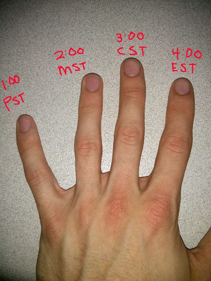
For a regular internet article, it’s rather difficult to gauge how much reading you’ve got to do. Even list articles that aren’t all quick hits like “Here’s 20 Cat GIFs!” are tough to gauge. (In case you’re wondering now, you’re about 20% done with this blog post.)

Classic print used to have this baked in. You didn’t need explicitly need a progress bar — you could gauge it yourself by observing the the weight and size of the pages.

A few platforms that do make it easy — or otherwise leverage the idea of “progress” –exceedingly well:

  1. Medium.com.  It’s the only place on the internet that comes to mind where each article has an expected time length explained right up front. This article about LEGOs is going to take you ~5 minutes to read. Not that I expect you to set a stopwatch before opening it. But I do expect your internal clock will guide you, and that you’ll feel satisfied when you complete your task within the allotted time.
  2. Bleacherreport.com. They do this maniacal thing with lists where they’ll write “Page X of 34” at the top of a 33-page article, and I’ll be so driven to complete the list that even when I’m on what’s clearly the last page (for example, the Seahawks were the #1 team in the NFL Power Rankings) I’m still driven to go to the next page — and will subsequently find myself on the next article.
  3. The Amazon Kindle has a progress bar at the bottom of every document to let me know what page I’m on or my percentage completion. It’s delightful.
  4. Feed readers, like feedly.com. Feedly explicitly tells me I’ve got four unread articles left from TechCrunch. It automatically counts down as I careen through each update, and it automatically repopulates as the day goes on and new content is posted. Finally arriving at “TechCrunch (0)” ? Zen.

Second: Embrace the Blockbusters. That’s the term coined by a really smart person I know to refer to superstars. Everything in media today revolves around the biggest, brightest 1% of talent. ESPN gets this, and it’s why they run a wildly disproportionate number of stories on LeBron James and Johnny Manziel compared to their respective athletic peers.

In the context of print, I understand there’s some tension. Is the “Blockbuster” the publication — say, Rolling Stone — or is it the author — say, Matt Taibbi?

I think the world is moving in a direction where the authors are becoming the kings, and the smart media entities are embracing and investing in the blockbuster authors — which ensures that they’ve still got skin in the game.

Platforms that get this idea really well:

  1. ESPN. Who realized they had a blockbuster on their hands in Bill Simmons, and responded by giving him his own entire website in Grantland.com.
  2. ESPN, again. Who realized Nate Silver was a burgeoning blockbuster, so they hired him and are presently partnering with him to relaunch FiveThirtyEight.com.

Third: We need to better embrace the idea of being an “archive.” Back in print’s heyday you could print Yesterday’s News and accurately describe it as “Today’s News.” Classically, this was called a “Newspaper,” and classically, the primary value proposition was something like “this is the news as up-to-the-moment and relevant as possible.” It’s obvious now that technology has supplanted newsprint on the element of speed, which has consequently led to the masses writing off print.

So we need to re-consider the present and potential benefits of print. And where I think the medium really shines is in its ability to archive and catalog content. The heavy majority of online shortform content is ephemeral. It’s nearly impossible for me to look up a tweet I wrote a year ago — not that I’d really want to. Longform, however, affords the magical opportunity of being linked temporally. The New York Times has an archive dating back to 1851 — searchable on their site and I think at the public library.

Here’s what I’m also getting at: The difference of One Day is a pretty significant deal when we’re talking in terms of breaking stories. But when we’re talking in terms of archiving stories, the difference of a day pales in comparison to the importance of proper thought and consideration, of illustration, of context. For Longform to be successful, I think it really must harp on capturing “This is the complete picture of the way your world was at this point in time,” and defer to shortform media for the breaking stuff. With that perspective, I think I can better stomach the idea of waiting a day in exchange for assurances that A) This is important, and B) It’s been given careful thought and vetted for perspective.

A few platforms that do capture the idea of archiving well:

  1. Grantland.com. They produce the Grantland Quarterly, which is largely the same exact content that was already published on their website — but it’s revitalized with elegant graphics and print setting, and contextualized under the premise of “this is what it felt like to observe sports & pop culture for this 3-month window of time.” I think Pitchfork.com is moving into the same territory.
  2. Feed readers, like feedly.com. There’s a big difference between this and the social news aggregator types that seem to be en vogue these days — things like Flipboard, Prismatic, Twitter. With those, it’s nearly impossible to track and consume everything published by the sources that are most important to me. You can do it if you’re on the platform all the time. I’m not, because I have things to do. Feed readers let me pick the voices I want to hear and ensure I get all of it — I feel lost if I’ve missed even a single update from my favorite writers.

Fourth: Embrace more modern technology. For years we’ve been treating these computer screens as if they’re just iridescent pieces of paper. Which they’re not. Screens can do things besides put black words on white backgrounds. Things that make reading a better experience than anything even possible on paper. They can also do a lot of things which make reading a worse experience, so we’ll have to be careful.

Many people argue that screens make reading longform untenable because it’s unnatural to stare at what’s essentially a big, flat lightbulb for long stretches of time. I have to emphatically disagree here. Because otherwise the movie and TV industries would be dust.

Right now GIFs are en vogue. They’re prone to being cheesy and extreme (again, we have to be careful) — I wouldn’t expect a GIF-illustrated article to ever be published by an upstanding news source without derailing any sense of prestige and credibility.

But then… there’s cinemagraphs. Which are GIFs… but elegant. Cinemagraphs.com has a bunch. iwdrm.tumblr.com has a bunch from movies.  They’re subtle, and often, beautiful.

wab cindow

There’s also HTM5, now — which better than anything up until this point gives us the power to really upend the idea that the screen is a piece of paper.

A few places that get this idea:

  1. Pitchfork.com. I link to their Daft Punk Cover Story quite often. (Here it is again.) It does so much, so well, and it’s the best digital experience I’ve ever had reading close to 4,000 words in a single sitting.
  2. Rolling Stone once published something similar.
  3. New York Times’ Snow Fall is the piece that started this whole conversation.
  4. The aforementioned Cinemagraph repositories.

Fifth: We need to think really critically about Product Placement. I know. Sounds sketchy. And dangerous. Nobody wants to threaten the integrity of their voice. I’m not proposing that.

I’m not the biggest fan of traditional display ads. They were fine and enrapturing when the idea was invented some 100+ years ago. If anything’s changed since then, it’s not our collective attention spans, it’s our ability to tune out non sequitur advertising. We’ve just got more experience doing it now.

I think longform is the last major medium to really adopt product placement, and it’s killing profit potential. Why is print so far behind? Arguably it’s because it’s more natural to employ product placement in other media. In Back to the Future II, Marty McFly isn’t just outfitted with shoes and a hoverboard, he wears Nike HyperDunks and rides a Mattel hoverboard. Maybe it’s easier to place product without appealing to or breaking the principal of Checkhov’s Gun — the idea that every element mentioned in a narrative should be necessary and irreplaceable. You can get away with flashing Marty’s Nike sneakers on-screen; it’d be far more difficult to surface in longform print without the reference feeling blatant and Checkhov-ey. If I’m reading BttF2: The Novel, I can get by on simply assuming Marty’s wearing generic sneakers; in BttF2: The Movie, he needed to be wearing something anyway, it might as well have been Nikes.

We recognized this gap years ago when I was running Eleven, and started developing initiatives to address it. I’m tremendously proud of our work with Scion, where we created a concept that was intrinsically linked to the car, and afforded ourselves the opportunity to talk about the car (which was thus a Checkhov’s gun) without having to force it, without it being a distraction, and without it hampering the objectivity of the story — which was about cities, adventure, and music.On the road againA few places that do this really well:

…umm, nothing else in print really comes to mind. I could be missing something; I’m not omniscient/clairvoyant. Maybe you’ll consider something like Coors Light Cold Hard Facts, where the brand is somewhat relevant in the title but the beer really has little to do with the content contextually.

A recent trend is something called “native advertising” — these are the ads you’ll see if you use Facebook and Twitter on your smartphone, called “native” because they’re perched right inside your (otherwise content-filled) news stream. This is close.

A sponsored venue or setting seems to be the most reasonable opportunity for product placement. This was our angle with Scion — the venue was the car. Video series Always Open gets this with Denny’s. I think Jerry Seinfeld’s Comedians in Cars Getting Coffee has the potential to accomplish the same thing — which is ironic, given that the show is pointedly about being in cars and drinking coffee.

Sixth: Perhaps we’d better call it “Longform Media” instead of “Print Media.” Because I don’t think a war based on medium — print vs. digital — is winnable if you’re anti-technology. A conversation around content length however is I think inherently tenable, now that technology is sometimes on your side.

Conclusion:

You know, I usually like to make lists that are eleven items long, but this already turned into a 2,000-word behemoth. Print is an exciting place. I’ll be eager to see what the future holds.


The Idiosyncrasies of (Sports) Statistics

This recent article on ESPN cites the following:

How improbable was Sunday? According to Elias, teams trailing by at least 24 points at halftime were 5-617 entering Sunday night. Make it six.

For context: On 11/24, the Patriots were losing to the Broncos by a score of 24-0 halfway through the game. They ultimately rallied back to win the game.

No doubt, this was an exciting match. But calling the Patriots’ odds of victory at 5-617 is absolutely bunk.

To illustrate: Suppose that of those 622 games (5 + 617), 617 teams were losing at halftime by a score of 9,001-0. (Not an easy score to accomplish in the NFL…but bear with me.) Those 617 teams all lost handily — that’s an impossibly difficult comeback to mount! Further, suppose that the remaining five teams were each down 24-0 and all five of them came back and won their games.

In that fantasy scenario, it’s still technically correct to say that “teams trailing by at least 24 points were 5-617.” But you can see why the statistic is horribly misleading — in fact, without changing the world, you could also say “teams trailing by 24 points came back to win every single time” and be just as correct.

Back in our real-world Broncos & Patriots scenario: It’s worth pointing out that the Broncos scored its 24th point with over 6 minutes remaining in the 2nd quarter. So the Patriots actually had 36 minutes (15 minutes per quarter, plus the aforementioned 6) to mount their comeback, rather than 30. That’s 20% more time!

This sort of idiosyncrasy happens in sports ALL. THE. TIME. A slightly different example: In baseball, when the announcer says “Derek Jeter has gotten a hit in 3 of his last 4 at bats” you can all but guarantee that Jeter got an out in his 5th-to-last plate appearance, and the announcer could have said “Derek Jeter has gotten a hit in 3 of his last 5 at bats.” (Otherwise, of course, he’d have just said “Jeter has gotten a hit in 4 of his last 5 at bats” because that’d have made a more compelling point!)

Though I find this tends to happen in sports most abundantly, because sports fans find statistics like this to be fascinating, it’s just as applicable anywhere. When you hear something like “Facebook missed its earnings projections two quarters in a row,” you can make a strong bet that three quarters back, the company met or exceeded its benchmark.

Choose your own lesson, depending on how optimistically you view the world:

A. This is just a fun way that stats work. You can tease your friends about how harmlessly inaccurate the Derek Jeter statistic is and how dopey the announcer is for declaring it, and not put too much thought into things.

or

B. Be very careful of the biases and values of your sources — because even statistics that are based in fact can be warped to deceptively convey a very biased opinion.

Travel site search results

From Quora: What’s something that is common knowledge at your work place, but would be mind blowing to the rest of us?

The loading screens you see primarily on travel websites are artificial. Finding the cheapest flights, the best hotels, and whatever else you may be looking for takes less than a second. In fact, a lot of hard work goes into making all that information very easily accessible for the web app.

The loading screen exists because when the information is returned to the user as quickly as possible, he or she will often perceive it to be less valuable. It’s as if the server didn’t put much effort into really finding a great deal. No customer ever actually articulates that; but surveys, customer testing sessions, and most importantly conversion rates support the notion that when a seven or eight second loading screen tells the user that the numbers are being crunched just for this one query, the result is perceived to be more valuable.

In other words: an objectively better solution — the same results, but instantaneous — is panned as worse because of being human. And of course, the phenomenon isn’t universal. Google sinks untold amounts of money into surfacing the fastest results possible. In fact, they’ll even quote you precisely how long a results page took to draw up — often around 0.3 seconds or less.

Moral of the story: People are weird. But you have to build for people.

Jon Stewart

On September 3, Jon Stewart returned to The Daily Show. He’d taken the summer off to direct Rosewater, a movie and personal project of his.

I should say. He didn’t return to The Daily Show. He returned to The Daily Show With Jon Stewart. He’s eponymous. The Daily Show With Jon Stewart was, in fact, hosted by John Oliver for three months.

Jon Stewart is probably the single most important cog in the Daily Show machine, and he took three months off to pursue a personal project. And the show was fineLeft in capable hands, returned in working condition.

The point is: If Jon Stewart can leave The Daily Show with Jon Stewart…there’s no reason why you or I couldn’t do the same should the right opportunity and passion arise.