Re-designing the Travel Bag

How can we make travel bags better?

In the past few years, we’ve seen several significant shifts in the way Americans approach and experience airline travel. Low-cost point-to-point airlines are more commonplace, personal electronics devices have proliferated, oil prices have spiked, and security measures have heightened—among a multitude of other trends. Each development has brought about new policies and procedures employed by airlines, airports, and passengers, resulting in an experience that may seem highly foreign for a traveler from even twenty years ago. Everyone is now a terrorist who hides explosives in his laptop, belt, and shoes—unless you’re under 12 years old, in which case apparently shoe-based weapons have been ruled out as a possibility.

The common travel bag, on the other hand, has not seen change commensurate with the rapid evolution of the travel process. The last time bags got a significant upgrade was when the wheel was invented implemented.

My Goal: Design a travel bag that better suits the size and portability needs of the modern tourist.

At first glance, the above trends have the following primary direct implications:

  1. Shorter trips, which call for lighter luggage loads, are more commonplace
  2. Travelers often tote laptops, which need to be inspected separately by security
  3. It is now commonplace for airlines to charge additional fees for checked luggage because “high oil prices”

And the following primary indirect implications:

  1. Much higher percentage of passengers with two carry-on bags and zero checked bags
  2. Longer lines at multiple stages of boarding process

Here’s a Journey Map of what it’s like to fly these days.

  1. Home. I am packing clothes for my trip. I have some idea of how much I will need to pack, constrained by how many days my trip will last. I am explicitly limited by the physical capacity of my luggage. Generally, if an additional article of clothing will fit inside my bag, I will pack it. If it doesn’t fit, I’ll ask mom to come help me fold and fit everything better.
  2. Transit to the airport. In Boston, the cab costs an unfathomable $40. I take public transit which costs about 45 minutes.
  3. I get to the airport, which has a bunch of smaller steps. These could arguably be bundled together into “hate myself,” but for the sake of comprehensiveness:
    1. Arrive, wait in queue, and get boarding pass.
    2. Check larger luggage (if applicable).
    3. Queue for TSA and metal detectors.
    4. Arrive at gate, wait for boarding.
  4. Board the plane, queue to reach my specific seat. Store carry-on luggage in overhead compartment or beneath seat.
  5. Disembark, collecting luggage from overhead bins.
  6. Leave airport, commute to final destination.

I’d consider four parties to be the primary players in the travel bag & airplane boarding process: The traveler, the luggage maker, the airport/security team, and the airline. They each have different objectives and relationships with the travel bag. Generally, I think a luggage maker might only design a bag to meet the needs of me, the traveler. An intelligently-designed travel bag, however, would make life better for everyone. (Isn’t that a generous thing for a travel bag to want to do?)

Problem Reframe: Can we design a Travel Bag that better suits the needs of all parties in the travel journey map—including not just travelers, but airlines, airports, and manufacturers, too?

Part II tomorrow with a few more pictures.

Credit Card Design

My thinking about credit card design began earlier this year with the post “What’s This? CV2 / Credit Card Security Code”. I realized then that there was still more work to do, and took a shot at redesigning the whole thing.

On the whole, credit cards are pretty ugly, congested things. That’s a result of the combination of a) needing to convey a ton of information in a confined space, and b) designers who probably knew or cared relatively little about visual or business design. Let’s give this a shot.

First, for reference, some “before” photos I scraped from Google Images:

honga konga donkey konga

The cards I own generally have the following features:

Front: Credit Card Number, Expiration Date, Name, Cardholder Since, Visa Logo, a thousand different conflicting colors and logos from my bank.

Back: Magnetic strip, signature area, my signature, the last four numbers of the card, a hologram, the confusing cv2 thing, more logos, three different phone numbers, a website, some number jargon in the top corner, the copy “Not valid unless signed,” the bank’s site URL.

For my design, I decided to go with a minimalist approach. Not just because I think it generally makes good design sense, but because it looks so unlike any other card I’ve ever seen—and that’d make it fun and attractive.

Front side:

i'm bringing sexy back

Quite a departure, right?

Notable design decisions:

  1. I started with a blank slate, and added back only what I felt was absolutely, positively necessary. You might even argue that the only item that falls into this category is the credit card number. I contemplated a design like that. However, thinking about how the credit card is generally used, I feel that including the expiration date and CV2 number make a more effective design. Specifically: The use case of buying products online. With this card, you won’t have the painful (I mean, “painful”) use experience of having to flip the card over to find vital purchasing details. This design makes it intuitively obvious what the expiration date and CV2 number are, without requiring help text which clutters up the card. You don’t need your name on the front of the card, because you don’t (at least, shouldn’t) need to use the card as a reference to remember what your name is.
  2. It may be a little bit of a leap for a stodgy finance company like Visa, but I don’t think you need any logos on the front of the card. The design should speak for itself about what your brand is. Ever notice how you’ve never once seen an Apple logo on the front of an iPhone? You still know it’s an iPhone, right?
  3. I thought it would look awesome if the card numbers were punched out cleanly, rather than just imprinted. Purely aesthetic, stylistic choice that seemed like it would look and feel bad ass. I could certainly be wrong, but my impression is that the imprinted card numbers thing became the norm because merchants originally used carbon paper contraptions like this in order to record your data. It’s possible that modern ATM machines wouldn’t recognize this new style, in which case, we stick with the universally accepted standard. If we didn’t have to cater to these ATM standards at all, it might have been fun to experiment with entirely new shapes. Perhaps a smaller square with a standard-size hole punched in so that you could easily wear the card on your keychain? That raises an entirely different set of design issues…it was just a thought.

Back Side:

Men in Black

Notable design decisions:

  1. Obviously, if the vital numbers are punched through, you’ll still see them when you flip the card over.
  2. On the cards I have on hand, the hologram generally seems to be at least partly overlapping with the imprinted numbers. My guess is this is some kind of tactic to impede forgery, so I stuck with it.
  3. Hey! There’s my name! So if I need to find it, and prove that I’m me, here it is. Furthermore, my understanding is that when a cashier is cross-referencing my credit card to my ID, he wants to investigate that both the name matches and that the signature matches. Now he doesn’t have to flip the card back and forth to see both.
  4. My signature here has been printed directly onto the card. As a result, we don’t need that ugly multi-color signature space, and we don’t need any explanatory text to remind us that “card is not valid unless signed.” My intuition is that a digitally reproduced copy of my signature is acceptable—the DMV does this on my Driver’s License, and there doesn’t seem to be any concern about validity there.
  5. Took a little creative liberty with the Visa logo. Hopefully they’d be cool with this look.
  6. I’m not totally sure why the back of every card I’ve looked at has a reproduction of the last four digits of your credit card number along with the CV2 code. I’m just going to assume that it has to be there. Furthermore, per my original CV2 post, every single website ever has those instructions that point clueless users to where their CV2 code is located. It would be a horrible user experience if, somehow, you managed to miss the numbers on the front by following the site instructions, and found that help text pointed to nothing on your card. So for the sake of those hopeless people, I’m leaving the numbers here in tact.
  7. All the rest of the vitals crap is stuffed away above the magnetic strip. I think much of it is unnecessary, but imagine that this isn’t a battle I’d be able to win against corporate. The name “Visa Black Card” really ought to be intuitive enough to search in Google or by phone that I shouldn’t need to state it here. Same goes for the web address. Every card seems to have some kind of serial number jammed into a corner, so I’m assuming this stays. The phone number I accept as inherently useful—though I think it’s silly that the card should explain that it’s a “24-hour customer service line.” If it was an 8am-5pm line, I’d need the advisory note. But saying that the number works 24 hours isn’t going to affect my usage behavior at all.

Soup Bowl Design

I microwave a TON of soup. Soup is one of my favorite foods.

Think about how microwaving food is supposed to work:

  1. Put all your stuff in a microwave-safe container
  2. Turn the microwave on for the allotted time
  3. Microwave dings
  4. Take it out and enjoy

How it works in reality: Step (4), according to the instructions on the can which nobody has ever read, ever, is technically “let your stuff sit for a minute to cool off, then grab it.” I emphasize technically. Because in practice, it’s “burn your hands just trying to move the bowl to the kitchen table and probably spill a bit on the floor because it’s hot and you’re rushing.”

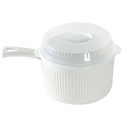
You know what I decided I wanted? A microwavable soup bowl with a handle.

Seriously. Just add a handle. That’s the rocket science. Sort of like how you can lift a pot of boiling water off a stove top burner without a visit to the emergency room.

So I use this thing. Mine is orange. I don’t think the designers anticipated people eating directly from it, but I don’t care. I think it’s brilliant. I heat a bowl of soup, the microwave dings, and I chow down on that sucker.

A few other added benefits that I’ve noticed post-facto:

  1. Between steps (2) and (3), your food has probably exploded all over the inside of the microwave for you to clean later. This thing comes with a lid. Problem completely solved. No more kitchen appliance interior decorating.
  2. It’s totally oversized. Which is great. It’s not like I was running out of space inside my microwave or my food was claustrophobic or something. What’s more important is the strange fact that Campbell’s generally sells soups in sizes like “10.75 ounces” and Target generally sells bowls in sizes like “six inches” and it’s awfully difficult to tell whether the one will fit inside the other. I used to fill six-inch soupbowls up to the tippy-top, which I’d inevitably spill either because I’m a klutz or, again, the microwave has turned the bowl to molten lava temperatures. This thing: no problem.

I suppose the jury is still out on the prevalence of mouth burns now that the preliminary hand burn has been bypassed. I’d argue that there are more clues for food (steam, bubbly water, heat, etc.) than for plastic in judging appropriate temperatures. No scalded taste buds for me yet.

Calibri

Calibri is a nice font. I’m glad Microsoft Office made the transition.

But there’s one part that annoys the bejeezus out of me. It’s the “~” key. The Tilde.

I like to approximate things. So, for example, if I’ve just played prolific amounts of the world’s suckiest sport, I might say this:

My sweat is yellow

But that’s only if I was playing the world’s suckiest sport sometime prior to 2007, when Times New Roman was the Office default font.

If I’d tried to be like Mike today:

my sweat is now Zima

Eww eww eww eww eww.

The Future of the Web URL

It started out as http://www.cocacola.com

Then the internet got smarter; www.cocacola.com was all that you really needed.

Then the internet got smarter still. cocacola.com would direct you to the right place.

Then we got cutesy. Things like google.com/fanhaerhr became google.com/about .

Cuter still, with the need to mind your messages down to the very character. You can get to facebook.com by simply typing fb.me .

There’s an ever-blossoming number of different domains now. The US has  .com; most countries with robust internet access have their own alternative like .es, .it, .co.uk, or whatever. Having a .org address used to mean something different. Now there’s .co, .info, .biz, .xxx, and who knows what else.

I imagine that, eventually, you might have every different permutation of domains. Cocacola.com might become cocaco.la (like delicious.com used to be del.icio.us).

This seems silly though. Does CocaCola need to own every single different iteration of its namesake, across dozens (hundreds?) of different domains? How long until you can just own “CocaCola,” and just type “CocaCola” into a browser and that’s where you go? Some browsers already do this by taking advantage of your browsing history, or doing tricks with Google’s “I’m feeling lucky” function.

But I mean, I’m talking the real deal. I want to own “Josh Petersel;” how long until that’s possible?

Make Cabs Better

What in the world does the light on top of the cab even mean?

What do you even mean

It says “TAXI.” Sometimes the light is on. In some cities, when the light is on, it means “available.” Other cities, when the light is off it means “available.” I think. I don’t know. I don’t get it at all.

So why doesn’t it look like this:

Oh. Available. I get it.

If the light is on, I can read that the sign says “available.” It’s available. Why did we need to be reminded that the bright yellow car with the word “Taxi” plastered on both sides is, in fact, a taxi?

Not that this change ever gets implemented—even though it’d be easy and cheap to roll out, and makes the user experience simply better. The cab companies are probably far busier throwing hissy fits at startups like Uber and Sidecar who saw the same problem (“Why the hell can’t I find an available cab anywhere?”) and came up with far more complicated (yet, admittedly, effective) solutions.

“What’s This?” (CV2 / Credit Card Security Code)

Every single online checkout page—ever—asks you to input your credit card information in more or less the following way:

“What’s this?” leads to a page like this:

The CV2 / CSC / CVD / CVC / CCV / CV2 / Card Security Code / (…Seriously???) / CVV2 / Verification Code was implemented as a security measure for when you do transactions and the card isn’t physically present at the register (like when you’re buying menial crap on the internet).

But that doesn’t answer the question: Why does this page still exist? We’ve been doing this internet thing for well over a decade. People have pretty readily figured out what the Credit Card Number and Expiration Date. Why are we still struggling here? Isn’t this silly?

Two thoughts:

1) Label your crappy credit cards better. “Credit Card Number” is pretty intuitive because those numbers are big and imprinted. Every card I’ve ever had has said something like “Valid Until” or “Good Thru” or “Expiration Date” next to the expiration date, so that’s handled. Why the secrecy surrounding the CV2?

On this credit card, there’s no indication at all that the number 7379 has any significance whatsoever. With about fifteen seconds’ labor…

Any question now? This sample card wasn’t really designed too well; I added the white box to make it clear that “CV2:” was referring to 7379 and not 01001. With a little more thought and care, the two number series might be distanced and the white box rendered superfluous.

2) Pick a name. There’s obviously some serious confusion in this department—The Wikipedia page for “Card Security Code” lists seven different names with ten corresponding acronyms. Pick one! I’d lean towards “Verification Code” since I guess it’s a bit more intuitive (consider how much trickier it’d be to remember what an “EXD Code” was instead of an “Expiration Date”). I used “CV2” above for the sake of size. The face of a credit card has a pretty limited amount of real estate. And also I didn’t really feel like reorganizing and squeezing things around.

Toilets.

I’ve decided to branch my thinking out into a slightly new direction: Design.

I don’t necessarily mean the sort of creative work that my friends Matt and Logan are capable of. Maybe someday. For now, I’m referring more to business design. Way more human interactive experience, way less Adobe Illustrator (theoretically).

So I thought I’d kick things off by talking about toilets.

Yes, it was totally weird to be taking a snapshot of something while in a bathroom. It was entirely empty at the time.

In case you haven’t pooped any time in the last decade or so, there’s been a fairly significant innovation in the world of public toilets. That little black square on the left side of the pipe is a motion sensor: It can tell when you’ve stood up, and will automatically flush the toilet for you so that you won’t have to physically touch a handle (how outdated!).

Here’s the thing, though: These sensors kind of suck. Most of them can apparently detect the movement of anything bigger than an oxygen particle, and will flush repeatedly throughout the course of one, *ahem*, sitting. I’d guess this is also a waste of water, but as far as I’m really concerned, it’s just a broken experience. And I think it can be easily fixed.

See Figure 2, below:

Now, with more lasers!

Here’s the thing with the toilet flush sensor: Its success doesn’t hinge on the fact that it activates the second you stand up from the seat. All we want to do is alleviate the need for you to touch a handle and spread germs. It’s not necessary for the monitor to be fixated on your back while you’re reading a particularly funny Calvin & Hobbes strip or after you’ve consumed more than your fair share of late night Taco Bell. This contrasts starkly with the motion sensor on the sink (which, I believe, was first to market), where the design completely fails unless your hands are directly under the sink when the sensor activates.

All I did above was make two excruciatingly simple changes to the design. First, I rotated the sensor 90 degrees. No more excessive flushes from seat shuffles. All you have to do is hover your hand over the sensor when you’re done. If we were to get really fancy, you might even move the sensor over to the other side of the stall so that patrons don’t have to reach over the toilet. (I don’t know; they’re the germophobes, not me!).

Second, I added a thin red light. Figuring out the three-dimensional depth of where I need to place my hands to line up with the bathroom sink sensors usually works after a few seconds of trial & error. It’s not a terribly big inconvenience, but heck, we’re fixing things anyway. We solve this modern day crisis with the red light, which is much easier to line your hand up with spatially. My guess is that common sinks don’t employ this because they’re usually pointed horizontally and might get in childrens’ eyes. No such problem here.

Anyway. I hope there will be more crap like this to come.