Credit Card Design, Pt. II

Perfect timing: Less than a week after I published my thoughts on Credit Card Design, MasterCard unveils their vision of the future. They call it the Display Card.

Design: Priceless?

Wow. I don’t know where to start.

One of the biggest drivers for my original Credit Card Design post was that there was just way, way too much going on in such a small, cramped space. Somehow that got translated into “LET’S ADD AN ENTIRE KEYBOARD AND DISPLAY SCREEN WOOHOO!!!”

To be fair: There could be use cases among here among classes of individuals who I just won’t understand. From the perspective of me and my peers, however, this is an unmitigated disaster.

Let’s pick away at some of the easy stuff.

  1. To be clear: This is an official mock-up from MasterCard’s own website. I mean, I really, really had a hard time believing that.
  2. An on/off switch? Is this thing battery operated, or do I have to recharge it occasionally? Will it even fit in the card slot in my wallet, or the reader in the ATM, or is it too thick?
  3. I don’t think a single element on the card is aligned. The metallic chip thing is slightly lower than the credit card number. The blue M in the bottom left is a bit outside the box created by the keypad, whereas the C to the right is entirely inside the box. Ad infinitum.
  4. Do I have to learn more things? What the heck does “OTP” mean? If the keys are touch sensitive, how do I activate “OTP” or “SIGN” instead of 6 or 8? I guess someone decided that having two extra keys on the pad dedicated to OTP and SIGN would’ve been excessive, but the current twelve key layout is appropriate?
  5. Thinking about how big a standard credit card is…how are you even supposed to press, say, the 4 key—and only the 4 key (again, all the surrounding keys are touch sensitive)—without using a tweezer?
  6. How much could this thing cost?
  7. What happens when a hefty businessperson who leaves his wallet in his back pocket sits on this?

Let’s try some medium stuff: According to the website, these cards “can be used as “Information Display” Cards enabling cardholders to access critical information such as account balance anywhere, anytime.”

  1. Who actually wants this feature?
  2. Who actually thinks their credit card will be a better medium for this than a smart phone?
  3. Even assuming people want this service, and want to use it through their credit cards, how in the world are you supposed to process your way to this information without any sort of directional navigation buttons?
  4. Apparently one of the core functions will be for executing high balance transactions. You can punch a key code in for added security. Although…maybe it’s not actually safer to put the security device on the easily abducted card? Wouldn’t it be better to leave those two things separate?

Expert level. Subtle things:

  1. One of my biggest gripes about touch screen cell phones is the lack of response feedback for button presses. Most phones ameliorate this with the phone’s auxiliary functionality—press a key, hear a tone or feel a vibration. On this credit card? Certainly impossible. In which case, how do I know if I’ve pressed successfully? How do I tell if I haven’t pressed accurately or hard enough, or if there’s just a bit of lag between the press and the results showing up on the screen?
  2. Also drawing from cell phone experience: On non-flip phones, the phenomenon of the Butt Dial proliferated until meticulous lock/unlock procedures were implemented. These often require a specific set of touches, usually on disparate parts of the device (consider, for example, how you need to press the Home button on the iPhone before swiping). This may be less of a concern depending on a few variables.  For phones, for example, the lock is also important so as to stave off unnecessary battery strain. This may not matter as much for the card, I don’t know.
  3. What happens after too many errant button presses? Or what happens if you just forget your passkey? Or if you do the equivalent of a butt-dial? Does the card go into lockdown mode? Do you have to call someone, and have them relay the numbers to you over the phone? If so, how is that all that much safer than before?

Re: Credit Card Design

Perfect timing: Less than a week after I published my thoughts on Credit Card Design, MasterCard unveils their vision of the future. They call it the Display Card.

Design: Priceless?

Wow. I don’t know where to start.

One of the biggest drivers for my original Credit Card Design post was that there was just way, way too much going on in such a small, cramped space. Somehow that got translated into “LET’S ADD AN ENTIRE KEYBOARD AND DISPLAY SCREEN WOOHOO!!!”

To be fair: There could be use cases among here among classes of individuals who I just won’t understand. From the perspective of me and my peers, however, this is an unmitigated disaster.

Let’s pick away at some of the easy stuff.

  1. To be clear: This is an official mock-up from MasterCard’s own website. I mean, I really, really had a hard time believing that.
  2. An on/off switch? Is this thing battery operated, or do I have to recharge it occasionally? Will it even fit in the card slot in my wallet, or the reader in the ATM, or is it too thick?
  3. I don’t think a single element on the card is aligned. The metallic chip thing is slightly lower than the credit card number. The blue M in the bottom left is a bit outside the box created by the keypad, whereas the C to the right is entirely inside the box. Ad infinitum.
  4. Do I have to learn more things? What the heck does “OTP” mean? If the keys are touch sensitive, how do I activate “OTP” or “SIGN” instead of 6 or 8? I guess someone decided that having two extra keys on the pad dedicated to OTP and SIGN would’ve been excessive, but the current twelve key layout is appropriate?
  5. Thinking about how big a standard credit card is…how are you even supposed to press, say, the 4 key—and only the 4 key (again, all the surrounding keys are touch sensitive)—without using a tweezer?
  6. How much could this thing cost?
  7. What happens when a hefty businessperson who leaves his wallet in his back pocket sits on this?

Let’s try some medium stuff: According to the website, these cards “can be used as “Information Display” Cards enabling cardholders to access critical information such as account balance anywhere, anytime.”

  1. Who actually wants this feature?
  2. Who actually thinks their credit card will be a better medium for this than a smart phone?
  3. Even assuming people want this service, and want to use it through their credit cards, how in the world are you supposed to process your way to this information without any sort of directional navigation buttons?
  4. Apparently one of the core functions will be for executing high balance transactions. You can punch a key code in for added security. Although…maybe it’s not actually safer to put the security device on the easily abducted card? Wouldn’t it be better to leave those two things separate?

Expert level. Subtle things:

  1. One of my biggest gripes about touch screen cell phones is the lack of response feedback for button presses. Most phones ameliorate this with the phone’s auxiliary functionality—press a key, hear a tone or feel a vibration. On this credit card? Certainly impossible. In which case, how do I know if I’ve pressed successfully? How do I tell if I haven’t pressed accurately or hard enough, or if there’s just a bit of lag between the press and the results showing up on the screen?
  2. Also drawing from cell phone experience: On non-flip phones, the phenomenon of the Butt Dial proliferated until meticulous lock/unlock procedures were implemented. These often require a specific set of touches, usually on disparate parts of the device (consider, for example, how you need to press the Home button on the iPhone before swiping). This may be less of a concern depending on a few variables.  For phones, for example, the lock is also important so as to stave off unnecessary battery strain. This may not matter as much for the card, I don’t know.
  3. What happens after too many errant button presses? Or what happens if you just forget your passkey? Or if you do the equivalent of a butt-dial? Does the card go into lockdown mode? Do you have to call someone, and have them relay the numbers to you over the phone? If so, how is that all that much safer than before?

Credit Card Design

My thinking about credit card design began earlier this year with the post “What’s This? CV2 / Credit Card Security Code”. I realized then that there was still more work to do, and took a shot at redesigning the whole thing.

On the whole, credit cards are pretty ugly, congested things. That’s a result of the combination of a) needing to convey a ton of information in a confined space, and b) designers who probably knew or cared relatively little about visual or business design. Let’s give this a shot.

First, for reference, some “before” photos I scraped from Google Images:

honga konga donkey konga

The cards I own generally have the following features:

Front: Credit Card Number, Expiration Date, Name, Cardholder Since, Visa Logo, a thousand different conflicting colors and logos from my bank.

Back: Magnetic strip, signature area, my signature, the last four numbers of the card, a hologram, the confusing cv2 thing, more logos, three different phone numbers, a website, some number jargon in the top corner, the copy “Not valid unless signed,” the bank’s site URL.

For my design, I decided to go with a minimalist approach. Not just because I think it generally makes good design sense, but because it looks so unlike any other card I’ve ever seen—and that’d make it fun and attractive.

Front side:

i'm bringing sexy back

Quite a departure, right?

Notable design decisions:

  1. I started with a blank slate, and added back only what I felt was absolutely, positively necessary. You might even argue that the only item that falls into this category is the credit card number. I contemplated a design like that. However, thinking about how the credit card is generally used, I feel that including the expiration date and CV2 number make a more effective design. Specifically: The use case of buying products online. With this card, you won’t have the painful (I mean, “painful”) use experience of having to flip the card over to find vital purchasing details. This design makes it intuitively obvious what the expiration date and CV2 number are, without requiring help text which clutters up the card. You don’t need your name on the front of the card, because you don’t (at least, shouldn’t) need to use the card as a reference to remember what your name is.
  2. It may be a little bit of a leap for a stodgy finance company like Visa, but I don’t think you need any logos on the front of the card. The design should speak for itself about what your brand is. Ever notice how you’ve never once seen an Apple logo on the front of an iPhone? You still know it’s an iPhone, right?
  3. I thought it would look awesome if the card numbers were punched out cleanly, rather than just imprinted. Purely aesthetic, stylistic choice that seemed like it would look and feel bad ass. I could certainly be wrong, but my impression is that the imprinted card numbers thing became the norm because merchants originally used carbon paper contraptions like this in order to record your data. It’s possible that modern ATM machines wouldn’t recognize this new style, in which case, we stick with the universally accepted standard. If we didn’t have to cater to these ATM standards at all, it might have been fun to experiment with entirely new shapes. Perhaps a smaller square with a standard-size hole punched in so that you could easily wear the card on your keychain? That raises an entirely different set of design issues…it was just a thought.

Back Side:

Men in Black

Notable design decisions:

  1. Obviously, if the vital numbers are punched through, you’ll still see them when you flip the card over.
  2. On the cards I have on hand, the hologram generally seems to be at least partly overlapping with the imprinted numbers. My guess is this is some kind of tactic to impede forgery, so I stuck with it.
  3. Hey! There’s my name! So if I need to find it, and prove that I’m me, here it is. Furthermore, my understanding is that when a cashier is cross-referencing my credit card to my ID, he wants to investigate that both the name matches and that the signature matches. Now he doesn’t have to flip the card back and forth to see both.
  4. My signature here has been printed directly onto the card. As a result, we don’t need that ugly multi-color signature space, and we don’t need any explanatory text to remind us that “card is not valid unless signed.” My intuition is that a digitally reproduced copy of my signature is acceptable—the DMV does this on my Driver’s License, and there doesn’t seem to be any concern about validity there.
  5. Took a little creative liberty with the Visa logo. Hopefully they’d be cool with this look.
  6. I’m not totally sure why the back of every card I’ve looked at has a reproduction of the last four digits of your credit card number along with the CV2 code. I’m just going to assume that it has to be there. Furthermore, per my original CV2 post, every single website ever has those instructions that point clueless users to where their CV2 code is located. It would be a horrible user experience if, somehow, you managed to miss the numbers on the front by following the site instructions, and found that help text pointed to nothing on your card. So for the sake of those hopeless people, I’m leaving the numbers here in tact.
  7. All the rest of the vitals crap is stuffed away above the magnetic strip. I think much of it is unnecessary, but imagine that this isn’t a battle I’d be able to win against corporate. The name “Visa Black Card” really ought to be intuitive enough to search in Google or by phone that I shouldn’t need to state it here. Same goes for the web address. Every card seems to have some kind of serial number jammed into a corner, so I’m assuming this stays. The phone number I accept as inherently useful—though I think it’s silly that the card should explain that it’s a “24-hour customer service line.” If it was an 8am-5pm line, I’d need the advisory note. But saying that the number works 24 hours isn’t going to affect my usage behavior at all.

Soup Bowl Design

I microwave a TON of soup. Soup is one of my favorite foods.

Think about how microwaving food is supposed to work:

  1. Put all your stuff in a microwave-safe container
  2. Turn the microwave on for the allotted time
  3. Microwave dings
  4. Take it out and enjoy

How it works in reality: Step (4), according to the instructions on the can which nobody has ever read, ever, is technically “let your stuff sit for a minute to cool off, then grab it.” I emphasize technically. Because in practice, it’s “burn your hands just trying to move the bowl to the kitchen table and probably spill a bit on the floor because it’s hot and you’re rushing.”

You know what I decided I wanted? A microwavable soup bowl with a handle.

Seriously. Just add a handle. That’s the rocket science. Sort of like how you can lift a pot of boiling water off a stove top burner without a visit to the emergency room.

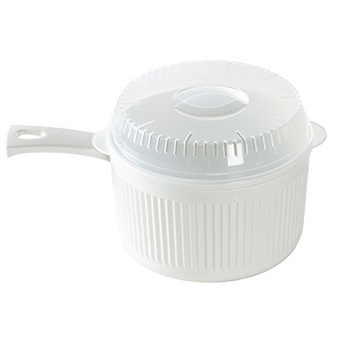
So I use this thing. Mine is orange. I don’t think the designers anticipated people eating directly from it, but I don’t care. I think it’s brilliant. I heat a bowl of soup, the microwave dings, and I chow down on that sucker.

A few other added benefits that I’ve noticed post-facto:

  1. Between steps (2) and (3), your food has probably exploded all over the inside of the microwave for you to clean later. This thing comes with a lid. Problem completely solved. No more kitchen appliance interior decorating.
  2. It’s totally oversized. Which is great. It’s not like I was running out of space inside my microwave or my food was claustrophobic or something. What’s more important is the strange fact that Campbell’s generally sells soups in sizes like “10.75 ounces” and Target generally sells bowls in sizes like “six inches” and it’s awfully difficult to tell whether the one will fit inside the other. I used to fill six-inch soupbowls up to the tippy-top, which I’d inevitably spill either because I’m a klutz or, again, the microwave has turned the bowl to molten lava temperatures. This thing: no problem.

I suppose the jury is still out on the prevalence of mouth burns now that the preliminary hand burn has been bypassed. I’d argue that there are more clues for food (steam, bubbly water, heat, etc.) than for plastic in judging appropriate temperatures. No scalded taste buds for me yet.

Calibri

Calibri is a nice font. I’m glad Microsoft Office made the transition.

But there’s one part that annoys the bejeezus out of me. It’s the “~” key. The Tilde.

I like to approximate things. So, for example, if I’ve just played prolific amounts of the world’s suckiest sport, I might say this:

My sweat is yellow

But that’s only if I was playing the world’s suckiest sport sometime prior to 2007, when Times New Roman was the Office default font.

If I’d tried to be like Mike today:

my sweat is now Zima

Eww eww eww eww eww.

The Future of the Web URL

It started out as http://www.cocacola.com

Then the internet got smarter; www.cocacola.com was all that you really needed.

Then the internet got smarter still. cocacola.com would direct you to the right place.

Then we got cutesy. Things like google.com/fanhaerhr became google.com/about .

Cuter still, with the need to mind your messages down to the very character. You can get to facebook.com by simply typing fb.me .

There’s an ever-blossoming number of different domains now. The US has  .com; most countries with robust internet access have their own alternative like .es, .it, .co.uk, or whatever. Having a .org address used to mean something different. Now there’s .co, .info, .biz, .xxx, and who knows what else.

I imagine that, eventually, you might have every different permutation of domains. Cocacola.com might become cocaco.la (like delicious.com used to be del.icio.us).

This seems silly though. Does CocaCola need to own every single different iteration of its namesake, across dozens (hundreds?) of different domains? How long until you can just own “CocaCola,” and just type “CocaCola” into a browser and that’s where you go? Some browsers already do this by taking advantage of your browsing history, or doing tricks with Google’s “I’m feeling lucky” function.

But I mean, I’m talking the real deal. I want to own “Josh Petersel;” how long until that’s possible?

Make Cabs Better

What in the world does the light on top of the cab even mean?

What do you even mean

It says “TAXI.” Sometimes the light is on. In some cities, when the light is on, it means “available.” Other cities, when the light is off it means “available.” I think. I don’t know. I don’t get it at all.

So why doesn’t it look like this:

Oh. Available. I get it.

If the light is on, I can read that the sign says “available.” It’s available. Why did we need to be reminded that the bright yellow car with the word “Taxi” plastered on both sides is, in fact, a taxi?

Not that this change ever gets implemented—even though it’d be easy and cheap to roll out, and makes the user experience simply better. The cab companies are probably far busier throwing hissy fits at startups like Uber and Sidecar who saw the same problem (“Why the hell can’t I find an available cab anywhere?”) and came up with far more complicated (yet, admittedly, effective) solutions.

Best Buy

Background reading:

  • Amazon is ramping up its number of warehouses, a move most likely signaling the introduction of same-day delivery.
  • Best Buy has a new CEO. More generally speaking, Best Buy sucks.

So Amazon is betting big on this same-day delivery thing. Big enough that they’re going to invest in a ton of real estate capital, and give up the ability to skirt around sales taxes—one of their most significant cost advantages. (Arguably, the writing was on the wall for the sales tax thing anyway, and this is Amazon’s strategy to cope with that. But drawing out their strategic decision tree is not the point here.)

Here’s what’s interesting to me: Doesn’t Best Buy already have a robust network of warehouses across the globe? In fact, they’ve got roughly a thousand retail shops; I’m sure there are a bunch of store-supplying warehouses around as well. So why wouldn’t Best Buy roll out a delivery service of its own, and beat Amazon to the punch? Best Buy should be able to launch a delivery program (in select markets, at least) within a matter of weeks. The hard part is certainly not finding teenage employees clad with drivers licenses. Pizza joints have had this much figured out since man invented the wheel (and the pizza). I mean, forget same-day delivery: A pizza place can guarantee you a pie in 30 minutes or less—and they still have to cook stuff. So, Best Buy: How about same-hour delivery? There are two questions to consider:

  1. How much is first-mover advantage worth, exactly? Surely the corporate honchos have some precise way of quantifying this. If Best Buy rolls out first, how many customers switch from Amazon to Best Buy to make their next purchase? Perhaps even more importantly, what percentage of those customers stick around with Best Buy after Amazon catches up and enters the same-day delivery market? (You might frame the problem the other way around, too: How many Best Buy loyalists defect when Amazon introduces same-day delivery? How many come back when Best Buy catches up, if it doesn’t fold first?)
  2. What is the optimum competitive play? We’ve established that curating adequate real estate is the tricky part of the equation. We can’t say for sure if same-day delivery is a bona fide value proposition yet. We can probably illustrate this best with a payoff diagram. Here’s what I went with:

Not pictured: Best Buy bleeding money due to general lack of competence.

How to interpret:

  • I’m assuming that whether the Same-Day Proposition is awesome or sucky is an independent variable. Whether the program is a hit or not is up to the public, out of the company’s control. (Realistically, you might assign probability weights to each, based on research and intuition. You might also argue that the likelihood of success can be influenced by proper advertising and promotion, etc. And you could certainly contend that this isn’t a black & white scenario; “pretty good,” and the like, are also possible outcomes.)
  • The First Mover, in this scenario, is in Best Buy’s control, as outlined above. (A robust analysis might also include a bevy of other competitors. But whatever. Simplicity here.)
  • The blue version shows Best Buy’s payoffs, and the beige version shows Amazon’s. So, for example, if the Same-Day Proposition is Awesome and Best Buy moves first, then Best Buy stands to gain $$$ and Amazon loses $$$. (These dollar figures are just very rough guesses, and could be debated ad infinitum.)
  • In the scenario where Same-Day Proposition Sucks and the company was not the first mover, I’ve assumed a zero payoff—in other words, the company doesn’t enter the market. It’s possible that there might actually be a slight positive payoff as a result of the competitor’s negative PR, goodwill, what have you.

The critical cell, as far as game theory and competitive strategy go, is the bottom-right-most outcome under Amazon’s payoffs. That’s the result of Amazon’s heavy capital investments going bust. Which leads me to the following two thoughts:

  1. Eyeing that massively negative potential outcome, it’s possibly in Best Buy’s…err…best interests to stall on the development of its delivery program until Amazon starts sinking irredeemable capital into developing its warehouses. A scenario where Best Buy is a slight first mover might be its optimal choice, because then, even if Same-Day fails, Amazon is still stuck with big utility bills.
  2. If the likelihood of success is 50/50, then looking at Amazon’s payoffs above, the company may actually be better off not entering the market at all. Either way, Amazon’s expected payoff is (-$). Which probably means one or more of the following:
    1. Amazon’s got a pretty good hunch that this is going to succeed.
    2. I screwed up in drawing accurate payouts.
    3. As postulated way at the beginning, Amazon doesn’t really have a choice but to do this.

Secret Menu: The Restaurant

For some reason, all my favorite ideas come from the realms of restaurants and airlines. The short of it: I must really, truly, innately desire to blow a whole boatload of money as soon as I’m nice and rich.

So here’s an awful idea and my latest obsession: I want to start a restaurant called Secret Menu.

I ate at In-n-Out Burger last week. It was positively divine. I’m a sucker for greasy junk like that, and a sucker for eating at landmark establishments. But perhaps the best part of the trip was ordering off of In-n-Out’s venerable secret menu.

…Their secret menu isn’t really a secret. Go hit up Google, you’ll find it all over. Hell. They itemize it on their own corporate website. So what? It still feels awesome being on the inside.

My idea kicks it up a notch. I cut out the chaff. My restaurant only has a secret menu.

When you’re seated, the waiters (assuming we have waiters; I haven’t the foggiest as to what type of food and ambiance we’ll be shooting for) will provide you a menu with everything blacked out like a World War II letter censored by Yossarian. Don’t know what you want to order? Sorry, we can’t help you.

Most of the menu items will be pretty reasonable fare. But the secret menu affords us an opportunity to do some stuff that’s a little more weird and fun. Like a steak place where you can order a Peanut Butter & Jelly. Maybe if you want the chicken, you’ll have to order a “Chicken Soup, hold the soup.” Maybe there’s a gag meal like liver & onions that comes out if you try to order from the secret menu but screw it up.

I think the foodie circles and blogosphere will probably try just about anything and go gaga over it if you make your concept stupid and quirky enough. What do you say?

Airplane Seat Probability

The probability of getting a nice seat on the airplane, based on which letter you’re assigned.

Airplane Row Layout Options:

A || BC

AB || CD

ABC || DEF

AB || CDE || FG

AB || CDEF || GH

ABC || DEFG || HIJ

Assuming an even distribution of plane sizes. And maybe it’s just me, but I’m way more into window seats than aisle seats. Here’s how I’m scoring it: 100 points for a window, 30 points for an aisle, and 0 for a middle.

Results:

  1. A: 100% odds of window seat, with a 17% chance of a dual window+aisle seat. Final Score: 105 / 100.
  2. J: All aisle, all the time. 100/100.
  3. H: 50% odds of window, 50% aisle. 65/100.
  4. G: Always a good seat, like H, but worse odds of a window. 53.3/100.
  5. C: Amazingly, C is guaranteed a good seat through all six major plane width configurations. Too bad they’re mostly aisle. 41.7/100.
  6. F: Feeling lucky? More likely than C to end up in a sweet window seat…but you could also get stuck in a crummy middle. 40/100.
  7. D: There’s one window seat left, but you’re probably getting stuck in a middle. 32/100.
  8. B: No hope left of a window seat. 20/100.
  9. E: Not looking good…7.5/100.
  10. I: 0/100. Fuck I.

Do note, again, I’m way more into windows. Maybe aisles are more of your thing, in which case the relative values of H, G, and C rise precipitously and D’s rank drops a bit.

This is a totally ridiculous thing to have ironed out mathematically.