Barack Obama has normal ears

For this blog post, I am going to disagree with President Barack Obama.

This is what he looks like:

obama-standing


And here are a few examples of what he sounds like:

1) His visit to Comedians in Cars Getting Coffee (if you’re impatient, skip to the 05:40 mark).

2) His goof for the White House Correspondents’ Dinner (in particular, the 01:02 mark):

There’s more. There’s tons more. Here Obama says he was bullied. Here his daughters are mocking him. Here he says his look inspired Shrek.

Barack Obama insists that he has “big ears.”

I feel like this is like a reverse The Emperor’s New Clothes. In the classic, the Emperor exclaims that his clothes make him look fantastic and nobody cares to point out that he should be embarrassed about being naked. In Obama, the leader of the free world describes how embarrassed he is about how he looks, and nobody cares to point out that the dude looks totally fine.

I looked up some stuff about ears. The average adult male ear is 6.4cm tall. Barack Obama is 6’1, or 185.4cm. In the photo above, I found Obama to be standing 514 pixels tall, while his right ear stands 18 pixels tall:

obama-measurements


185.4cm :: 514px. Therefore, 18 pixels :: 6.49cm. *Slightly* above average. Not to mention the fact that the reported average height for an American male is somewhere from 5’7 to 5’10. So with Obama being 6’1, we should expect some modest increase in ear size.

Wait, what’s going on? Why is this important? Who cares?

Well, Obama’s tricking you. You’re being actively deceived by the standing US President. Aren’t you offended? Shouldn’t we impeach him and send him to the Supreme Court, or ask for his birth certificate or his tax return? …Probably not.

Here’s the thing. Obama almost definitely knows he doesn’t have big ears. What makes this cool is that he sounds all humble and relatable, when really, he’s not conceding anything negative about himself at all. I mean, Jerry Seinfeld once ended a relationship with a girl for having big hands… among a litany of other obtuse reasons for break-ups… and I don’t even think he would dump a girl because her ears were too big.

There’s morals to this story about modesty and about self-conscience. Being modest and humble is nice. But if you’re going to self-deprecate, why attack your self-confidence in doing so? Might as well pick something that either you really don’t care about, or that totally doesn’t matter in the first place.

My sister wrote a book

Sometimes, a terrible thing happens when you have a younger sibling.

As the elder statesman, you spend your entire life learning, working hard, and creating an identity for yourself, while paving the way to make it easier for the new kid to get along.

What a mistake.

Because then, if you do that, you one day wake up and find definitive, conclusive evidence that they’re better than you. That you’re no longer the most adventurous or the most experienced or the bravest or the one with the most to share. (Or maybe, you never were.)

That day happened to me. It was March 22nd, 2016.

Before March 22nd, I’d tease about this idea to friends. I’d conjure the image of a DNA lottery draft, like the draft at recess when you picked sides for kickball. “Alyssa,” I’d say, “as the youngest of three siblings, had the last overall pick in the Petersel genetic lottery. I got music, Zach got sports, Alyssa got stuck with caring about people, having a moral compass, and wanting to save the world.”

Before March 22nd, I’d prided myself on my worldliness and my journalistic tendencies: I started and ran a music magazine. I’ve written up coverage of music festivals in strange, foreign lands. I’ve maintained this blog for over nine years.

But on March 22nd, 2016, my sister dropped a book. A full-length, edited, publisher-approved book. The culmination of almost a year abroad, and almost three years of effort. I thought I was leading the way around the track; it turns out, Alyssa’s nearly lapped me.

(For what it’s worth: Zach’s no slouch either.)

Having lived with Alyssa during her formative years, I can share some unique insight and perspective on this book in addition to the above confessions of my own nascent inferiority complex.

First: As a kid, she was ceaseless and terribly effective in lobbying for control of the TV. I can’t count the number of times I’ve had to sit through the movie Spiceworld (on VHS!) as a result.

Second, and far more importantly & relevantly: I don’t think we grew up in a particularly Jewish household.

Accordingly, it was kind of strange and unsettling to me when Alyssa announced she was writing a book about “searching and belonging in Jewish Budapest.” Honestly, my most vibrant “Jewish” memories only tangentially register to me as “Jewish.”

  • We got Bar and Bat Mitzvahed, but in suburban Long Island, this roughly equates to six months of extra homework, which I already did a lot of, followed by a massive birthday party. I have a far better recollection of the walk-up music I chose for my friends and family than I do of the prayer songs I actually performed at the service
  • We visited Israel once as a family for New Years, but we took family trips annually to all matter of beautiful and historically significant places — to Mexico, to celebrate dad’s time spent living there; to Italy, to appreciate the history of art (and Zach’s love of pasta)
  • We went to Aunt Clara’s house every year and had a big family dinner (called a “Seder”) to celebrate Passover… but this wasn’t really all that materially different from the big family dinners we had at Aunt Barbara’s house in November to celebrate Thanksgiving

Then again… on further reflection…

  • We always knew our dad’s mom was an immigrant who fled Europe around the time a particular German regime was coming to power. It wasn’t until later, but Dad eventually revealed to us that our great aunt was a Holocaust concentration camp survivor, and that many of his aunts and uncles were holocaust victims
  • I got bullied in high school for being jewish
  • I wore a Star of David necklace for a while growing up. I stopped; I liked being jewish, but I no longer wanted my religion to be such a visible part of my identity

For whatever reason, despite all the skepticism proffered by intellectual friends and modern philosophy classes, I still identify as Jewish. I believe zealously in the power and pleasure of traditions — not just the stereotypically “Jewish” traditions like that aforementioned Passover seder, but much simpler, modern traditions, too. Like always drinking a Mountain Dew when I play video games with Matt, or checking in at the Sweet Hollow Diner, ordering a Belgian Waffle, and eating it as fast as possible every time I go out to Long Island and visit my parents and high school friends.

To me, that’s the reality of modern Judaism — if not modern religion in general. And that’s what Alyssa captures brilliantly, and beautifully, in her book. Somehow I Am Different speaks to the power of creating and celebrating spirituality in your own unique way. And I’m tremendously relieved that Alyssa’s shown me that I’m far from alone in that endeavor.

Check out Somehow I Am Different on Amazon, if you want to read more.

Alyssa and I briefly toyed with the idea of doing an interview for this blog post, but I think we effectively covered everything she and I both wanted to cover after just one question:

Josh: What is Judaism?

Alyssa: I wonder if we should leave it at that.

Adele Sells Out

Adele in Hello:

adele


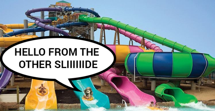
Adele in Hurricane Harbor at Six Flags:

adele-water


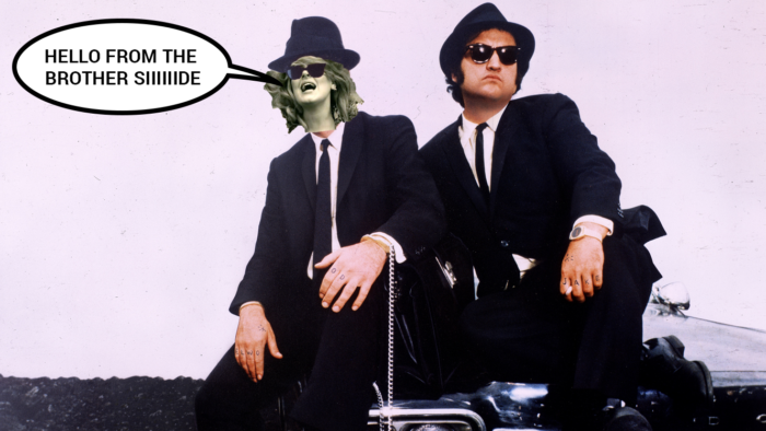
Adele in a classic comedy:

adele-brother2


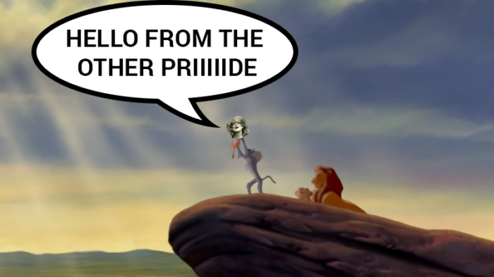
And in a classic Disney movie:

adele-simba


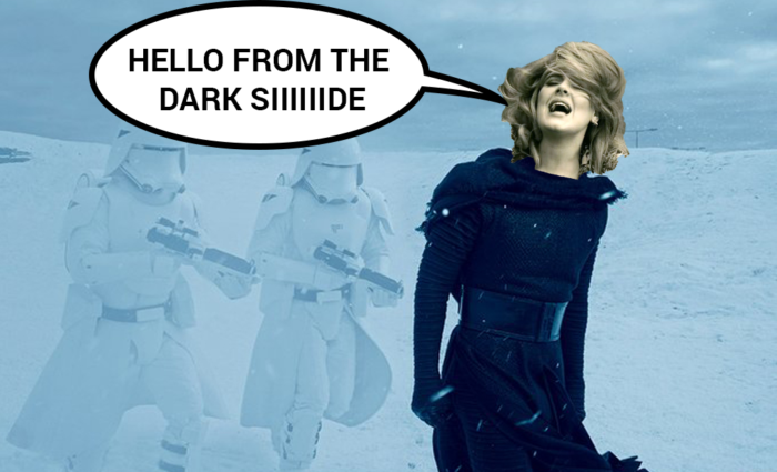
Adele in Star Wars:

adele-star-wars


Adele is Inigo Montoya, you killed her father, prepare to die:

adele-princess-bride


Adele in a Budweiser ad:

adele-budweiser


Adele in Snow White:

adele-snow-white2


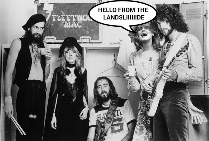
Adele in Fleetwood Mac:

adele-fleetwood


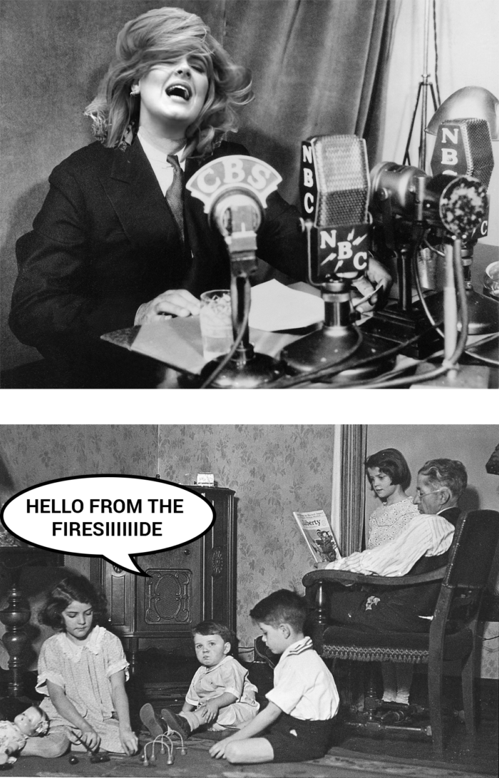
Adele in helping to solve the Great Depression:

adele-fireside


Adele sells car insurance:

adele-nationwide


I’m sorry, for everything that I’ve done.


(h/t Logan)

Contact Us


“Contact Us” is a page that exists on pretty much every website. This is because virtually the entire point of most websites — especially for businesses — is for you, the visitor, to reach out to the host person or company to strike up a conversation.

At best, the Contact Us page on every website I’ve ever seen can be fairly universally described as “mediocre.”

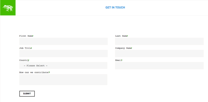
For example:
screen-shot-2015-12-03-at-7-43-02-pm


That’s from Frog Design — one of the world’s premier business design consultancies. Everything they build should be world-class in terms of user experience. Their Contact Us page, though? Nope. This is pure vanilla.

Googling around for “Contact Us Page Best Design” surfaces nothing beyond cutesy re-skins of the same exact crap.

  • Name (often first & last separately)
  • Email
  • Phone
  • Company Info
  • Open-ended essay on what the visitor is inquiring about
  • Submit Button

And of course, every field above is marked as “required.”

This is all insane. A feature important enough to exist on basically every single website, and nobody thinks to do a good job of it.

So I’ll try.

What do you want to happen at the Contact Us page?

I want people to contact me.

(Okay, duh.)

If I get really specific, though: I want my visitors to hit the “Submit” button. Nothing else they do on this page matters — no amount of personal information or detail about their inquiry — none of it matters if they don’t hit “Submit.” That’s our bottleneck, and that’s what we’ll design around.

My Proposal: Cheat

Albert Einstein was a pretty smart guy. He said this:

Make things as simple as possible, but no simpler.

Name, email, phone, company/personal info, open-ended note, submit.

I propose: 66% of these features are actually (surprisingly!) unnecessary at first pass.

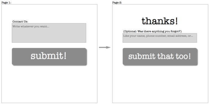
Instead, allow me to present the ideal Contact Us form:

screen-shot-2015-12-04-at-10-02-43-am

That’s it. It’s such a simple form that I’m hesitant to even call it a “form” anymore.

Q & A:

1) Why just this

Because any simpler and we’d have either a) a page that was just an open text form that couldn’t be sent anywhere, or b) a page that was just a Submit button. Both obviously non-functional. “As simple as possible, but no simpler” would not pass.

2) But Josh, this is insane

Are you sure?

3) Yeah I’m sure! How will you reach back out to the visitor without their name, job title, company info?

I mean, they’re contacting you without your name and job title. So is that all really such a big deal?

And besides, if that info was really important to them, any submitter you’d actually want to reach is probably smart enough to include it in the box.

And besides-besides, if it’s really important to you, you can just write them and ask once you’ve received the message they’ve sent. You can’t do that with a visitor who reaches this page, balks at the 5+ mandatory fields, and flakes out. Once you’ve gotten them to hit that first submit, the conversation’s open.

4) But what if they forget to include their contact info

Arguably, again, any submitter you’d actually want to reach should probably be intelligent enough to include their contact info. If they can’t do that much, they probably aren’t worth your time to respond to.

HOWEVER! Good design is also accident-proof. So let’s bake that in:

screen-shot-2015-12-03-at-8-47-31-pm

Now you’ve got the highest likelihood of hitting the Submit button, and you’re mistake-proof. If a visitor still manages to screw up on the contact info part, well… you didn’t want them anyway.

5) Why is this called “Cheat”

We’re cheating because we know the Submit button is important, so we’re shortcutting all those annoying middle fields. Before, with Frog, the Submit button was the 8th (!) thing you filled out. Now it’s the 2nd.

We employed a similar practice when I worked at OpenTable. There, we correctly identified the objective and bottleneck was “complete reservation.” Anything we put in the way between a new site visitor and “complete reservation” was lost reservations and lost money. So now, if you visit Opentable.com for the first time to make a reservation, you don’t need to create an account with a password until after the reservation is confirmed. (There’s still a prompt to create a password once you’ve finished confirming your reservation. But again, at that point, they’ve already got you through the bottleneck.)

6) What else is great about this?

  1. The Submit button is HUGE! People like big buttons. People are more likely to click big buttons. More people will click on my button than the Frog button
  2. Also, because the Submit button is huge, the open text form doesn’t look as big. People don’t like big, open-ended essay areas. (Probably deep-seated emotional scars from english class in grade school.) So if we make this part seem smaller, it won’t feel like such a chore to fill out
  3. Two fields to fill out is way more mobile-friendly than eight. It’s 2015 and mobile phones & responsive-design websites are a big deal. So this is good
  4. Nowhere in my form does it say the word “Required.” “Required” is spooky language. (Probably also related to the grade school emotional scars from #2.) You hate doing things that are Required. Just as bad is that feeling when you *think* you’ve gotten through with filling the form out, and you hit submit, and it sends you back to the top of the page with an Error! message and it turns out you missed some “Required” stuff. With my form, that’s impossible

7) Wow Josh that’s all really cool

thanks

8) What else you got?

Let’s see…

One okay idea

You could try having a “chat with us!” widget on your site. The psychological hurdle for IM’ing someone is substantially lower than writing an blind email (or, heaven forbid, making a phone call). It does hinge on you actually having someone who can hang around and respond to chats at most hours, and if you’re a small org or just generally busy, that’s probably not tenable.

One really bad idea

Many places still employ the WORST FUCKING THING on the internet: Mailto links.

That’s the thing that looks like a regular link, but actually, it’s like a Rick Roll on steroids. Because instead of just sending you to a dopey YouTube page, the Mailto link automatically freezes everything else you were doing so that it can force-open Microsoft Outlook and start a new email.

It looks and works like this (and I can’t stress enough, don’t actually click on this unless you hate yourself): Contact

The Mailto link is a prime example of failing the “as simple as possible, but no simpler” test. It’s too simple. Nobody needs to be saved the hassle of copy/pasting an address into their email client of choice. And nobody deserves the surprise and anguish of having to force quit the desktop email program that hasn’t been opened since it came pre-installed on their computer and only booted only once on accident the very first time you powered the computer on.

I can’t stress this enough. The worst, the worst, the worst, the worst.

But still, suppose you really hated forms and wanted an email thing

Your objective then changes from “get the visitor to click submit” to “get your email address in the visitor’s email client.” They’re probably going to use copy/paste to get it there.

So at some base level, you just could have a totally blank page with just your email address on it. (Check out Cards Against Humanity. Be careful about the Mailto link)

There are ways to manipulate text strings so that visitors can copy your email address in one click. (Check out what happens when you try shortening a link at http://bit.ly). That saves a step.

You can add a bunch of words to explain how excited you are to hear from your visitor. But that sounds to me like the equivalent of recording an extensively long voicemail greeting for yourself.

Instead what I’d propose is doing something quirky that would inspire curiosity and engagement. If you get someone to convert to contacting you just because they’re curious, you’ve still won.

So my email address-based Contact Us page would look something like this:

Please contact whoever you think you'd most like to speak with:
 
josh@joshpetersel.com
grandma@joshpetersel.com
freemoney@joshpetersel.com
bizdev@joshpetersel.com
asfhlrghliughelruhuliwreg@joshpetersel.com
notjosh@joshpetersel.com
abelincoln@joshpetersel.com
press@joshpetersel.com
fuuuuuuuck@joshpetersel.com
puppies@joshpetersel.com

We look forward to hearing from you.

You might need to tone down (or tone up!) the sense of humor depending on the nature of your business.

(Those email addresses all work, by the way. Try one if you don’t believe me.)

But again…

screen-shot-2015-12-03-at-8-47-31-pm


The dream.

1994-1995

Life Goals

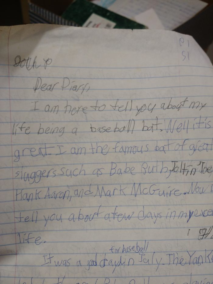
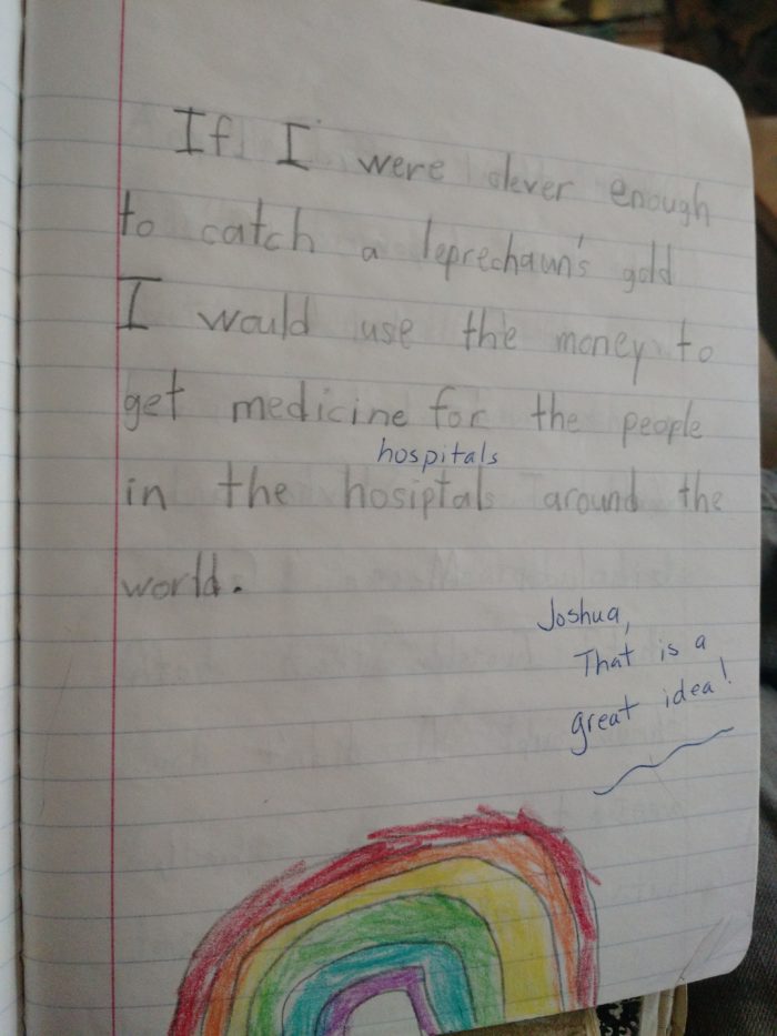
One time, as an 8-year old, I decided I would be a baseball bat.

img_20151126_152839477


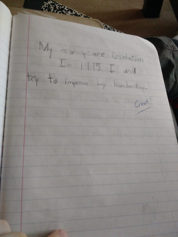
I resolved to improve my handwriting.

(This never panned out.)

img_20151126_144656981


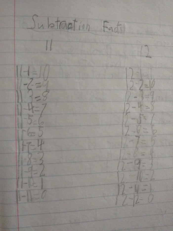
I knew a lot of facts.

(Can’t argue with anything here.)

img_20151126_150131294

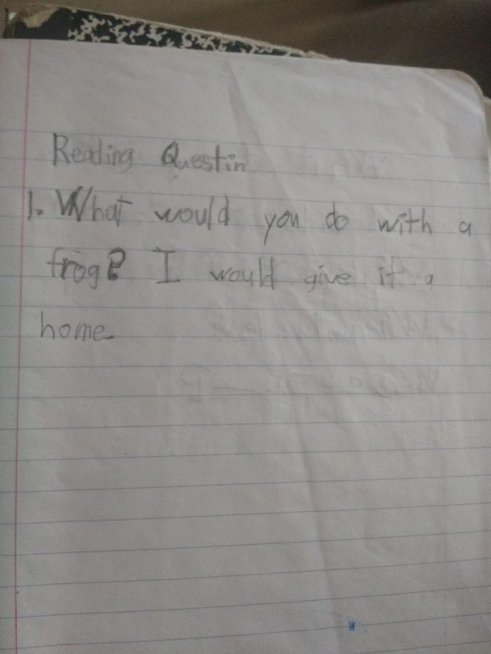
I was good to animals.
img_20151126_145902957

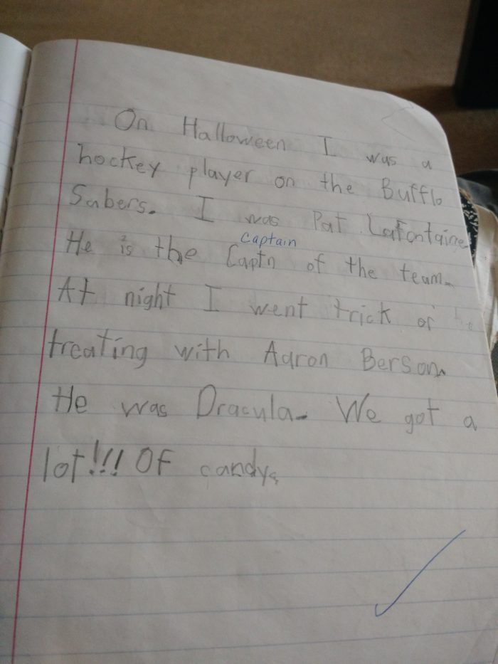
Candy was good.

(But a lot!!! of candy was better.)

img_20151126_144715925

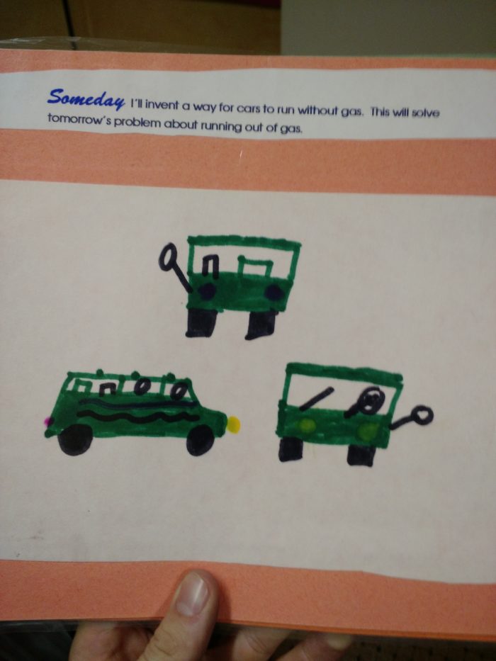
I could see the future.

(Elon Musk who?)

img_20151126_152459333

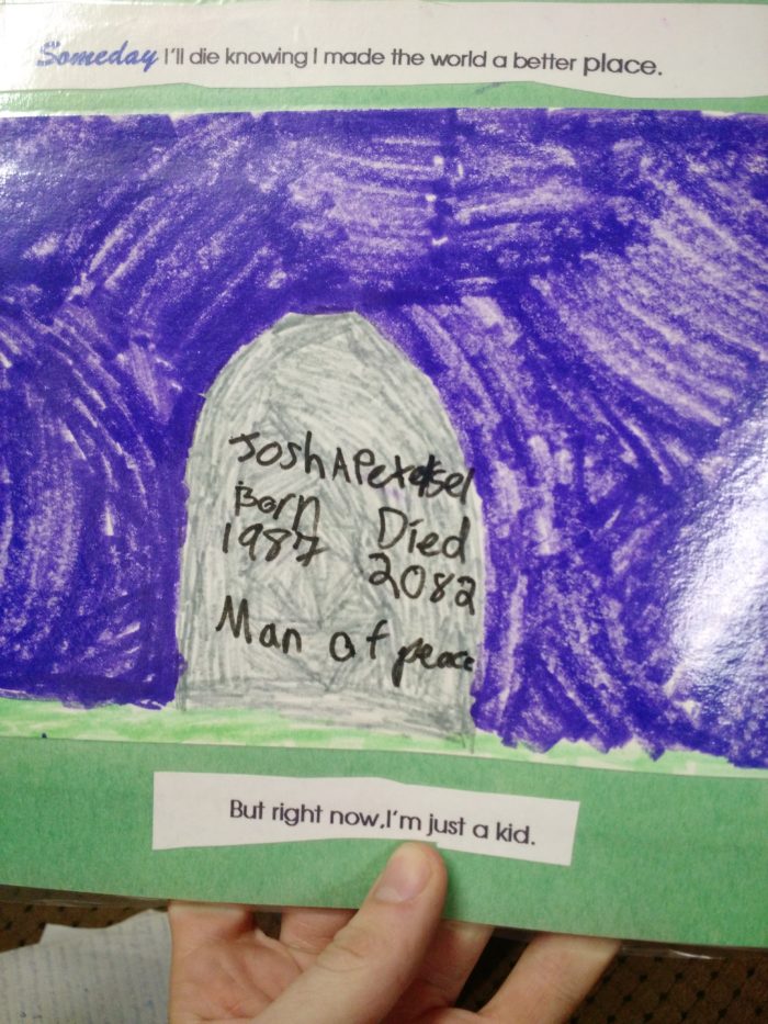
I… uh… wait what? 2082??

18c5b99b230b488b547e80eca9ced536

img_20151126_152550540


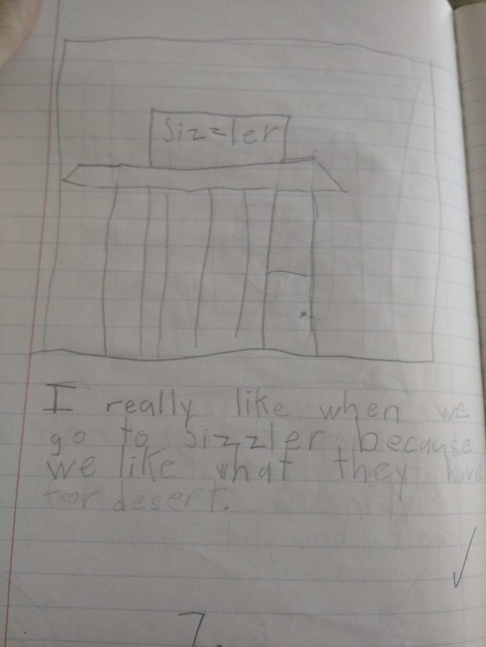
I had poor taste in restaurants.

img_20151126_145511022


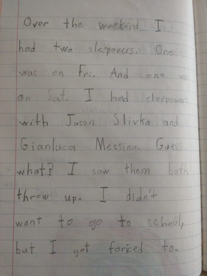
I was a good kid.

img_20151126_144854797

…But still always conniving ways to try to get out of school.

(To be fair: This experience was really traumatic.)
img_20151126_144940485

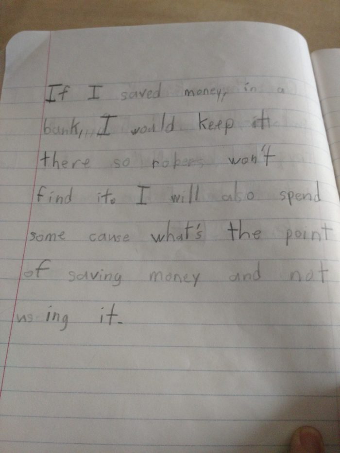
I knew how to manage money.

(And not to waste my life counting it.)

img_20151126_144740970

And I liked my family a whole lot.

(Still do.)
img_20151126_145438089


The worst part of a sports event is the sport itself

Watching sports is the worst part of going to a live sports event.

In theory, the game itself is what you paid money to go see. In reality, the game itself is usually… actually, it’s pretty eh.

It typically winds up being a lot of nothing happening. Like this:

baseball-gif

And this:

baseball-gif-2

And who could forget this:

baseball-gif-3

You are supposed to sit through that for an intolerable 2.5+ hours. It’s dreadful.

Most fans wind up just putzing around on their phones almost the entire time.

In fact, the game is usually so mundane that it’s a regular thing for fans to leave early. In droves. Because they want to beat the traffic. Avoiding the traffic is more interesting than watching the sports game.

fans-leaving

In no other entertainment medium is it a thing for everybody to leave early like this. People don’t leave Taylor Swift concerts early. People don’t leave Broadway plays early. People don’t even leave Paul Blart: Mall Cop 2 en masse the way they leave sports events.

People leave early because watching sports is the least fun thing there is to do at sports arenas. And because by the time you get to late in the 4th quarter (or the 9th inning, or the 5th day of cricket (how does this sport work??), or whatever), you’ve already had all the fun there is to have.

Want to know why sports fans really go to see games live? It’s got nothing to do with the sport, and everything to do with the eight items below:

8. Give advice to nobody

Here are some of the things that real people will actually say at sports events:

  • “Stay inbounds!”
  • “Catch that!”
  • “Throw a strike!”
  • “Hit him!”

Sports stadiums are filled with tens of thousands of people spouting similar nuggets of sage wisdom. Some of these people take steps to try and ensure their messages are heard by the intended party.

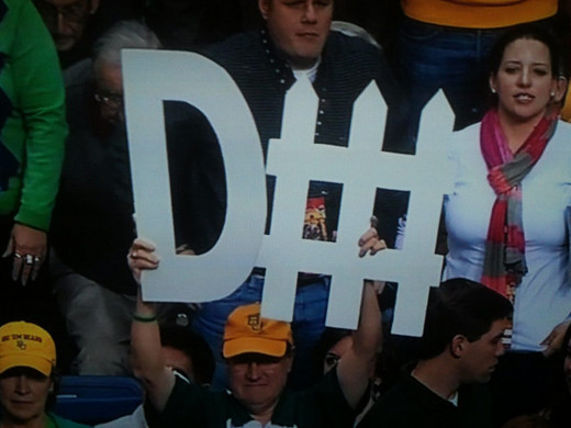
Like these guys:

defense1

defense2

defense3

If not for these fans’ ingenuity and passion, many athletes may forget to perform defense, an entire half of their job!

Meanwhile, everyone else in the stands sits and sporadically leaks their thoughts into a muddled orchestra of truly unhelpful advice. “Tackle him!” “Don’t get a penalty!” We don’t bring loudspeakers, we haven’t hacked our way into teams’ phones or communications devices. There is absolutely, positively, unquestionably no way that our guidance will ever reach its intended recipients.

We fans like it this way.

It’s better this way because we can feel like we’ve contributed to someone’s success without actually burdening ourselves with any accountability or responsibility for their (or our own) actions.


7. Yell at nothing

In a moment, I am going to present you with a noise meter. When you see it, I want you to yell at it.

Ready?

Here, yell at this:

Come on, louder!

I CAN’T HEAR YOU, COME ON, LOUDER

When I was like, six, it was empowering to feel like my actions had consequence as illustrated by these noise meters — the louder I yelled at the meter, the higher it would go.

When I was six.

(Note: roughly 90% of sports fans are 18 or older.)

HEY IT’S TIME TO YELL AGAIN LET’S GOOOO

This yelling game may not seem that fun while you’re hollering at this blog post from the comfort of your own home, but when you’re at a sports game, it is awesome. It is so inspiring that you probably play this game a dozen times before heading home to beat the traffic.

6. Be horrible to famous people

When a friend of mine tells me “Hey I’ve got an extra ticket to the game tonight, do you want to go?” what I’m really hearing is “Hey, do you want a free pass to use the F word at some strangers?”

Here is a real life situation: The New York Rangers are a group of about 20 highly-trained professionals who were hired from countries all over the world to skate on an ice rink, usually in downtown Manhattan. For the most part, the Rangers’ crime against humanity is wearing a shirt that is a slightly different shade of blue than the one we like.

So we fans cheer: “Rangers Suck!” “Rangers Suck!” “Rangers Suck!”

During the four beats of The Chicken Dance when you’re just supposed to clap your hands, we cheer “The. Ran. Gers. Suck!”

During “If you’re happy and you know it,” we replace the lyrics “If you’re happy and you know it” with “If you know the Rangers suck.”

Here are a bunch of fans doing a cheer of “Rangers Suck” during the Stanley Cup finals in 2012:

And let’s be crystal-clear here: This is a match between the Devils and the Kings. The Rangers are not playing. In fact, they’re not even competing at this point in the hockey calendar year; they’d been eliminated days earlier. There is utterly no point to this cheer other than to be wantonly mean to 20 people we will never meet in person.

It’s great.

5. Be horrible to regular people

Even better are the times when some unfortunate regular person decides to attend the sports game perpetrating the same crime as the Rangers: wearing the wrong-colored t-shirt.

Here is a fan who wore such a wrong-colored t-shirt that apparently the police had to get involved.

There are only three places in the universe where society has deemed it completely okay to be horrible to a regular person. One is when you’re driving on the highway and someone kind of momentarily veers into your lane. The second is when you hate a reality TV contestant on some show. The third is when you’re at a sports game.

It’s much cheaper to buy a sports ticket than it is to buy a car or to buy a cable-bundle-subscription-package-thing, which makes being horrible to people at sports games really a logical, economical decision. Plus, your person-hate is not impeded by some panes of glass; you can call a human an asshole right to their face and watch them react, which gives you a much rawer high than the diluted substitutes your car and your TV offer.

4. Watch kids be worse at the sport the adults were just playing

We’re really just hoping to see discombobulated kids screw up and fall on their faces.

3. Just throw all kinds of shit on the floor and leave it

Nobody likes concession stand food. It’s the same schlock at every arena: hot dogs, peanuts, sodas, beers, nachos, popcorn, cotton candy, Cracker Jack.

The real reason we buy this stuff is that when we’re done consuming the edible parts, we can just throw all the rest of that shit right on the floor. The little paper boat the hot dog comes in, the soda cup, the peanut shells, that absolutely disgusting, moist, sticky paper cone that once held the cotton candy puff.

Just right on the floor! All of it! Nobody gives a shit!

In fact, I don’t think I’ve ever seen a trash receptacle at a sports arena outside of the restrooms.

There’s absolutely nowhere else in society where you’re allowed this kind of freedom. Movie theaters? You can get away with leaving trash on the floor, but that’s mostly because it’s dark and you can be sneaky about it. In a movie theater, you’re likely to leave your empty box of Jujyfruits in a cupholder. Sort of respectful. In a football game, you’re likely to leave your half-finished box of cracker jacks on the floor, spilled, with the loose kernels crushed and mashed into the ground because people stepped on them. You don’t care.

Spot a souvenir helmet that someone left half-filled with popcorn? Easy! Turn it over, dump the popcorn on the floor, and now you own a free, unencumbered souvenir helmet.

We justify this because we implicitly understand that the arena is going to get completely cleaned after the game. (…But really, is that any more true about a sports arena than it is about a restaurant, a theater, or your friends house?)

In fact: I would probably pay for an event that’s just a neat, entirely presentable room where you go and make a huge mess of everything and leave. $5 if you just let me spill an entire large soda on a very clean floor. $20 if it’s a higher-quality room and you leave me for an hour or two.

2. Reflect on your own inner sadness, loneliness, and failure while hoping that this could be the day

or, in other words:

2. Watch the Kiss Cam

Some truth:

  • We’ve got millions of sports fans at arenas all over the country (or the world)
  • Drinking beer
  • Cheering on 50 or so hyper-aggressive alpha males either physically or metaphorically just beating the hell out of each other

And at every single one of these events, without fail, is a 90-second segment where those fans watch completely random (and usually not terribly attractive) people give each other a quick, polite kiss before we immediately never see them again.

It’s the most honest and raw expression of vulnerability that sports fans can muster. As a collective, we are a neurotic, self-conscious, lonely bunch. The sports are irrelevant. They’re a 2.5 hour charade so we can tell our peers we were doing something full of aggression and bravado, when really, all we want is to feel the embrace  — however fleeting — of a romantic interest.

Want to see what sports fans, everywhere, truly desire and dream about? It has nothing to do with overcoming long odds or winning championships. It’s here:

This guy right here:

screen-shot-2015-10-30-at-11-26-44-am

We go to sports because maybe, some day, we’ll get to be as happy as him.

This list item was kind of a downer. Which is okay, because there’s still #1 which is…

1. OHHHH MY GOD IT’S T-SHIRT LAUNCH TIME GET THE FU—

What if I told you that you could have a t-shirt with the following attributes:

  • made from the worst cotton possible
  • inevitably the wrong size, usually by a lot
  • plastered with a mess of corporate logos

You’d probably be like Bill Reilly here:

Now.

What if I told you that you could have a t-shirt with the following attributes:

  • made from the worst cotton possible
  • inevitably the wrong size, usually by a lot
  • plastered with a mess of corporate logos
  • BUT SOMEONE (MAYBE IN A SILLY COSTUME) FIRED IT OUT OF A GUN


Look at these kids:

These are high school kids; by their nature, they don’t give a damn about anything. The rule with being a high school student is that the less you care about anything, the better you are at being a high schooler. Even the most fleeting display of caring about something can be enough to undo years of hard work (and perceived lack thereof) in climbing the social hierarchy.

So it’s unfathomable to see these kids springing up out of nowhere to try and get their hands on a terrible shirt they will never wear, ever. But it happened there, and it happens everywhere.

That’s the power of the t-shirt launch.

The T-shirt launch is our holy grail.

screen-shot-2015-10-30-at-12-36-18-pm


100

I’m leaving New York.

(Okay, not, like, immediately.)

I’m going to leave New York in about 100 weeks.

100 is a cool number. It’s nice and round. But as a number of weeks, 100 is curious. It’s light years away, and yet, simultaneously, right around the corner.

100 weeks is just under two years away. And that means there’s a lot to do.

It was August 15th, 2015, when I decided I was going to leave New York. I was with my dad, and we’d been driving up the Pacific Coast Highway. We’d been looking out at the ocean…

img_20150814_193548207_hdr-web2


…when dad started talking about leaving New York.

Dad left New York.

He drove a 1968 Thunderbird. Green.

Dad left New York in 1973, as he explains it, because he had to. As I understand it, leaving New York became something of his odyssey.

In New York, Dad had a job, a girlfriend, his parents, a life. He left all of it and moved to Guadalajara, Mexico.

He had to become a doctor. By 1973 Dad was in his 30’s — too old to be accepted by most any decent American university. But he had to become a doctor.

To hear Dad explain Guadalajara… it’s kind of fantastical. He found love, faced death, made friends and enemies. Of all the experiences I’d listened to dad delineate in the prior 48 hours — his tour with the army through the Vietnam war, starting his medical practice, finding and falling in love with Mom — to me, the journey through Mexico stands out. It’s undoubtedly shaped him into the man, age 74, he is today.

img_20150816_093841405-web

He had to go.

And so, I have to.


I have to go.

My parents live in New York. My friends, my work, and my life are all here. But I have to go.


What makes an odyssey?

In a sense, I’ve already had one. In 2011 I gave up my girlfriend, my friends, my business, and my entire life and drove out of town. (In a 2010 Hyundai, blue.) Where dad drove south, I drove north. Where dad was too old, I was too young. Where dad was locked out of schools everywhere, I was accepted to the world’s premier academic institution. But Harvard Business School was no odyssey. In many ways, it was more jungle-gym than jungle. I went, but I never felt I had to go.

What makes an odyssey, then? The dictionary suggests long wanderings and hardships, especially when marked by notable experiences.

I’m certain the reality of Dad’s odyssey was much more mundane — if not lonely, grim — than the tales he regales me with now, forty years later. That’s okay. I expect it to be lonely. I don’t expect to find love. I don’t expect it will be easy. I don’t expect to return with stories of escapades from the brink. I don’t expect much. I just have to go.

I think what makes it an odyssey, in the Petersel tradition, is that you just have to go. And it helps that when you just have to go, you have to go South.

So I draw the line here: I’m going to go to South America in search of an odyssey.


100 Weeks.

I am leaving New York. I have plenty of time, and yet, I don’t have much time at all.

100 weeks is just under two years away. And that means there’s a lot to do.

Where should we start?

Tidal (series)

Part I: Tidal’s failure has nothing to do with PR

People hate Tidal.

It’s an easy target. The launch event was the most noxious PR move we’ve seen anywhere since LeBron took his talents to South Beach, and a nauseating event like that deserves every ounce of disrespect it continues to receive.

But a product getting marketed poorly doesn’t necessarily mean it’s abysmal. (Consider that, in LeBron’s case, the Heat actually turned out to be a pretty talented ballclub.)

So in light of all of the Tidal hate, I wanted to try to write the most hopeful, constructive, and maybe even at times positive review of Tidal.

This wouldn’t be easy.

Tidal does have two pretty meaningful structural problems: Buffering and video.

In 2015, if your music app has to pause mid-song to buffer, you’re dead in the water. There’s too many competitors out there, and no amount of bonus features are going to counteract the lurch of your speakers going completely quiet out of the blue, waiting for data to load.

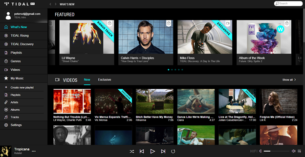
And video… well, devoting ~ 50% of the landing page real estate to video is a disaster.
tidal-landing-page-2

This screen space is just too important to devote to an idea which fundamentally splits Tidal’s use case in half. We already proved once that the world wasn’t ready for a combo music/video platform, and that was just two years ago.

With those cleaned up, we can focus on Tidal’s philosophy, and really figure out what went wrong and how to fix it.

“For Artists by Artists” is a dumb idea, right Josh??

tidallaunch

No, I actually think “For Artists by Artists” has the potential to be a really great idea.

In fact, I think Tidal has the potential to be three really great ideas. It just doesn’t seem to know which of the three ideas it should be:

  • For audiophiles who feel robbed by 320kpbs bit rates
  • For artists who feel robbed by Spotify’s payouts
  • For geeks and elites who feel robbed without exhaustive/exclusive info

Any one of these could be a fine launching point to build a niche, cult following and eventually build into a massive, attractive consumer platform. Instead, Tidal says nothing but “yes” to all ideas. In trying to appeal to everybody, Tidal winds up losing on all fronts.

(Maybe it’s just that nobody at company headquarters just had the balls to say “no” to Jay Z at any point?)

 Tidal’s failure has nothing to do with PR, and everything to do with ineffective product management & strategy. 

We’ll spend the next three essays diving deeper into how specifically Tidal failed at each of these three core initiatives, and thinking about, if executed properly, how a platform like Tidal might be redeemed.


Part II: High Fidelity, and… Pepsi

What’s the difference in Sound Quality between Tidal, Apple Music, and Spotify?

According to The Verge… nobody has any idea.

Tidal’s challenge is to innately understand its users — and specifically, in the case of Sound Quality, to understand its use cases.

In the video above, you’re inclined to conclude “these all sound the same; therefore, Tidal’s HiFi is a wash.”

The more scientific conclusion is that “these all sound the same under these specific conditions; therefore, under these specific conditions, Tidal’s HiFi is a wash.”

The difference (“under these conditions”) is subtle but profound.

At the end of the video above, the host disclaims that they tested using an average mobile phone and mediocre headphones. The quality of this listening experience is handcuffed to the quality of the hardware and surroundings. These are confounding variables.

Background:

confounding variable is when an extraneous thing that you weren’t testing for skews and affects the things you were testing for — so your results are fundamentally flawed. In the case of the study above, concluding “all these songs sound the same” using mediocre headphones is kind of the same as concluding “all this art looks the same” if you were walking around in a museum with all the lights off. The lights being on or off is a confounding variable which affects your ability to perceive art.

Unfortunately, most members of the public (and apparently many members of the media) won’t think of this. Which means that unless Tidal does something substantial, it will be impossible to differentiate itself on Sound Quality.

Did Tidal not anticipate that this is how their users would behave? A company like Tidal could learn this by studying how people actually use their product — not in focus groups, but in real-world observation through human-centered design. They’d see that listeners are often in subway cars. Or they’re half listening, half swiping through their email inbox or text messages or Tinder profiles. They’re almost definitely using crummy $15 earbuds.

No number of audio bits per second is going to drown out the hysteria of a daily commute or the adrenaline of a Tinder match. Despite being a better product, Tidal and Spotify and iTunes will all be indiscernible.

jaywantsit

Okay fine, Jay. If you insist on having Tidal rely on an unprovable use case like “it sounds better,” we can do that. We can even do that and still succeed. It’s even happened before.

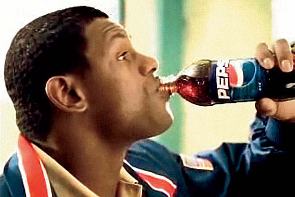
Tidal just has to become Pepsi.
sammy-sosa-pepsi

Step One: If Tidal wants to be the platform for audiophiles, it must understand its use case and make it disgustingly clear: “This is the kind of home audio system you need, these are the kind of headphones that make this worthwhile. Otherwise, don’t bother.”

This kind of pitch is brutally honest, and so narrow and exclusive that it unquestionably forfeits market share in the short-term. That’s okay. Maybe better than okay. Maybe even a strength. In fact, many of the best minds in tech suggest that starting by building for a very narrow niche rather than appealing to the general market out of the gate is the way to win in the long run. Focusing on such a narrow use case often affords you the benefit of being casually dismissed by competition and the media… until it’s too late. (Remember when Uber was just a black car service?)

More importantly, it gives Tidal an opportunity to focus on a narrow set of needs, and build differentiating features which would be impossible for mass-market competitors to compete with.
rob-gordon-high-fidelity


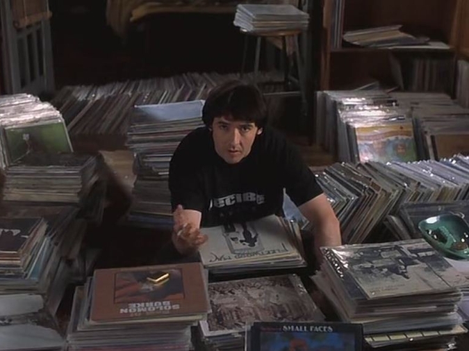
How do you get the people like Rob Gordon from High Fidelity to switch to Tidal?

Background:

Rob Gordon, the protagonist of High Fidelity, takes the time to reorganize his monstrous record collection in autobiographical order — that is, in the order in which he acquired each record. It’s unbelievably painstaking and neurotic; yet, he takes the time to do it. And his colleagues are mesmerized.

In Rob’s case, make it easy for him to organize autobiographically — maybe a separate column where the user can enter her own autobiographical data next to each album. More generally, find eight people who care about music like Rob Gordon does, follow them around, and figure out all the other the neurotic things they do like autobiographical order which technology can do better, and build for that.

Nine times out of ten, mass-market solutions of the world can’t compete with that, because there’s no economic case to build for Rob Gordon when they’re responsible for building for the mass market.

Step Two: Once Tidal has a narrow but zealous following, Tidal can become Pepsi by launching its own Pepsi Challenge.

Background:

In the 1980’s, Pepsi said “Do a blind taste test between Pepsi and Coke, and you’ll like Pepsi better.” This was true. It turns out we tend to like Pepsi better in taste tests, because it’s slightly sweeter and slightly more bubbly.

The thing is, nobody actually drinks cola in small taste-test fashion — we drink it in 20-ounce bottles at home and souvenir cups at ballgames. When you study how people actually consume soda, they prefer the slightly blander, softer taste of Coke. But it didn’t matter. Pepsi gained critical market share, Coke panicked and made New Coke which sucked (even though New Coke “tested” better than Pepsi) and led to Coke ceding even more critical market share.

In the cola case, Pepsi had a worse product than Coke, but acutely understood what its products strengths were and carved a path to monstrous growth. Tidal could be Pepsi, but not if it just says “hey try us out, we taste better.” It needs the Tidal challenge. It needs to create the setting — down to the headphones, seating, and environment— where its product is unquestionably better than the rest of the field.

In fact: Tidal has in an especially ripe opportunity to position itself above Apple, in the wake of the Beats acquisition. Beats are notorious for being gaudy headphones with middling technical performance. Apple irreversibly and conclusively compromised on audio quality. A Tidal partnership with Sennheiser or Bose and a direct frontal attack on Apple’s audio quality should have been a grand slam among both actual and aspiring audiophiles.

Conclusions 

  • When you’re building a product, test things scientifically. Understand the dangers of confounding variables
  • Start with a narrow niche where you can build something that solves very deep pain or creates monumental unique value. Tidal should concede the mass market and focus on the Rob Gordons
  • Intimately understand use cases to learn your actual strengths and weaknesses as they compare to your perceived strengths and weaknesses. Tidal must know that its quality is impossible to perceive when listeners are using average equipment in everyday situations, and build and market itself accordingly
  • From those last two, build on a value proposition that isn’t even a comparison — it’s unwinnable for anyone else. Tidal should launch the Tidal Challenge and let the results speak for themselves

Part III: For Artists, By Artists

The most common criticism about Tidal’s “For Artists” claim is that its payout structure still offers roughly a penny per track played — functionally equivalent to the rest of the music x tech field. This complaint comes from a real pain, but I think it’s a bit misguided.

As consumers, we obviously all saw through the launch party event and agreed that the artists we wanted to support weren’t the multimillionaires on stage, and nobody thought the world needed another Planet Hollywood.

jaywantsit

*Sigh*… all right, fine, Jay. You have to pick one, but if you want FAbA instead of High Fidelity Audio, and you’re sure of that, we can do it.

Tidal can be the For Artists by Artists platform and do a better job supporting the actual artists we consumers all want them to. But first, we have to understand the mechanics under the hood.

CAUTION: MATH SECTION

Most platforms do payouts like this, roughly: (Platform Net Revenue * Quantity of Artist Song Plays) / Total Plays of All Artists on Platform. So payout rate isn’t something the platform (or anyone) directly controls. Instead, there’s three variables we can manipulate to try and work in the favor of the artists:

1) Platform Net Revenue. Which is roughly (# Paying Users * Monthly fee). To make this variable go up, you either need more users or need each user to pay more per month. Naturally there’s a tradeoff—the more you charge, the fewer customers you tend to attract. (The platforms could also theoretically work out better deals with the labels and reduce their operating costs… but ugh, let’s not talk about record labels)

2) Quantity of Artist Song Plays. The more spins an artist gets, the more it gets paid

3) Total Plays. Somewhat counterintuitively, if there are fewer artists on the platform, if users are less engaged in the platform overall, the denominator of the revenue calculation gets smaller, and the payout for a given artist gets bigger assuming their Quantity of Song Plays remains constant

Spotify makes #1 go up by employing a freemium model which attracts lots of users and subsidizing costs with advertising. Tidal makes #1 go up with its HiFi product which charges $20/mo instead of $10. These initiatives are both in the interest of artists.

I’ll say that again: Spotify’s Free tier and Tidal’s Premium tier are both in the long-term interest of artists because they’re both designed to increase #1: Platform Net Revenue.

But then…

Each platform provides exhaustive tools for new artists to onboard, and for users to discover new artists. This is a double-edged sword. New Artist & Discovery features are helpful to artists for #2, but damning in terms of #3.

CAUTION:  MATH SECTION II

Say, for example:

– If 10,000 artists can get 1,500 plays each, they each go home with about $15.
– If 100 artists get 150,000 plays each, they each go home with $1,500.

(Conveniently, $1,500 should be just about enough for an artist to cover studio time + mixing.)

At first, 150,000 plays feels like an incredibly unreasonable number of plays to reach just to cover studio time. But that feeling is based on human logic which hasn’t yet adapted to the scale of the internet. Most artists — most regular humans — think in and react to terms they can readily grasp and understand. There’s this quote often attributed to Joseph Stalin, “A single death is a tragedy; a million deaths is a statistic.” That’s how humans, artists among them, are inclined to think. “A penny per track is a tragedy; access to 60 million listeners and getting 150,000 plays, a statistic.”

So at Tidal, if I wanted to be For Artists by Artists, maybe I’d spend my time thinking less about helping users discover new music, and more time thinking about getting users to be loyal to and excited about fewer, specific musicians, and helping those specific musicians be discovered by more loyal fans.

Maybe this means Tidal doesn’t have the world’s most exhaustive library. Instead, maybe Tidal’s got a very carefully curated list of artists who it thinks its listeners will like. This might mean ceding the potential base of listeners who just want to “Discover,” and being unable to support the very long tail of artists, and instead focusing on immersive, intimate experiences so that users can ramp playcounts up for the chosen few.

It’s possible that being a discovery platform is actually toxic for artists — that what artists really need is a loyalty platform.

Guess what: The “discovery platform which everyone thinks they love actually turns out to be a raw deal for content providers” thing isn’t a new phenomenon.

Check out what Mark Pastore, owner of a high-end restaurant in San Francisco, has to say about OpenTable. Here’s some select quotes:

Let me start by stating the obvious: the convenience and immediacy of booking a table online anytime day or night is beneficial to both diners and to restaurants …

It’s possible, however, for convenience to come at too dear a price …

customers [are] loyal to OpenTable, [and] restaurants find that they themselves no longer own the customer relationship.

Restaurants rely on the patronage of loyal customers whose continued engagement, conceivably, leads to a) bigger and bigger checks, b) louder word-of-mouth, and c) better-behaved patrons who restaurant owners genuinely like working to please. The platform promises new patrons, providing restaurants with theoretical access to millions of prospects, and providing the prospects with a gluttony of tools to discover the next new thing. Patrons use the platform to shop around, grow loyal to the platform, grow distant from restaurants individually.

Now, replace “Restaurants” with “Musicians,” and you’ve got a clear-cut illustration of how the modern music/tech industry works, and why every artist not named Taylor is having trouble shaking it.

Unfortunately, nobody in the restaurant industry has really figured out how to take down OpenTable just yet.

Maybe, I wonder, it’s just as simple as the fact that nobody truly influential enough has called the present-day Discovery model out on its destructiveness. Mark Pastore may be an influential restaurateur and known in select circles, but face it: you had no idea who Mark Pastore is.

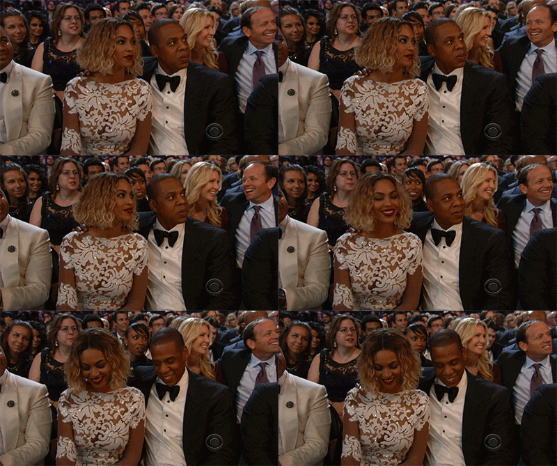
…So if only we knew someone motivated who could make an audacious claim like “discovery is killing artists,” and rally a lot of influential troops behind him…
jayz-modest


He could explain that the way to help your favorite artists succeed is to be loyal to them, and he could build a version of Tidal that encouraged and reinforced loyalty instead of discovery.

CAUTION: MATH SECTION III

The crux of the problem here is about math, but also about human intuition. On a purely monetary basis, the following two should be equal in value for an artist:

– 1,500 listeners who play one of your songs once this month
– 10 listeners who plays your songs 150 times this month

It should be obvious without even getting into any advanced math, though, that bands would prefer the second group of fans over the first — the latter is more likely to continue listening in months down the road, more likely to buy other products and tickets, more likely to engage with the content creator directly. On that basis, artists should seek tools and platforms to attract loyal listeners rather than fleeting listeners.

There’s problems, though. There’s the problem that loyal listeners and fleeting listeners kind of look the same when they first show up. More importantly, it’s MUCH harder to track and attribute success in converting a “New Listener” to a “Loyal Listener” than it is to track and attribute the conversion from non-listener to “New Listener.”

It’s easy and obvious on a human level to say “Tidal drove 1,500 new listeners to you this month,” because, well…there they are. And you can report that immediately, as soon as those listeners show up. For Tidal to say “we created 10 Loyal Listeners for you,” Tidal would at least have to wait around long enough (months?) for you to gauge loyalty, but also, Tidal has to convince you that it was something they did to create this longevity, rather than something endemic and catchy about the artist or her music.

So the incentives are screwed up. Tidal (and the rest of the music x tech mix, and OpenTable, etc.) all chase the Discovery metrics to which they can gauge and relate, and most unsophisticated artists play along because “new listeners” metrics makes sense. In so doing, the platforms are obliterating listener loyalty.

So how might a platform like Tidal engender listener loyalty and longevity?

  • Leaderboards and points for being a top listener to a given artist in you zip code, in your region, overall (like what Foursquare does)
  • Visible benchmarks (or even rewards!) for listeners which illustrate where bands need to get in order to achieve certain states of viability (like what Kickstarter does)
  • Storefront to buy stuff directly from bands (like what BandPage does)…
  • …or even just directly donate to the bands themselves (like what Patreon does)

I’m not sure that any of the features above are real breadwinners. Googling “how to create customer loyalty” brings up 14.5 million alternatives to what I’ve proposed. Customer loyalty is really hard.

So instead of a gimmick, or a new revenue model, I think it just comes down to Jay. Jay’s got to want it.

jayboom

Jay Z is the kind of force who, maybe, can engender loyalty just by saying “This is who I listen to. This is who I think is great.” Maybe Jay’s blessing is a self-fulfilling prophecy — he predicts a band should be listened to a lot, and it gets listened to a lot because of what he suggests as much as anything else. The narrative of the Tidal platform has to be flipped, from “discover a ton of new music here,” to “discover just a few bands to go really, really deep on.” The weekly update email isn’t “here’s this week’s latest releases,” but “here’s some new perspectives on that album you heard, and how everything gets better if you listen again.” Jay needs to make it sexy for people not to say “Hey, check out this new track I discovered,” but to say “I can’t believe how much better and deeper Tame Impala has gotten now that I’ve been listening for two weeks straight!”

It’s possible that this model is bunk, because almost no music is good enough, or broadly appealing enough, to warrant such substantial play. Or that there’s just too much good music, and no real upside any more for fans to do anything but continually bounce around.

Personally, I’m not the kind of music enthusiast who takes deep pride in listening to bands you’ve never heard of. I’d rather listen to, say, just twelve bands — but really, truly, deeply give a damn about each one of them. The kind of relationship where you’re compelled to fly across the country to see the finale show of their tour. Better yet if those are the same twelve bands I know my peer group is listening to as well. But maybe that’s just me.

Conclusions

  • Despite the popular narrative thinking otherwise, Tidal and Spotify Freemium are both actually designed to be For Artists
  • What really kills artists, and content creators across numerous verticals, is the obsession of platforms tracking “Discover” and “New Listener” metrics
  • To really be the For Artists by Artists platform, Tidal needs Jay Z to lead a push, a narrative, and a set of user tools designed for artist loyalty

Part IV: The Magazine of the Future + Overall Conclusion

Jay Z’s last desire, which we outlined all the way back in Part I, is that Tidal should be the go-to resource for the most devout music consumers in the market — those who want content that’s both exhaustive and exclusive.

It’s pretty hard to be a thought leader and get recommendations right — in any space, but especially in the music space. That’s why there’s thousands of blogs, companies, and algorithms all trying to accomplish the same thing.

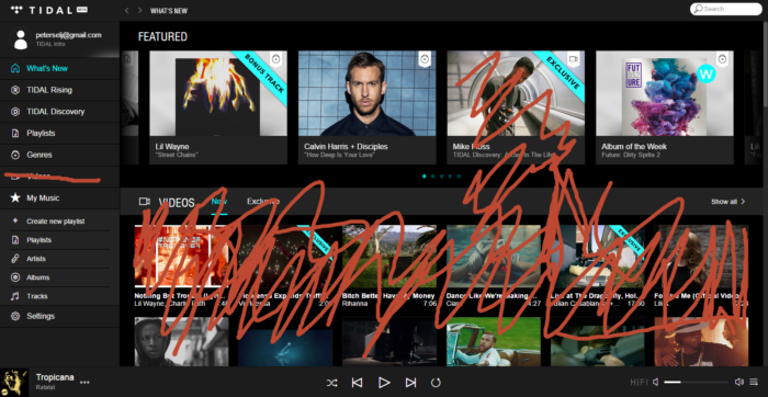
Tidal fails at the Exclusive Content value proposition because their “exclusive” stuff is all over the map. Look again at my landing page:
tidallandingpage

Lil Wayne + Calvin Harris + Julian Casablancas + Lilli K = I don’t think you have any idea whatsoever about what I want. There’s no voice, structure, theme — you’re hitting me with the kitchen sink.

To be fair, algorithmic recommendations engines take a little bit of time, and in my short 2-week trial, it’s feasible that Tidal simply didn’t have the requisite base set of data to be able to produce meaningful results.

I’ve personally never been a huge fan of algorithmic recommendations. I tend to opt for things that are a little more… human.

So, for the sake of argument: What if Tidal thought, talked, positioned, and designed itself like… a magazine?

I’m obviously a little biased here. But without an editorial voice, the fact that Mike Floss’s video above is “Exclusive” means absolutely nothing to me. “We’re the only platform that has this Mike Floss stuff” doesn’t necessarily equate to “You should really want it.”

I wonder what would happen if Tidal vertically integrated, and acquired a prominent music magazine like Pitchfork. What if the magazine and the streaming provider were one in the same, both rented for the flat $10 fare?

Netflix is a shining example of a vertical integration being implemented to great success. They integrated up the chain, becoming creators and producers to complement their distribution. A music player following suit isn’t an unheard of idea, or a terrible one. This integration we’re considering would go down the chain — Tidal would become distributor plus critic.

My biggest question (shaded again by my magazine background): Would an acquired magazine’s editorial integrity be compromised by being the primary content player as well as the editorial writer? I don’t think so; at least, no more than editorial is usually compromised by the needs to get clicks, page views, and ad conversions. 

In fact, it’s possible the Tidal Magazine model would allow for even better, more authentic, more aligned content than any of its peers.

The primary job of a music writer is thus: Inspire your reader to listen to the subject matter (album, artist, etc.) at hand. In a world where content is paid for by ads, the writer and the magazine employ tricks to ratchet up ad views: clickbait-y titles, articles spliced into 17 slides. It’s better for the advertiser and for the magazine if the reader clicks through five different quick pieces and sees five different BUY A FORD TRUCK ads. The reader’s experience and the author’s objective are compromised. As we discussed last time, the artist is marginalized as well by readers who are more inspired to flake around than hunker down.

In Tidal Magazine world, however, the publisher gets paid the same $10/mo no matter how many articles are viewed. Authors can be measured directly by their ability to convert article reads into album listens. The interests of the author, reader, and platform are all aligned. Instead of A/B testing articles for their titles’ clickbait-y-ness the magazine might A/B test the actual content of the article, and measure not views but conversions.

Many premium websites already sustain themselves by charging $10/mo just for access to the written content. I’m fascinated by the prospect of a sophisticated paid platform with an actual revenue-generating product behind it.

This website estimates Pitchfork is worth $83M . This website has them at 12.9M (as of 2011). Neither figure is really a serious amount of money in the Venture Capital backed, winner-take-all economy that the music media platforms live in. (Consider that Spotify acquired Echo Nest for $100M to enhance its recommendation platform, for comparison.)

To improve its platform, to really differentiate from a functionally indistinguishable crowd, to align participants and really get down to Jay Z’s root interests, to take a crazy shot at winning in what appears to be an increasingly desperate fight… I don’t know, this seems like a good deal.


Conclusions

  • Good content is hard to create and hard to curate algorithmically
  • But it’s probably not that hard to acquire
  • Tidal could differentiate by becoming (acquiring) a magazine. It’d be unique in its position to align the interests of writer, reader, and platform: All towards converting articles to song listens, without the distraction of ad views

OVERALL CONCLUSIONS

  1. We learned why Tidal Sucks: Its mission statement was all bark and no bite. We talked about the importance of product strategy, about the impracticality of trying to be everything to everyone, and about how much better it is to stick to one mission and kill it
  2. We discussed how Tidal might approach High Fidelity Audio, about what makes that particular value proposition difficult, and about how Tidal might thrive on even a fake competitive advantage anyway by harping on use cases its listeners could really experience and relate to
  3. We employed some math and psychology to learn why artists aren’t impressed by Tidal’s compensation. We explored some steps Tidal could take to make its platform more appealing and sustainable for up-and-coming artists, and could differentiate Tidal’s platform from the rest of the music discovery field
  4. Finally, we dove in to the premise of exclusive content, and explored an the merits of buying a media platform rather than trying to build one themselves

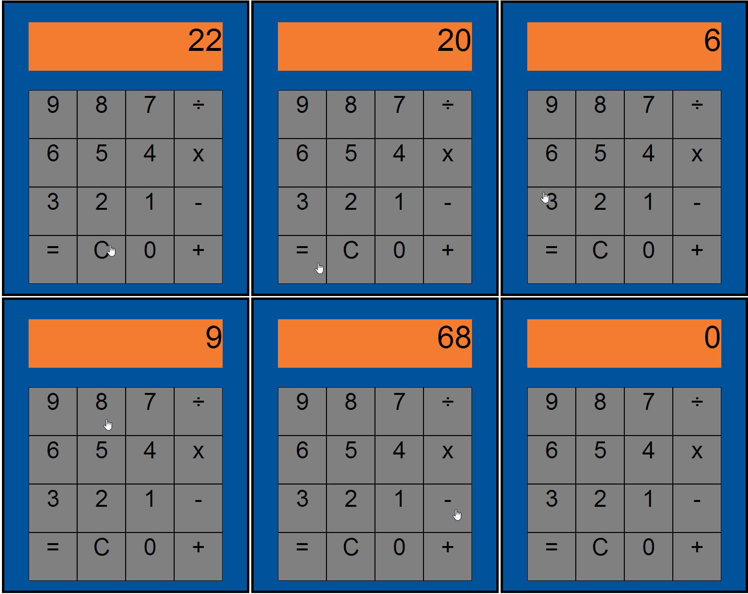
I built a calculator

Check it out at http://joshpetersel.com/Calculator/

calculatorworking

FAQ:

Q: Why did you do this?
A: Because coding is fun for me. Because I like solving problems.


Q: How did you do this?
A1: Explicitly, how the calculator is built: HTML, CSS, and JavaScript/jQuery to (respectively) make the buttons appear, to lay them out in the style I wanted, and to make them function like you’d expect a calculator to function.

For those uninitiated with software development, here’s what that looks like:

Building the functions of a calculator—like any software—can be surprisingly tricky or counter-intuitive when you have to think like a computer instead of like a human. “50 x 4 = 200” seems straightforward to a human, but to get to “200,” a computer has to do a lot of very subtle work. A computer thinks kind of like this:

  1. The user hit “5”. Okay, I need to display that at the top, and start remembering “5” as the first figure in what may be a string of numbers
  2. The user hit “0”. Okay, I need to add that zero to the end of the string starting with “5” so that it’s now “50”, and I need to remember that, and display it at the top
  3. The user hit “x”. Okay, we’re going to want to multiply—not immediately, but I need to remember this for later. I also know the first string is done at “50”. I need to store that “50” in longer-term memory and clear space so the user can start entering the second string of numbers. (I also should blink a little bit in the display when the user hits “x”, so that the user gets some feedback and feels confirmation that the computer received this input)
  4. The user hits “4”. Again, I need to make sure I’m not continuing the first string (which would lead to “504”), but starting a new string (“4”), which the user indicated is what he wanted because he just hit the “x” operator earlier
  5. The user hits “=”. Okay, I have to check if I’ve got all the pieces I need—do I have a first number? Yep, “50”. A second number? Yep, “4”. An operator? Yep, “x”. Okay, I’ll do the function!

A large part of the fun and the challenge of coding is thinking about all the different things a user could want to do, and writing instructions to tell the computer how to behave in those situations. (What if the user skipped Step 4 above, and hits “=” without specifying a second number to operate against? What if the user does Step 3 twice— he hits “+” but realizes this was a mistake and changes his mind to “-” ?)

The best coders write simple and versatile instructions, both so that the computer doesn’t have as much to read when it’s operating, and so that the developer doesn’t have that much to read when (inevitably) something goes wrong.

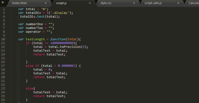
I wrote everything in Sublime Text. I worked with Steve, who himself built a separate but equally functional calculator at the same time on his own laptop.

sublimecalculator

A2: More generally, to think about and scope the project, I mirrored the lean product development process.

For those uninitiated with Product Management, here’s what that looks like (oversimplified):

  1. Steve and I first sat down and defined our objectives. We want to do something fun. We want to use JavaScript to solve a problem. We want the result to be something we could show and explain to our friends. We didn’t want to lose sleep over it. (Often, in professional Product Management, objectives need to be slightly more explicit than this—“We need this to load in under 3 seconds,” for example. But again, we didn’t want to lose sleep over this.) Anyway, we decided to build a calculator.
  2. Second, we laid out everything we expected a calculator to do. For example, “I should be able to add two numbers together,” and “I need a ‘Clear’ button to clear things if I make an entry mistake.”
  3. We also defined our available resources—in this case, this was mostly just our own time. We would have a few hours to tinker with this project after work on Tuesdays.
  4. With 1-3 defined, we were able to prioritize our to-do list. Some items, like “It should look like a calculator with a display and number & function buttons” naturally floated to the top. Other items, like “It should be able to do square roots and exponents” were closer to the bottom.
  5. Our to-do list was fluid, as new ideas, features, and problems can crop up during development.
    • One feature we added, for example, was scientific notation for really large numbers (head to the calculator and try multiplying 99999999999 by 99999999999, if you want!). We decided this was important because someone could reasonably try this, and it would look reprehensibly ugly if the display numbers spilled out of the display area.
    • On the other hand, we wound up cutting square roots and exponents functions. This happened as we got closer to our limit on resources, and we felt that the compounding effort required (not just new functions in JavaScript, but a new button layout in HTML/CSS) weren’t worth the benefit—even without those buttons, we still had a basic functioning calculator.

Also mirroring lean software development, the heavy majority of the work (maybe as much as 90%) was not in getting the basic calculator up and running and looking like a calculator, but in uncovering and fixing bugs.

Many bugs arise from what are commonly called “edge cases,” which are actions that a user might reasonably try… but not very frequently, or only under extreme use—this makes them harder to think of when you’re initially planning your project. The scientific notation feature I mentioned earlier is a good example of this: It didn’t occur to me or Steve at the outset that this would be a problem, but we uncovered it after a session of deliberately trying to break our calculator’s functionality. It’s hard to predict where these sorts of bugs will come up exactly on any given project… but they always seem to show up, so it’s important to budget time here.

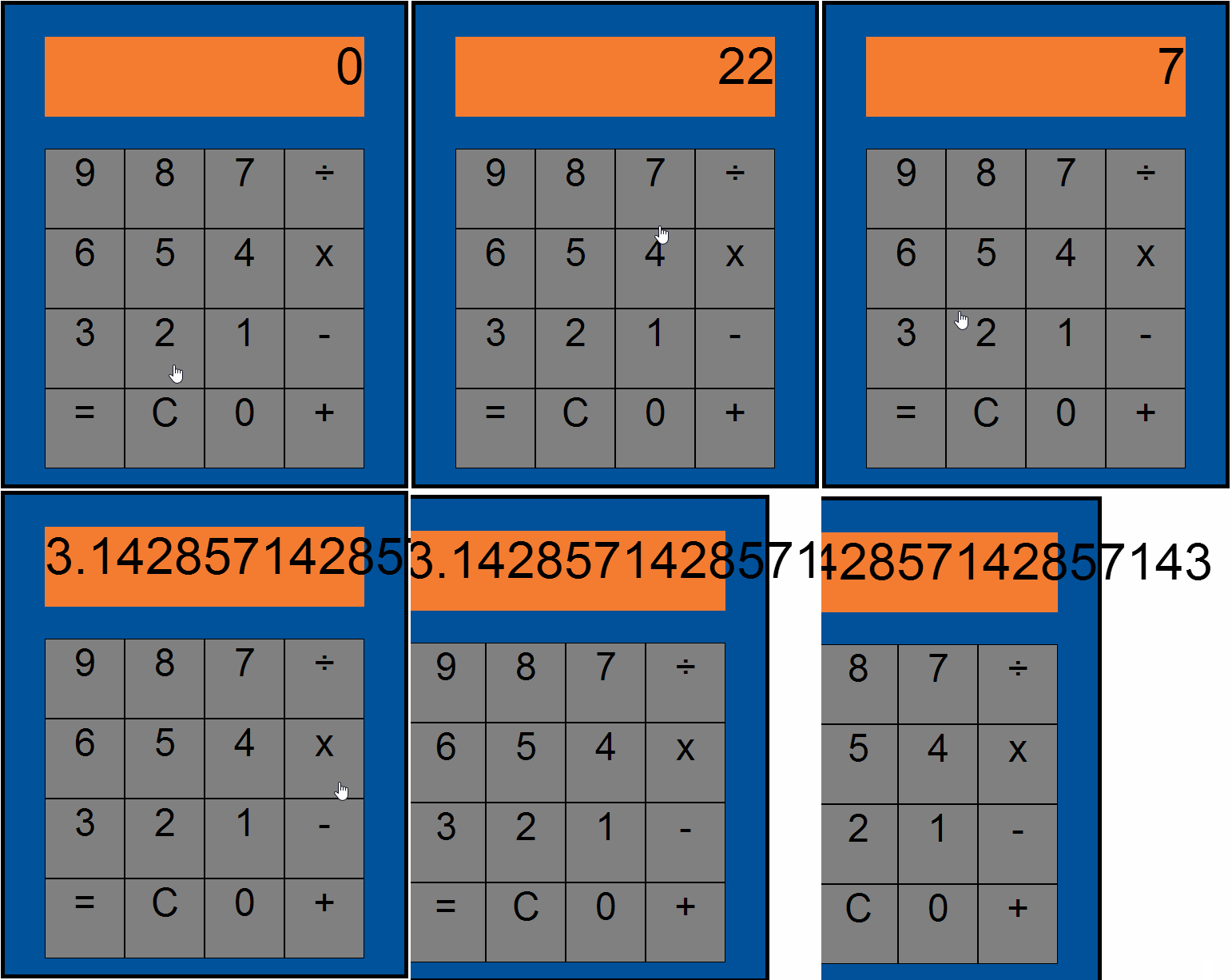
To give you an idea: We fixed the display bug for really small numbers by using scientific notation (head to the calculator and try dividing 1 by 99999999999, if you want!)… but we didn’t realize that this wouldn’t cover the case of irrational numbers, which would have to be addressed separately.

calculatorbreaking

Some bugs also arise from syntax errors—for example, we’d occasionally find that accidentally forgetting a “}” near the end of a line or accidentally typing a “:” instead of a “;” would cause the whole application to crash. Code can be sometimes very finicky that way. Seasoned developers are probably better at scanning for and fixing syntax errors—not to mention that they’re probably better at writing perfect syntax in the first place—but even veterans can still slip up from time to time across thousands of lines of code. The same way I, a seasoned writer, might still occasiomnally accidentally spell a word incorrectly. (Luckily, though, that extra “m” in the word “occasionally” doesn’t result in this entire paragraph becoming illegible.)


Q: But the calculator’s still broken? I found a bug? (*OR*) Wait, isn’t there a feature missing?
A: Yep, there’s a few bugs that I’m still aware of. (Dividing 22 by 7 still breaks the display, for example.) This is actually a pretty normal part of software development. Often, software does get released to customers with known bugs still in play. It’s not ideal, but if the bugs are not critical, it’s usually the case that the benefit of getting your software into customers’ hands sooner is worth the pain of exposing a few minor bugs.

Q: Aren’t you going to fix all that?
A: Typically, a software development team will continue working on the product even after it’s been shipped to customers. That way the team can not only iron out the known bugs, but can also work on the new bugs they learn about when customers start invariably tripping themselves up.
In the calculator’s case, though, we probably won’t fix anything else.

This is a difficult, but essential decision to make as a Product Manager. It comes down to careful awareness and appreciation of our original core objectives. Notice that “Build a perfectly-functioning calculator” is decidedly not one of those objectives. All other objectives have been satisfied. To stamp out even just the bugs we were aware of, we’d likely need to do a lot of redundant, recursive work, which would push our release date back by months since we were only working a few hours a week. Not a good investment of resources.
It’s worth noting that while this sort of effort would be valuable for us to become stronger developers, the reality is that our efforts and our skills as Product Managers will be better spent innovating, scoping, and coding up our next new thing.

It’s also worth noting that fatigue, the feeling of “ugh, I’m bored of this I want to move on to something else,” is very real among professional engineers—and it’s a very real Product Manager skill to be able to encourage developers to see lengthy projects through to fruition. But again, this was out of scope for our initiative here.


Q: Why is this calculator Blue and Orange?
A: Duh, Islanders colors =)

nystrom


Q: Wait, why’d you make a calculator of all things?
A: Hat tip to Matt who inspired the project. And for whom, accordingly, I also built a very special version of the calculator which randomly spits out Matt-themed insults as you press buttons.


(Thanks to Steve, who worked with me through development, and proofread a draft of this.)